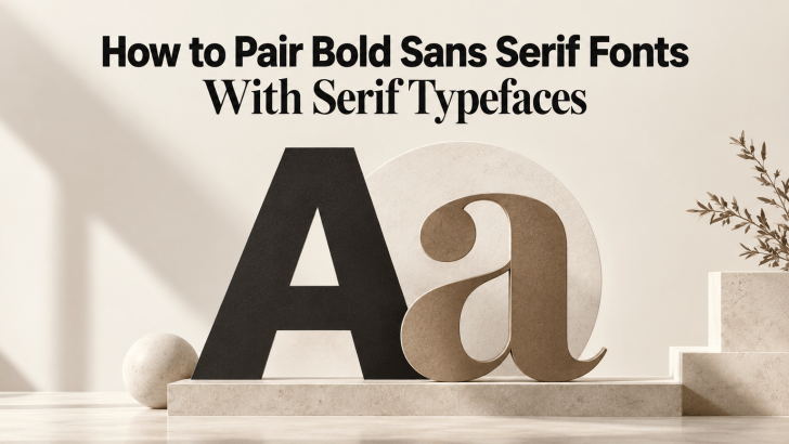
How to Pair Bold Sans Serif Fonts With Serif Typefaces

Learning how to pair bold sans serif fonts with serif typefaces can help designers create stronger contrast without making a layout feel disconnected. Bold sans serif fonts bring clarity, confidence, and visual impact, while serif typefaces add refinement, texture, and personality. When both styles are balanced well, the result can feel modern, polished, and easier …
Continue reading →

Modern Fonts Similar to Poppins for Modern Branding

Choosing modern fonts similar to Poppins for modern branding can help designers keep a clean, geometric, and contemporary look while creating a more distinctive visual identity. Poppins is widely recognized for its modern sans-serif structure, balanced proportions, and versatility across digital and print projects. However, using a similar font can add personality while preserving the …

Continue reading →

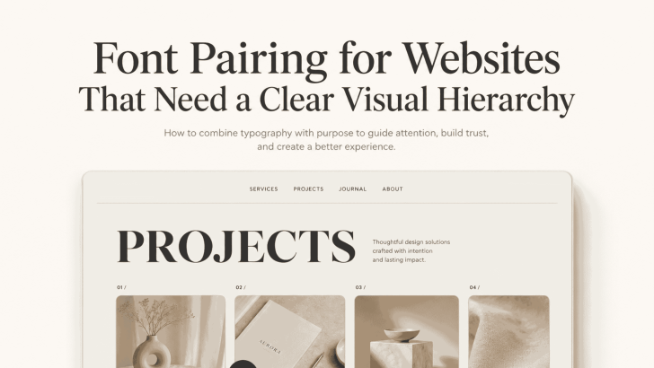
Font Pairing for Websites That Need a Clear Visual Hierarchy

Good font pairing for websites that need a clear visual hierarchy helps visitors understand a page before they read every word. The right combination separates headlines, supporting text, body copy, navigation, and calls to action without making the layout feel crowded. A website may have strong content and beautiful images, but unclear typography can make …

Continue reading →

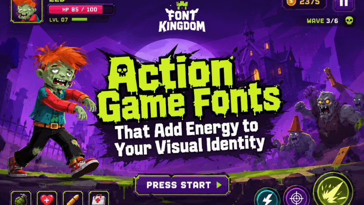
Action Game Fonts That Add Energy to Your Visual Identity

Many designers struggle with visual identities that feel flat, generic, or lacking excitement. Whether you’re creating graphics for a game title, streaming channel, gaming merchandise, esports brand, YouTube thumbnail, or promotional campaign, typography often becomes the missing ingredient. This is where action game fonts can make a significant difference. Action-themed typography is designed to communicate …

Continue reading →

How to Make a Portfolio for Designers Using Custom Fonts

Creating a strong portfolio for designers is one of the most important steps in building a successful design career. A well-structured portfolio shows your creativity, skills, and professional identity. However, many designers overlook one key element that can make their portfolio stand out: typography. Using custom fonts in your portfolio design can give your work …

Continue reading →

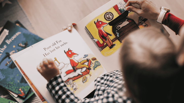
Best Storybook Fonts for Children’s Book Design

Choosing the right storybook fonts is one of the most important decisions in children’s book design. Typography shapes how young readers experience a story. The right font makes reading easier, more enjoyable, and emotionally engaging. The wrong font can create confusion, reduce readability, and weaken the storytelling impact. In this guide, we’ll explore what makes …

Continue reading →