Learning how to combine fonts can completely change the way your design feels. The right font pairing can create hierarchy, improve readability, and give a brand a stronger personality. The wrong combination, however, can make even a polished layout feel confusing, inconsistent, or visually crowded.
Font pairing does not have to depend on instinct alone. Once you understand contrast, hierarchy, personality, and consistency, choosing two typefaces becomes much easier. Whether you are working on branding, packaging, social media graphics, websites, or editorial layouts, a few practical principles can help you build combinations that feel intentional.
How to Combine Fonts by Starting With a Clear Role
Before selecting fonts, decide what each typeface needs to do. One font may become the primary typeface for headlines, while another handles body copy, captions, or supporting information. When every font has a clear purpose, the overall design becomes easier to control. For example, a bold serif typeface can create a strong editorial headline, while a clean sans serif can keep longer paragraphs comfortable to read. The important part is not simply choosing attractive fonts. You need to give each font a specific function.
Avoid using several decorative fonts at once. When too many typefaces compete for attention, the visual hierarchy quickly disappears.
1. Give One Typeface the Leading Role
Every good font pairing needs a dominant voice. Your primary font should communicate the strongest part of the design’s personality. A luxury brand may rely on an elegant serif. A modern technology company may prefer a geometric sans serif. A playful packaging concept could use a more expressive display font. The second typeface should support that personality rather than compete with it.
Think of font pairing like a conversation. One typeface speaks first, while the other helps make the message easier to understand.
2. Create Contrast Without Creating Conflict
Contrast is one of the most effective ways to combine fonts successfully. Pairing two typefaces that look almost identical can feel accidental. On the other hand, combining fonts with completely unrelated personalities can make the design feel disconnected. A useful approach is to create clear contrast in one or two areas while keeping other characteristics compatible.
You could combine:
- serif with sans serif
- bold headlines with lighter body text
- condensed display fonts with wider text fonts
- expressive titles with neutral supporting typography
For example, a sophisticated serif paired with a simple sans serif often works because their structures are different while their overall mood can still feel harmonious.
If you want to explore this idea more deeply, read The Art of Typeface Pairing: Creating Harmonious Designs for a closer look at building balanced typography combinations. This internal link can also help readers understand why successful font pairing depends on relationships rather than individual typefaces.
3. Match the Personality of Your Fonts
Two fonts can look beautiful separately and still fail when placed together. That usually happens because their personalities do not match. Imagine pairing an elegant high-fashion serif with a playful cartoon-inspired font. Both may be well designed, but they communicate completely different moods. Unless that contrast is intentional, the result may feel confusing.
Instead, consider what the overall design needs to communicate. Is the brand sophisticated, friendly, minimal, energetic, traditional, or experimental? Once you define the mood, selecting compatible typefaces becomes easier. Look beyond categories such as serif or sans serif. Pay attention to proportions, curves, stroke contrast, spacing, and overall character.
4. Keep Your Font Pairing Simple
More fonts do not automatically create more interesting designs. In many projects, two typefaces are enough. You can create additional variety through size, weight, spacing, alignment, and color rather than introducing a third or fourth font family.
A strong typography system might use one font for headings and another for body copy while relying on several weights within those families. This approach keeps your design flexible without making it visually chaotic.
If you want to understand the basic structure behind every typeface before experimenting with font combinations, read The Anatomy of Typography: A Beginner-Friendly Guide to learn how elements such as x-height, ascenders, descenders, strokes, and proportions influence the way fonts look and work together.
5. Use Font Weights Before Adding Another Typeface
Before searching for another font, check whether your existing family includes multiple weights. Regular, medium, semibold, bold, and italic styles can create hierarchy without introducing a completely different visual language.
This is especially useful for websites, brand guidelines, presentation templates, and editorial layouts where consistency matters across multiple pages.
6. Test Your Fonts With Real Content
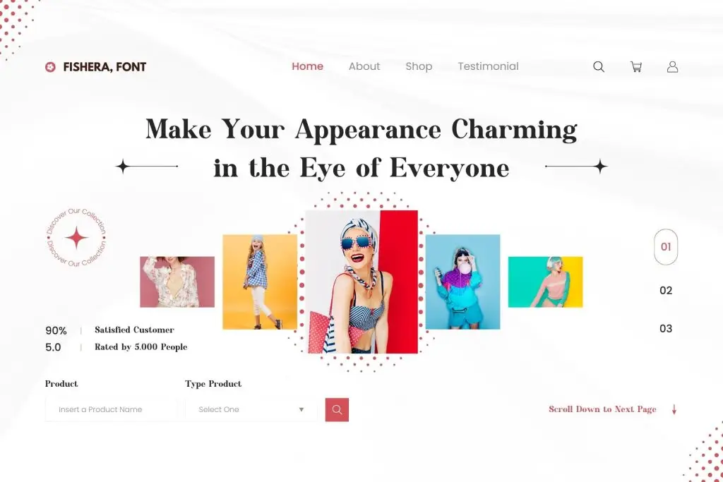
A font pairing can look impressive in a sample image but behave very differently in an actual project. Always test fonts using realistic headlines, paragraphs, numbers, buttons, labels, and other content that will appear in the final design.
Pay attention to readability at smaller sizes. Check whether the x-height feels balanced between the two fonts. Look at spacing and make sure one typeface does not visually overpower the other. You should also test your typography on different screen sizes if you are designing for digital platforms. A successful font combination should remain functional, not just attractive.
7. Build a Consistent Typography System
Once you find a font pairing that works, turn it into a repeatable system. Define which font is used for headlines, subheadings, body copy, captions, buttons, and other text elements. Set consistent sizes, weights, line heights, and spacing rules. This creates visual consistency across everything from social media graphics to websites and packaging.
A typography system also makes future design decisions faster because you no longer need to choose fonts from scratch for every new layout.
Final Thoughts
Understanding how to combine fonts is less about following strict rules and more about creating clear relationships between typefaces. Give each font a role, build contrast carefully, match their personalities, and keep the overall system simple.
When your font choices support the message instead of competing with it, typography becomes a powerful design tool rather than a decorative element.
Start with two fonts, test them with real content, and pay attention to how they work together across different sizes and applications. With a thoughtful approach, you can create font combinations that feel balanced, professional, and memorable without overwhelming your design.
