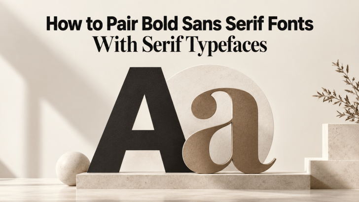
Learning how to pair bold sans serif fonts with serif typefaces can help designers create stronger contrast without making a layout feel disconnected. Bold sans serif fonts bring clarity, confidence, and visual impact, while serif typefaces add refinement, texture, and personality. When both styles are balanced well, the result can feel modern, polished, and easier to scan.
This combination works especially well for branding, websites, fashion campaigns, packaging, editorial layouts, and social media graphics. The key is to give each typeface a clear role instead of letting both compete for attention.
Why Bold Sans Serif and Serif Fonts Work Well Together
Bold sans serif fonts usually have simple shapes, thick strokes, and strong visual presence. Serif typefaces add more detail through their finishing strokes and often create a more classic or editorial tone. That difference naturally creates contrast.
A bold sans serif can make a headline feel direct and contemporary, while a serif typeface can soften the composition or add sophistication. In other cases, the serif can become the main display font while the bold sans serif supports subheadings, navigation, or calls to action. The pairing works because both styles bring something different to the design.
1. Start With One Dominant Typeface
A successful pairing needs hierarchy. Decide which font should lead the visual identity first.
Use Bold Sans Serif as the Main Headline

This approach works well for modern brands, sports, technology, lifestyle, streetwear, and digital campaigns. The bold sans serif creates immediate impact, while the serif adds a more refined secondary layer. For example, use a bold sans serif for a campaign title and a regular serif for an introductory sentence or quote. The result feels strong without becoming overly rigid.
Use Serif as the Main Display Font
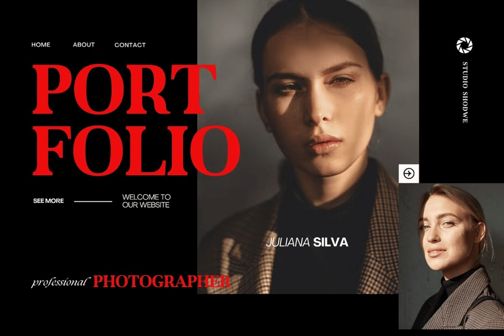
For fashion, beauty, hospitality, editorial, and luxury branding, the serif may be the better lead. A bold sans serif can then support navigation, product labels, prices, and CTAs. This creates a more elegant first impression while keeping practical information clean and easy to find.
If you are still deciding which category should define the brand tone, read Bold Serif vs Bold Sans Serif: Choosing the Right Tone for a Brand. It can help you compare the personality of both styles before pairing them.
2. Match the Fonts by Personality
Contrast is important, but the typefaces should not feel completely unrelated.
Compare Their Proportions
Look at letter width, x-height, and overall visual weight. A very wide bold sans serif paired with an extremely narrow serif can feel awkward unless the contrast is intentional. Try typing the same word in both fonts. They should look different enough to create hierarchy but still feel like they belong in the same design system.
Consider the Mood
A geometric bold sans serif can pair well with a refined serif for a modern editorial look. A softer humanist sans serif may work better with a warmer traditional serif. Think about how the brand should feel: premium, confident, playful, minimal, or sophisticated. The pair should reinforce the same overall direction.
3. Use Size to Strengthen the Hierarchy
Font pairing is not only about choosing two categories. Size plays a major role in how the combination works.
Make the Main Message Clearly Larger
The primary headline should be noticeably bigger than supporting text. If the bold sans serif and serif appear at almost the same size, they may compete for attention. A simple hierarchy could use a 56 px bold sans serif headline, a 28 px serif subheading, and 18 px body text. The exact sizes depend on the layout, but the difference should be visible.
Keep Supporting Text Comfortable
Longer paragraphs should remain easy to read. Avoid using the heaviest sans serif weight for body copy, even if it matches the headline. A regular serif or regular sans serif usually works better for longer text.
4. Balance Weight and Contrast
Weight can make or break a pairing. A heavy sans serif beside a very thin serif can create dramatic contrast, but it may also feel unbalanced if the serif becomes too weak. A medium-weight serif often creates a more stable relationship. Likewise, two very heavy typefaces may make the layout feel crowded. Use one strong focal weight and let the supporting font feel lighter. This keeps the hierarchy clear.
For a more detailed explanation of this approach, read How to Balance Bold Serif Headlines With Readable Body Text.
5. Pair Fonts According to Their Role
The easiest way to keep the system consistent is to assign each typeface a specific function.
Bold Sans Serif for Attention
Use it for:
- Hero headlines
- Campaign titles
- Product names
- Section headings
- CTA buttons
Its strong presence helps important information stand out quickly.
Serif for Depth and Personality
Use it for:
- Introductory text
- Quotes
- Editorial subheadings
- Brand stories
- Selected product descriptions
The serif can add a more refined tone without competing with the main headline.
6. Use the Pairing Across Branding Applications
A good font combination should work beyond one layout.
Websites
Use the bold sans serif for navigation, buttons, and main headings. The serif can support editorial sections, quotes, or brand storytelling.
Packaging
A strong sans serif can highlight the product name, while the serif handles flavor notes, collection names, or short descriptive text.
Social Media
Use the bold sans serif for short promotional messages and the serif for supporting copy or more emotional statements.
Editorial Layouts
Either font can lead. The decision depends on whether the layout should feel more modern or more refined.
7. Keep Spacing Consistent
Spacing helps different typefaces feel connected. If the bold sans serif uses tight tracking, the serif does not always need the same spacing. However, both should fit the overall rhythm of the layout.
Use generous whitespace around major headlines, especially when both fonts have strong personalities. This prevents the composition from feeling crowded.
8. Avoid Common Pairing Mistakes
One common mistake is choosing fonts that are too similar. If both typefaces have nearly the same proportions and visual tone, the contrast may feel weak. The opposite can also happen. A playful serif paired with an ultra-minimal corporate sans serif may feel disconnected.
Another mistake is using too many weights. Keep the system simple. One bold weight, one regular weight, and perhaps one medium weight are usually enough.
Finally, always test the pair at real sizes. What looks balanced in a large design preview may behave differently on mobile screens or printed packaging.
Conclusion
How to pair bold sans serif fonts with serif typefaces comes down to balance. Use the sans serif for strength and clarity, then let the serif add personality and refinement. Decide which font leads, create enough size contrast, and assign each typeface a clear role.
The best pairing should feel intentional, not decorative. It should help users understand the hierarchy while reinforcing the personality of the brand.
