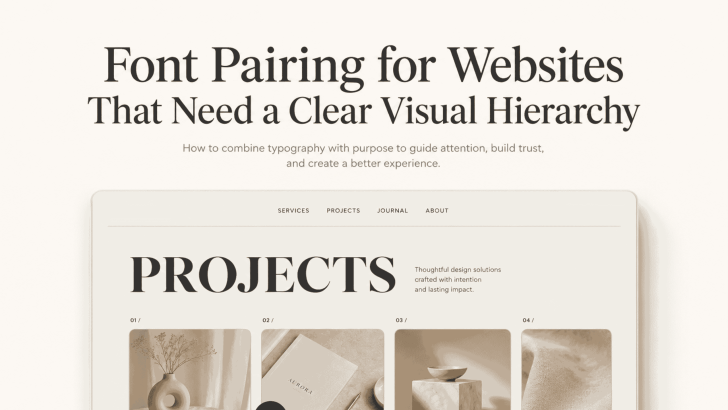
Good font pairing for websites that need a clear visual hierarchy helps visitors understand a page before they read every word. The right combination separates headlines, supporting text, body copy, navigation, and calls to action without making the layout feel crowded.
A website may have strong content and beautiful images, but unclear typography can make it difficult to explore. When several text elements look too similar, visitors may not know where to focus first. A thoughtful font pairing creates contrast, supports readability, and gives the website a more polished personality.
Why Font Pairing Matters for Website Hierarchy
Visual hierarchy controls the order in which users notice information. Usually, they should see the main headline first, followed by the subheading, key benefits, body text, and CTA.
Fonts help create this order through differences in style, size, weight, and spacing. A serif font may bring elegance to a headline, while a clean sans serif keeps paragraphs easy to read. A display font can add personality to selected areas without taking over the entire page. The goal is not to use as many fonts as possible. In most cases, two complementary families are enough. A third font should only be added when it has a clear role.
Recommended Font Pairings for Websites
Different combinations can support different brand personalities and website goals.
1. Serif Headline With Sans Serif Body Text
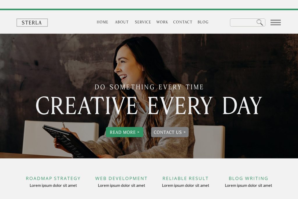
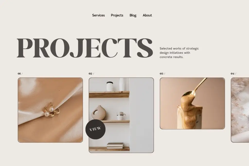
This is one of the most reliable font pairings for websites. The serif adds character and authority to headlines, while the sans serif creates a cleaner reading experience for paragraphs, menus, and buttons.
This combination works well for fashion, hospitality, interior design, editorial, and premium service websites. Use the serif for hero headlines and section titles. Then apply the sans serif to descriptions, navigation, forms, and CTAs.
To strengthen the hierarchy, keep the headline noticeably larger than the supporting text. Generous spacing around serif headings can also create a more refined appearance.
2. Sans Serif Headline With Serif Body Text


This pairing creates a modern first impression while giving longer content a more traditional reading rhythm. A bold sans serif headline can feel direct and contemporary, while a readable serif supports articles, case studies, and brand stories.
It may suit architecture studios, creative agencies, educational websites, and professional portfolios. Choose a serif with clear letterforms and avoid styles that feel too decorative at smaller sizes.
Use the sans serif consistently for headings, labels, and buttons. This helps interface elements feel connected across the website.
3. Display Font With Sans Serif Support
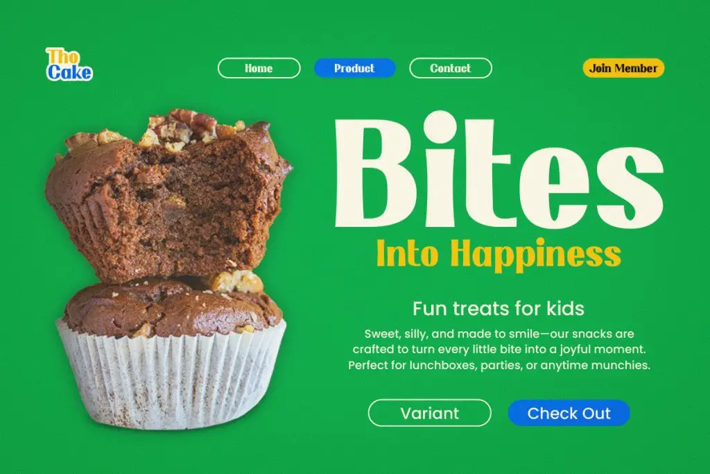

A display font can make a website memorable, especially when the brand needs a stronger visual personality. However, it should be reserved for short headlines, campaign phrases, or featured section titles.
Pair it with a neutral sans serif for body text, navigation, product descriptions, and forms. This combination works well for creative studios, entertainment brands, events, restaurants, lifestyle businesses, and product launches.
Avoid using the display font for long paragraphs. Its details may become distracting or difficult to read on smaller screens.
How to Make Font Pairings Feel Balanced
A successful pairing needs contrast, but the two fonts should still feel connected.
Compare Their Proportions
Check the height, width, and overall visual weight of both typefaces. One font should not feel extremely narrow while the other appears unusually wide unless that contrast is intentional. Type the same words in both fonts and compare them side by side. They should look different enough to create hierarchy but harmonious enough to belong to the same website.
Give Each Font a Clear Role
Decide where each font will appear before building the full layout. For example:
- Display or serif font: hero headlines
- Sans serif font: body copy and navigation
- Medium or bold sans serif: CTA buttons
- Smaller regular style: captions and metadata
Clear roles keep typography consistent and make future pages easier to design.
Test the Pairing on Mobile
A font combination that looks elegant on desktop may become difficult to read on a smartphone. Check headline wrapping, paragraph size, button labels, and spacing across different screens. Reduce large display text carefully rather than shrinking every element by the same amount. The hierarchy should remain visible at every breakpoint.
Create a Website That Is Easy to Follow
Effective font pairing for websites that need a clear visual hierarchy combines personality with practical structure. Serif and sans serif pairings offer dependable contrast, while display fonts can introduce a memorable accent when used with restraint.
Choose one dominant typeface, give the supporting font a clear purpose, and test the system across real website sections. For a deeper look at creating balanced combinations, explore The Art of Typeface Pairing: Creating Harmonious Designs and build a typography system that feels cohesive, readable, and aligned with the brand.
