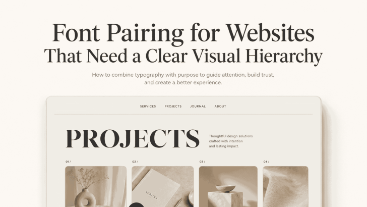
Font Pairing for Websites That Need a Clear Visual Hierarchy

Good font pairing for websites that need a clear visual hierarchy helps visitors understand a page before they read every word. The right combination separates headlines, supporting text, body copy, navigation, and calls to action without making the layout feel crowded. A website may have strong content and beautiful images, but unclear typography can make …
Continue reading →

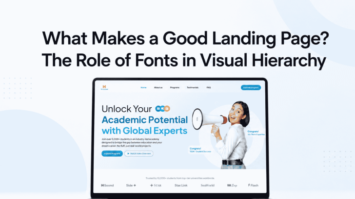
What Makes a Good Landing Page? The Role of Fonts in Visual Hierarchy

Understanding what makes a good landing page starts with knowing how visitors process information. Before reading every sentence, people usually scan the headline, supporting text, visuals, benefits, and call-to-action button. Fonts help organize these elements and show users where to look first. A landing page may include strong images and persuasive copy. However, the message …

Continue reading →

Which Attributes Describe a Good Landing Page Experience?

Understanding which attributes describe a good landing page experience can help you choose a website or app template that looks professional and supports real business goals. A beautiful layout may attract attention, but visitors also need clear information, readable typography, relevant visuals, and an easy path toward the next action. These qualities are especially important …

Continue reading →

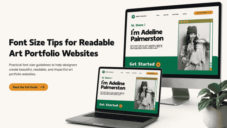
Font Size Tips for Readable Art Portfolio Websites

Applying the right font size tips for readable art portfolio websites can help visitors explore your work without feeling distracted or overwhelmed. While strong images attract attention, readable typography keeps potential clients, art directors, and collaborators engaged with project descriptions, artist statements, and contact information. A font may look beautiful in a design mockup, but …

Continue reading →

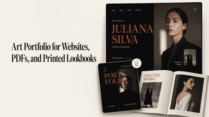
Art Portfolio for Websites, PDFs, and Printed Lookbooks

Creating an art portfolio for websites, PDFs, and printed lookbooks requires more than arranging attractive images on a page. Typography also affects how viewers understand your style, follow project descriptions, and remember your creative identity. A website portfolio needs clear and responsive text. Meanwhile, a PDF must remain readable across different screen sizes, and a …

Continue reading →