How to Choose a Dripping Font for Halloween Party Branding

Choosing the right dripping font for Halloween party branding can instantly shape the mood of your visual identity. A good dripping font can feel spooky, playful, dramatic, or even slightly retro depending on its form and color. The challenge is finding one that looks expressive without making the event name difficult to read. Halloween branding …
Continue reading →

Cute Handwritten Fonts for Kids’ Brands and Educational Products

Choosing cute handwritten fonts for kids can instantly change the mood of a children’s brand or educational product. These fonts often feel more playful, personal, and approachable than rigid geometric typefaces. Used carefully, they can make worksheets, packaging, activity books, and learning materials feel warmer without sacrificing readability. The challenge is balancing personality and function. …

Continue reading →

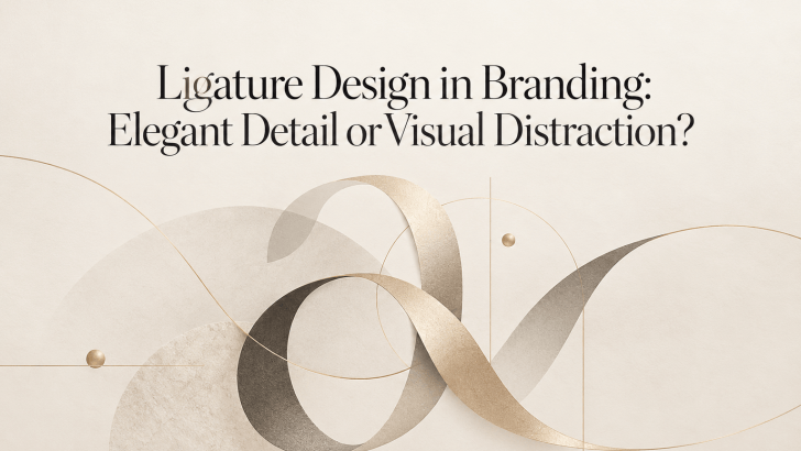
Ligature Design in Branding: Elegant Detail or Visual Distraction?

Ligature design in branding can make a logo or visual identity feel refined, distinctive, and more memorable. By connecting or combining letterforms, ligatures introduce subtle details that can give typography a custom-made appearance. However, when they are overused or applied without purpose, they can also reduce readability and make a brand look unnecessarily complicated. For …

Continue reading →

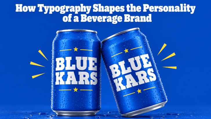
How Typography Shapes the Personality of a Beverage Brand

Understanding how typography shapes the personality of a beverage brand can help designers create packaging, menus, advertisements, and social media content that feel more consistent and memorable. Before customers taste a drink, they often notice the bottle, can, cup, label, or menu first. Typography becomes one of the fastest ways to communicate whether the product …

Continue reading →

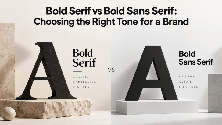
Bold Serif vs Bold Sans Serif: Choosing the Right Tone for a Brand

Comparing bold serif vs bold sans serif fonts can help you choose a typeface that matches the personality of your brand. Both styles can create strong visual impact, but they communicate very different moods. Bold serif fonts often feel more editorial, established, or sophisticated, while bold sans serif fonts usually feel cleaner, more direct, and …

Continue reading →