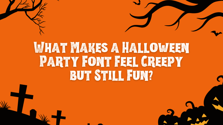
A good Halloween party font needs to create tension without making the design feel too dark or serious. The most effective styles usually combine spooky details with playful shapes, bright colors, or exaggerated proportions. This balance helps posters and event graphics feel seasonal, entertaining, and easy to enjoy.
That combination is especially useful for Halloween parties, school events, costume nights, and social media promotions. The typography can suggest ghosts, monsters, slime, or horror movies while still keeping the overall design approachable. The result feels creepy enough for Halloween, but fun enough for a party atmosphere.
Creepy Fonts Usually Start with Familiar Horror Cues
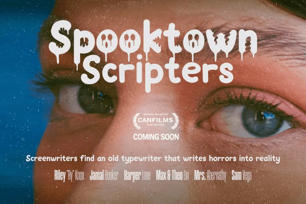
Certain visual details immediately communicate Halloween. Drips, scratches, sharp edges, uneven baselines, and distorted letterforms can make typography feel strange or unsettling. These features work because viewers already associate them with monsters, horror films, haunted places, and supernatural themes.
The trick is not to use all of them at once. A font with one strong horror characteristic often feels more effective than a design packed with several competing effects. Keeping the visual idea focused also improves readability.
Playful Shapes Keep the Mood Light
A font can feel spooky without becoming aggressive. Rounded corners, chunky proportions, oversized letters, and cartoon-like forms make horror elements feel friendlier. These shapes are especially useful for party posters aimed at younger audiences or casual events.
A dripping letter does not always need to look like blood. When it appears in bright green or purple, the same shape can suggest slime, monsters, or playful fantasy instead. This simple change can shift the mood from frightening to entertaining.
Exaggeration Makes Horror Feel More Fun
Halloween design often works well when the visual language feels slightly theatrical. Oversized drips, unusually wide letters, crooked shapes, or dramatic curves can make typography feel intentionally exaggerated. This creates a sense of fun because the design does not take itself too seriously.
The best results still maintain a recognizable letter structure. If the distortion becomes too extreme, the headline can become difficult to understand. Designers should exaggerate the personality without losing the word itself.
Color Changes How a Halloween Font Feels
Typography does not create mood by shape alone. Color plays a major role in deciding whether a font feels creepy, playful, mysterious, or intense. Dark red and black usually push the design toward horror, while green, orange, purple, and yellow feel more energetic.
For party graphics, bright contrasts can make spooky typography feel more inviting. A bold green font on a purple background, for example, can still feel Halloween-inspired without becoming visually heavy. The color system helps control the emotional intensity of the font.
Dripping Details Can Feel Scary or Silly
Drip effects are one of the most recognizable features in Halloween typography. Their meaning changes depending on how they are drawn. Thin red drips may feel disturbing, while thick rounded drips can look more like slime or melted candy.
This flexibility makes dripping fonts useful across many types of Halloween events. Designers can adjust the shape, color, and texture to suit the audience. The same basic visual idea can move from horror movie style to playful party design.
Rounded Letterforms Feel More Approachable
Sharp corners tend to create tension, while rounded forms feel softer and more welcoming. A Halloween font with rounded shapes can still include spooky details without looking threatening. This makes it a strong choice for costume parties, family events, or children’s Halloween graphics.
Rounded typography also pairs well with cartoon illustrations. Ghosts, pumpkins, monsters, and candy graphics often share the same soft visual language. When the font and illustration style match, the whole design feels more cohesive.
Texture Adds Personality
A completely clean font can sometimes feel too polished for Halloween. Rough textures, grain, scratches, or slightly uneven edges add character and make the typography feel less mechanical. These details can suggest old horror posters, handmade signs, or retro movie graphics.
Texture should remain subtle enough to preserve readability. If the distressed effect removes too much of the letter shape, the font becomes harder to scan. A little imperfection is often more convincing than excessive damage.
Typography Should Match the Event Tone
Not every Halloween party has the same audience. A late-night costume party may support darker typography, while a school celebration needs something more playful and accessible. The font should reflect the energy of the event rather than using horror styling automatically.
This is where visual context matters. The headline, illustrations, colors, and supporting copy should all point in the same direction. If you want to explore broader font options for different Halloween event styles, read Fonts for Halloween Party Posters for more practical inspiration.
Supporting Fonts Should Stay Simple
An expressive Halloween font works best when it has room to stand out. Event dates, venue details, ticket information, and supporting copy should usually use a cleaner typeface. This creates contrast and makes the poster easier to scan.
A simple sans serif often works well for this purpose. It keeps the practical information readable while allowing the Halloween display font to carry the personality. This pairing also prevents the layout from feeling visually crowded.
One Spooky Font Is Usually Enough
Using several decorative fonts in one poster can quickly create confusion. Each typeface introduces its own visual language, so too many styles compete for attention. One expressive Halloween font paired with one neutral supporting font is usually more effective.
This also creates stronger hierarchy. Viewers immediately understand which text is the headline and which information is secondary. The design feels more deliberate and polished.
Readability Still Matters
A font can be fun, creepy, and decorative, but it still needs to communicate clearly. Party posters are often viewed quickly on phones, social feeds, or printed displays. If the title takes too long to understand, the typography is working against the design.
Test the headline at different sizes. Zoom out, view it on mobile, and check whether the letters remain recognizable. A successful Halloween font keeps its personality even when the design becomes smaller.
The Best Halloween Fonts Balance Two Moods
The most memorable party typography often sits between two emotions. It feels spooky enough to communicate Halloween but playful enough to suggest celebration. That tension creates a more interesting design than typography that is purely scary or purely cute.
Designers can achieve this balance through shape, color, texture, and scale. A creepy font can become more fun with brighter colors, while a playful font can feel more seasonal through dripping details or rough textures. The balance depends on the audience and the event.
Final Thoughts
A strong Halloween party font feels creepy and fun because it combines recognizable horror cues with approachable design choices. Drips, rough edges, and distorted shapes establish the Halloween mood, while rounded forms, bright colors, and exaggerated proportions keep the atmosphere playful. This combination makes the typography feel seasonal without becoming too intense.
The key is restraint. Let one or two spooky details create the mood, then keep the rest of the design clear and readable. When the balance is right, the font does more than decorate the poster—it helps define the personality of the entire Halloween party.
