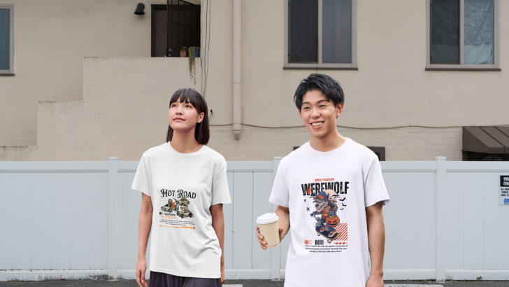
Halloween 2026 T-Shirt Styles: Fantasy, Retro, or Maximalist?

Exploring Halloween 2026 T-shirt styles means looking beyond the usual pumpkins, bats, and orange-and-black graphics. This season, three directions feel especially useful for designers: fantasy, retro, and maximalist. Each one creates a different mood, and typography often determines whether the final design feels playful, nostalgic, dramatic, or visually intense. The strongest T-shirt graphics usually combine …
Continue reading →

Ligature Design in Branding: Elegant Detail or Visual Distraction?

Ligature design in branding can make a logo or visual identity feel refined, distinctive, and more memorable. By connecting or combining letterforms, ligatures introduce subtle details that can give typography a custom-made appearance. However, when they are overused or applied without purpose, they can also reduce readability and make a brand look unnecessarily complicated. For …

Continue reading →

How to Combine Fonts Without Ruining Your Design

Learning how to combine fonts can completely change the way your design feels. The right font pairing can create hierarchy, improve readability, and give a brand a stronger personality. The wrong combination, however, can make even a polished layout feel confusing, inconsistent, or visually crowded. Font pairing does not have to depend on instinct alone. …

Continue reading →

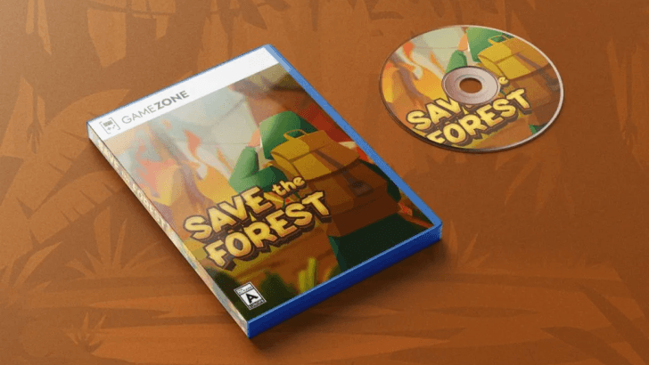
Retro Game Fonts: How to Create Nostalgic Design Styles

Retro design has made a strong comeback in recent years, especially in graphic design. One of the most popular elements in this trend is retro game fonts. These fonts bring back the nostalgic feeling of classic video games from the 80s, 90s, and early 2000s. Understanding how to use retro game fonts correctly can help …

Continue reading →