Choosing modern fonts similar to Poppins for modern branding can help designers keep a clean, geometric, and contemporary look while creating a more distinctive visual identity. Poppins is widely recognized for its modern sans-serif structure, balanced proportions, and versatility across digital and print projects. However, using a similar font can add personality while preserving the same polished, approachable feel.
This approach works well for websites, logos, packaging, social media graphics, presentations, and brand systems that need clarity without looking too plain. If you like Poppins’ overall character but want something less familiar, several alternatives can offer a similar modern direction.
What Is Poppins Font?
Poppins is a geometric sans-serif typeface known for its clean construction and rounded forms. Its balanced letter shapes make it suitable for both headings and body text, which is one reason it has become popular across websites, apps, branding, and digital interfaces. The font feels modern without becoming too technical. Its simple structure can communicate professionalism, friendliness, and accessibility at the same time.
Poppins also offers multiple weights, which makes it easier to build a visual hierarchy. A bold weight can support headlines, while regular and medium styles work well for navigation, descriptions, and supporting information.
Why Choose Fonts Similar to Poppins?
Poppins is highly versatile, but a widely used font can sometimes make a brand feel less distinctive. Choosing a similar typeface allows you to keep the qualities you like while introducing a different personality.
Keep a Modern and Clean Look
Fonts similar to Poppins often use geometric shapes, balanced spacing, and minimal decoration. These characteristics work well for modern brands that want to appear organized and approachable. This style can suit technology companies, lifestyle brands, fashion businesses, creative studios, and e-commerce platforms.
Create a More Unique Brand Identity
A familiar typeface can make a layout feel polished, but it may not always help a brand stand out. A less common alternative can create stronger recognition without changing the entire visual direction. The key is choosing a font with enough similarity to maintain the same mood, but enough difference to feel intentional.
Maintain Digital Readability
Many Poppins alternatives also perform well on screens. Clean letterforms and balanced proportions can help body text, navigation, and buttons remain easy to read.
For more ideas on choosing clear digital typography, explore Best Sans Serif Fonts for Better Readability on Screens. It can help you evaluate how different sans serif styles perform across websites and other screen-based layouts.
Best Modern Fonts Similar to Poppins for Branding
1. Fougie

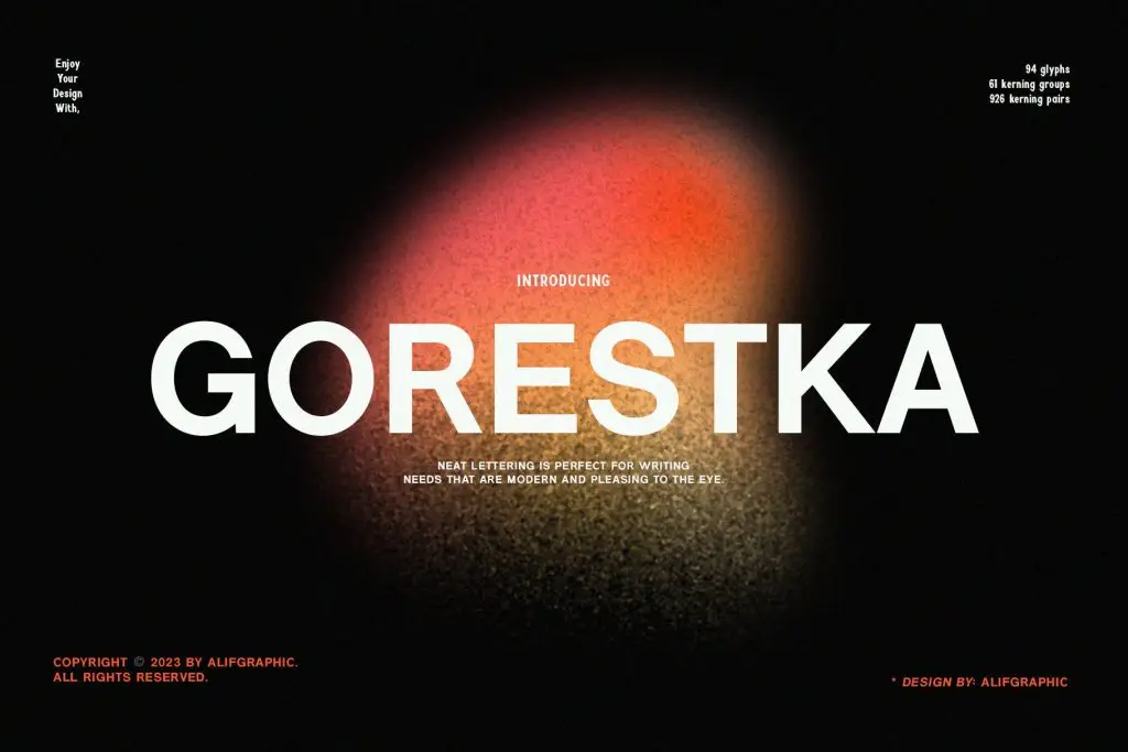
2. Gorestka
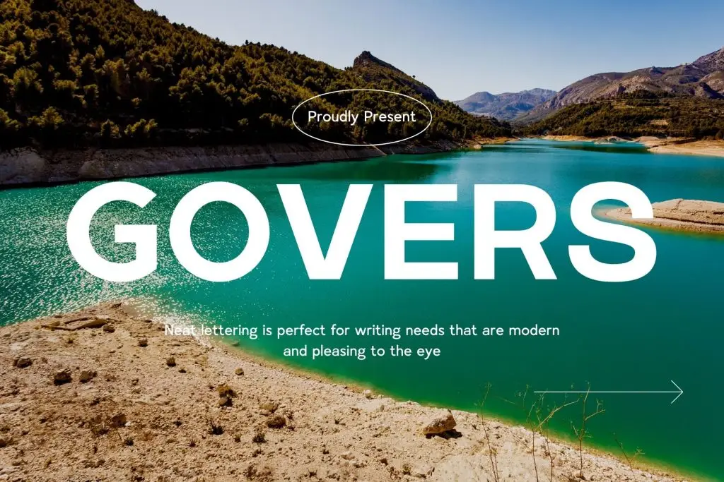
3. Govers
4. Vaneska

5. Signer

How to Choose the Right Poppins Alternative
A similar appearance does not automatically mean the font is right for your project. Compare each option based on personality, readability, and flexibility.
Match the Font to the Brand Personality
Think about how you want the audience to describe the brand. Words such as modern, premium, friendly, bold, or minimal can help guide the decision.
Test the Font in Real Applications
Do not choose a font based only on a specimen image. Type the real brand name, product categories, website navigation, and campaign headlines. Check how the font performs on desktop and mobile screens. Also test small applications such as packaging labels and social media profile graphics. A font may look beautiful in a large headline but lose clarity when reduced.
Pair Poppins Alternatives With Serif Fonts
Modern sans serif fonts often become more interesting when paired with a contrasting serif. This combination can create stronger hierarchy and give the brand more personality.
If you want to develop this approach further, read How to Pair Modern Sans Serif Fonts with Serif Typefaces for practical ways to balance contrast, weight, and personality.
Build a Consistent Modern Brand System
Once you choose a Poppins alternative, define how it will be used across the brand. Keep the same font roles on websites, packaging, social media, presentations, and advertisements.
For example:
Primary font: Logo and campaign headlines
Supporting font: Body text and product descriptions
Bold style: CTA buttons and important details
Regular style: Navigation and supporting information
A consistent system helps customers recognize the brand more easily and makes future designs faster to create.
Choose Similarity Without Losing Personality
Modern fonts similar to Poppins for modern branding can give designers a familiar clean structure without making every identity look the same. Fougie offers a more creative and editorial direction, Vaneska adds sophistication, while Signer provides a professional and functional modern style.
The best alternative should match the brand personality, remain readable, and work across real applications. Test each font before committing to the final visual system.

2 Comments