Spooky Fonts for Halloween Snack Packaging

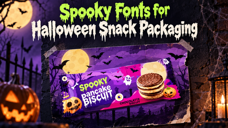
Choosing the right spooky fonts for Halloween snack packaging can make a seasonal product feel more exciting before the package is even opened. Typography helps communicate whether a snack feels creepy, playful, mysterious, or family-friendly. For Halloween products, that first visual impression matters because shoppers often make quick decisions based on color, illustration, and type. …
Continue reading →

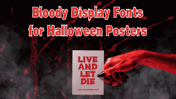
Bloody Display Fonts for Halloween Posters

Choosing the right bloody display fonts for Halloween posters can instantly make a design feel darker, more dramatic, and more immersive. Unlike ordinary display typefaces, bloody fonts often use dripping edges, distressed textures, irregular shapes, and exaggerated strokes to create a horror-inspired atmosphere. These visual details make them especially useful for Halloween promotions, haunted house …

Continue reading →

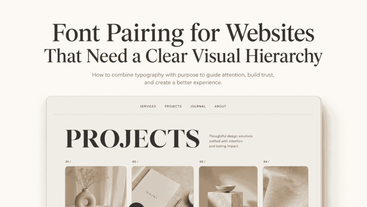
Font Pairing for Websites That Need a Clear Visual Hierarchy

Good font pairing for websites that need a clear visual hierarchy helps visitors understand a page before they read every word. The right combination separates headlines, supporting text, body copy, navigation, and calls to action without making the layout feel crowded. A website may have strong content and beautiful images, but unclear typography can make …

Continue reading →

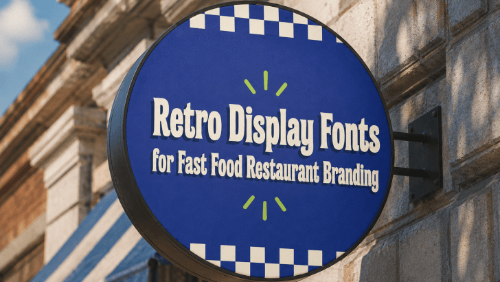
Retro Display Fonts for Fast Food Restaurant Branding

Using retro display fonts for fast food restaurant branding can help designers solve a key visual challenge: making food brands feel fun, memorable, and instantly recognizable in a crowded marketplace. Fast food restaurants often compete on taste, speed, price, and personality. However, without strong typography, even a colorful visual identity can feel forgettable. Retro display …

Continue reading →

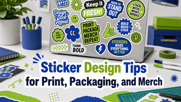
Sticker Design Tips for Print, Packaging, and Merch

Understanding sticker design tips for print packaging and merch is essential for designers, small business owners, and creative brands that want stickers to look professional, readable, and marketable. Many sticker designs look attractive on screen, but they often fail when printed, placed on packaging, or used as merchandise because the typography is too small, the …

Continue reading →