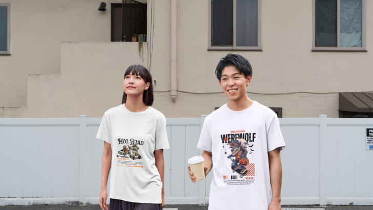
Exploring Halloween 2026 T-shirt styles means looking beyond the usual pumpkins, bats, and orange-and-black graphics. This season, three directions feel especially useful for designers: fantasy, retro, and maximalist. Each one creates a different mood, and typography often determines whether the final design feels playful, nostalgic, dramatic, or visually intense.
The strongest T-shirt graphics usually combine illustration and type instead of treating them as separate elements. A headline can frame the artwork, strengthen the theme, or become part of the illustration itself. That is why font choice matters just as much as the central Halloween image.
Fantasy Halloween T-Shirts Feel Story-Driven
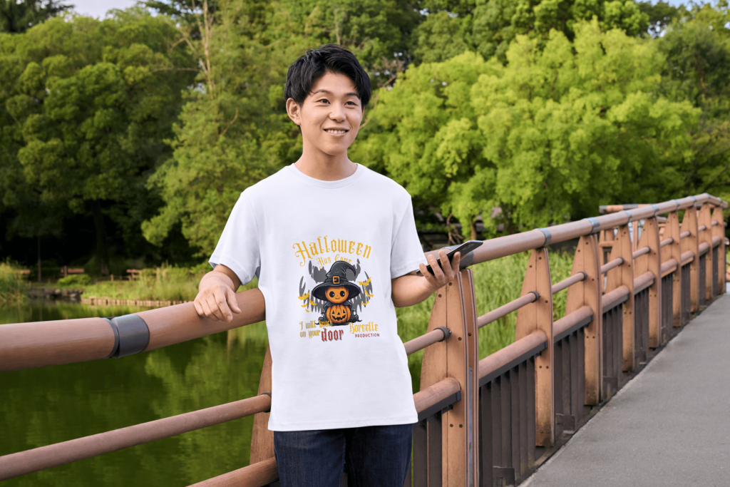
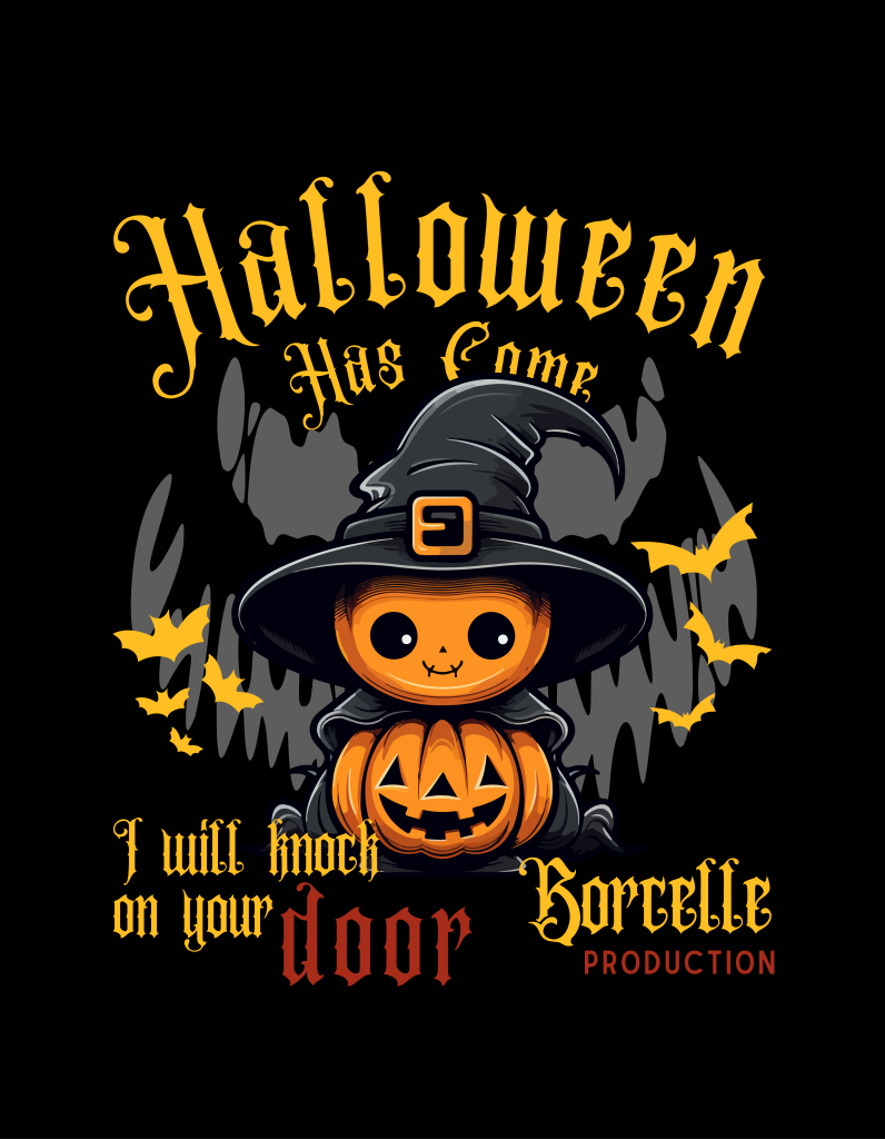
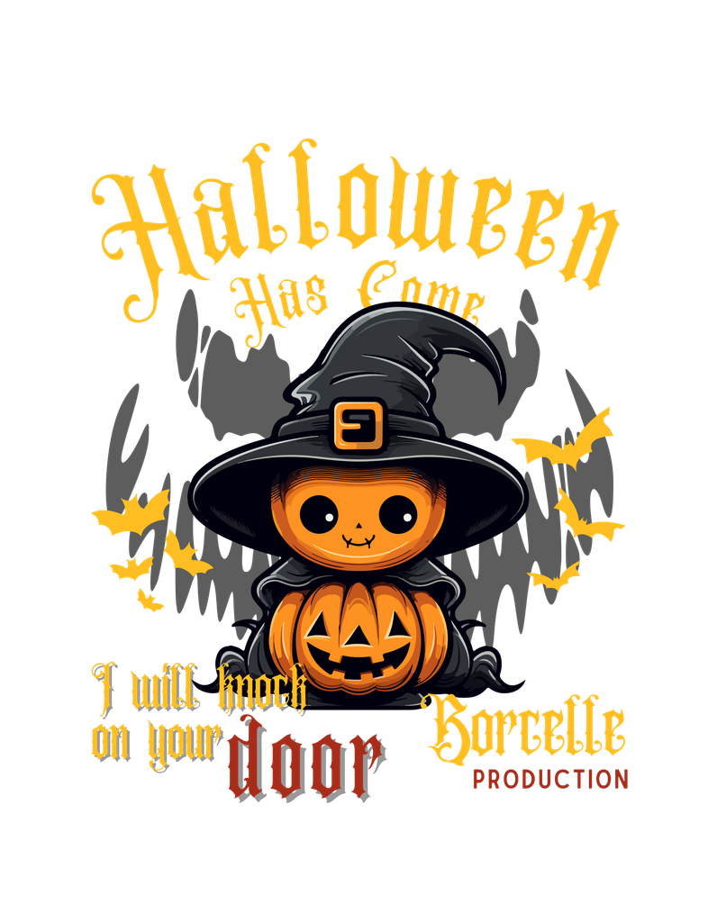
Fantasy Halloween designs focus on characters, storytelling, and atmosphere. Witches, ghosts, enchanted pumpkins, creatures, and magical settings often become the center of the composition. The goal is less about shock and more about creating a small world that feels imaginative.
Typography in this style often feels decorative or storybook-inspired. Serif fonts, gothic details, curved lettering, and ornamental type can work well because they support the sense of fantasy. The key is making sure the font feels expressive without becoming difficult to read.
Fantasy graphics can also work well for softer Halloween audiences. Cute creatures and whimsical lettering make the design feel approachable while still maintaining seasonal character. This is especially useful for casual merchandise or designs meant to feel collectible rather than aggressive.
Retro Halloween T-Shirts Bring Nostalgia
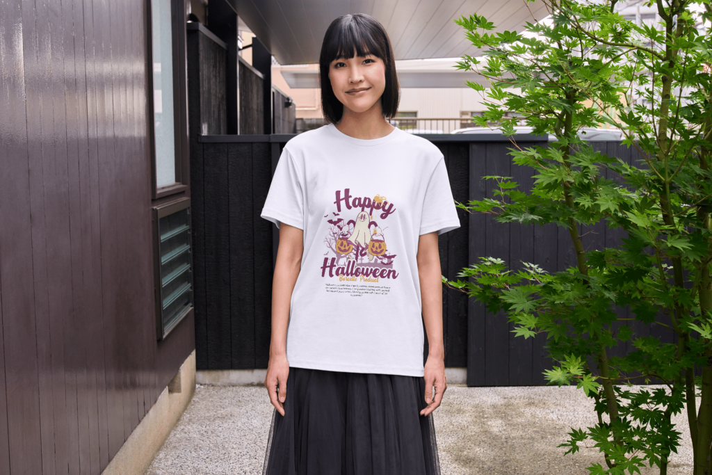
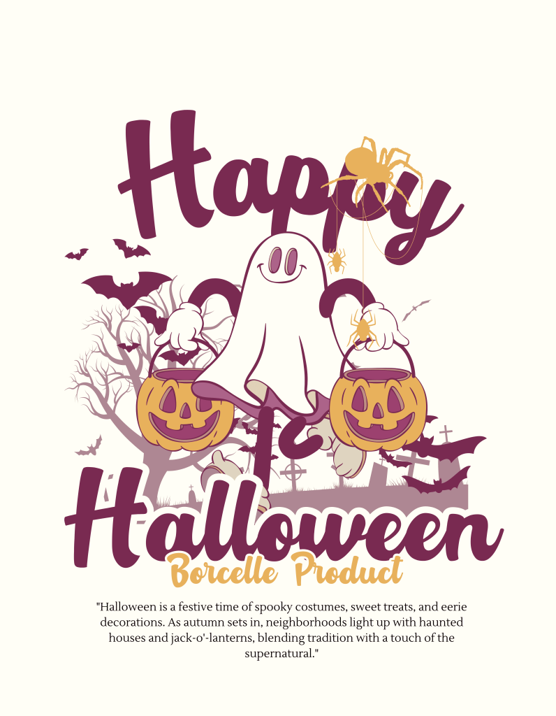
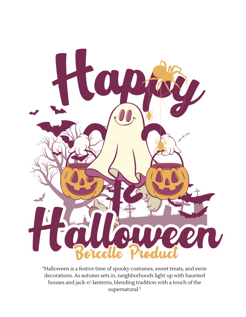
Retro Halloween graphics create a very different kind of appeal. Rather than feeling polished or modern, they can reference vintage posters, old merchandise, pulp graphics, or classic seasonal illustrations. The result often feels nostalgic and familiar.
Distressed textures, faded colors, blocky serif fonts, and retro display type all work well here. Orange, cream, black, burgundy, and muted brown can help reinforce the vintage direction. A slightly worn visual treatment also makes the design feel more authentic.
Retro designs are especially effective when the typography has enough weight to balance the illustration. Thick letterforms can hold their own against detailed artwork, while smaller supporting type can create the feel of an old poster or merchandise graphic.
Maximalist Halloween T-Shirts Use More Visual Energy
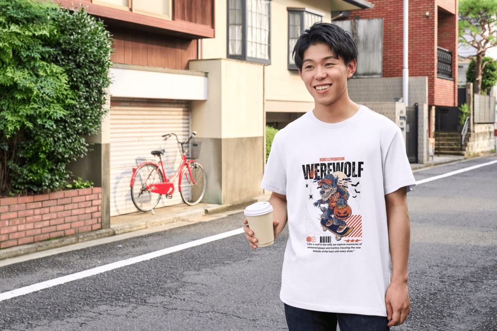
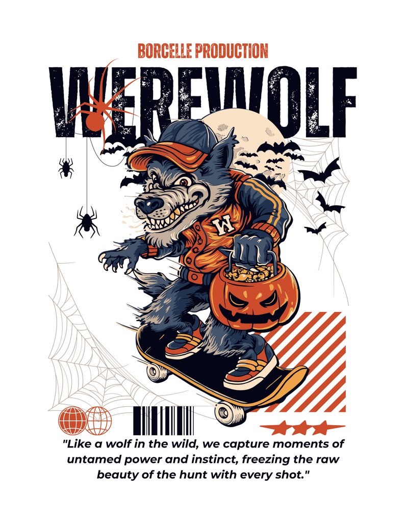
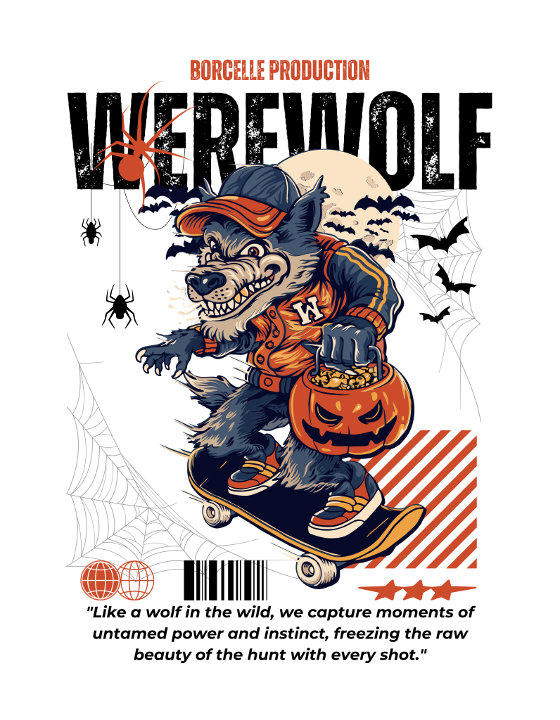
Maximalist T-shirt design takes the opposite approach from minimal seasonal graphics. Instead of relying on one central icon, the composition may combine large typography, detailed illustration, secondary text, symbols, textures, and decorative elements. The result feels dense, energetic, and designed to attract attention.
This approach works especially well for horror-themed graphics, streetwear-inspired merchandise, and designs with strong character illustrations. Large central artwork can be surrounded by small details without losing hierarchy when the composition is carefully structured.
The challenge is knowing when to stop. Maximalism does not mean filling every empty area. Strong hierarchy is still necessary so the viewer understands where to look first.
Horror Typography Can Push the Design Further
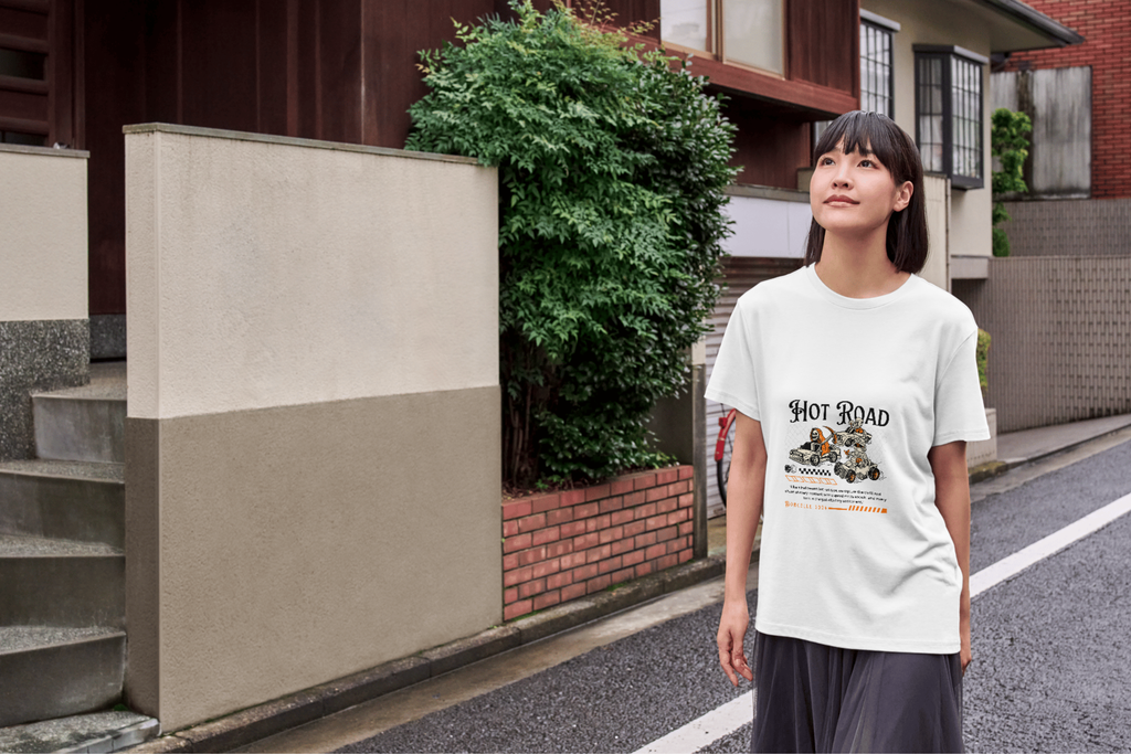
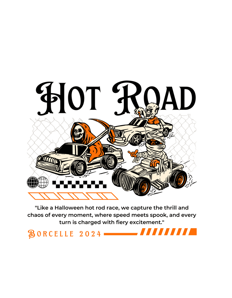
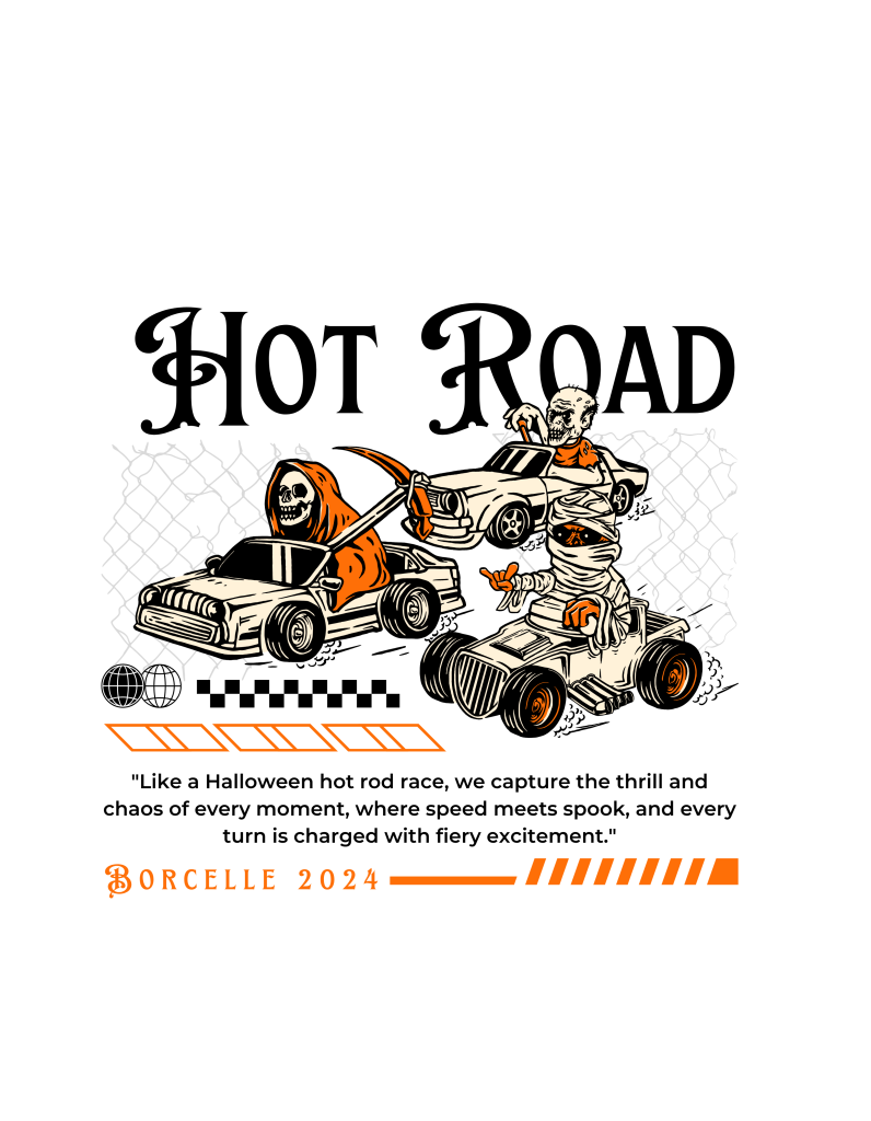
Typography becomes especially powerful in more intense Halloween T-shirt designs. Distressed serif fonts, blackletter-inspired type, bold condensed lettering, and irregular display fonts can make the graphic feel darker and more dramatic. These styles work well with skeletons, monsters, motorcycles, or other aggressive imagery.
The same typography principles also apply to posters and event graphics. If you want to explore Halloween display type in another format, read Fonts for Halloween Party Posters for a broader look at spooky, playful, gothic, and horror-inspired font directions.
Playful Halloween Graphics Still Have a Place
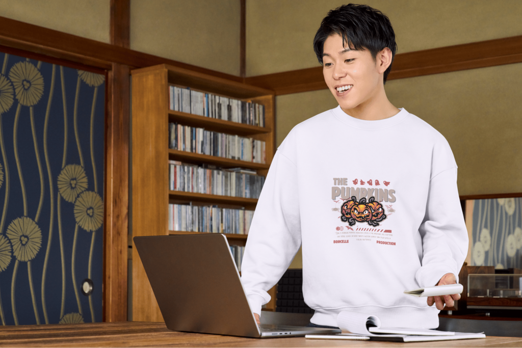
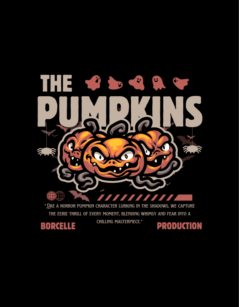
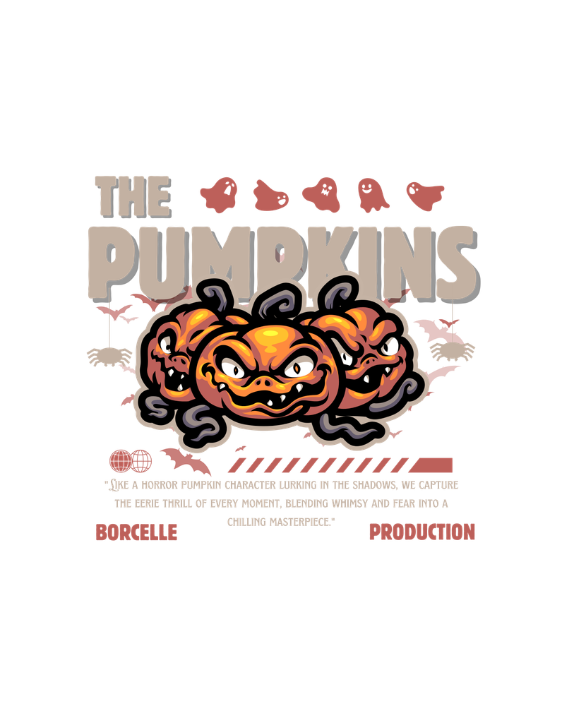
Not every Halloween T-shirt needs to feel dark. Friendly ghosts, soft script lettering, pastel tones, and simple illustrations can create a lighter seasonal style. This works well for audiences who prefer Halloween to feel charming rather than frightening.
Typography in this direction can be softer and more expressive. Handwritten fonts, rounded lettering, or casual scripts can support the playful mood. The important thing is keeping the message readable and visually balanced with the illustration.
Which Halloween 2026 T-Shirt Style Should You Choose?
Fantasy works best when the concept depends on characters and storytelling. Retro is a strong option when the design needs nostalgia and vintage personality. Maximalist styles work well when the goal is visual intensity and a more expressive streetwear feel.
Designers can also combine these directions. A fantasy character can sit inside a retro layout, or a maximalist composition can use vintage typography. The strongest results usually come from choosing one primary style and letting the others play supporting roles.
Final Thoughts
The most interesting Halloween 2026 T-shirt styles are not defined by one fixed aesthetic. Fantasy, retro, playful horror, and maximalist graphics all offer different ways to make seasonal merchandise feel distinctive. Typography helps determine which direction feels strongest.
Start with the mood you want the shirt to communicate. Then choose the illustration style, font, color palette, and level of detail around that idea. When those elements support one another, a Halloween T-shirt can feel much more intentional than a design built from seasonal symbols alone.
