Choosing the right dripping font for Halloween party branding can instantly shape the mood of your visual identity. A good dripping font can feel spooky, playful, dramatic, or even slightly retro depending on its form and color. The challenge is finding one that looks expressive without making the event name difficult to read.
Halloween branding needs to work across more than one layout. The same typeface may appear on posters, social media graphics, tickets, invitations, banners, and merchandise. That means the font should be visually distinctive but also flexible enough to stay clear across different sizes.
Start with the Mood of the Event
Before choosing a font, define the personality of the party. A late-night horror event may need sharp, blood-inspired lettering, while a family Halloween party may work better with rounded slime-style drips. The visual direction should come from the audience and atmosphere, not from the font trend alone.
This step prevents a common mistake: choosing a dramatic typeface simply because it looks “Halloween.” The font should support the event concept instead of overpowering it. A playful monster party and a gothic costume night need very different typographic personalities.
Look for Clear Letter Shapes
A dripping font can include unusual details, but the core letterforms still need to remain recognizable. Excessive distortion may look impressive in a font preview yet become difficult to read once placed on a real poster. This is especially important for event names and headlines.
Test the font using the actual party name before making a decision. Look closely at letters with similar shapes and check whether spacing becomes too tight. If the word is difficult to understand at first glance, the design is probably too decorative.
Keep the Drip Effect Controlled
Drips work best when they support the shape of the letters. Too many long extensions can make the font feel messy and reduce visual balance. A few intentional drips usually create a stronger effect than covering every character with decoration.
Controlled details also make the font easier to use across different formats. A logo or headline needs to work on both large banners and smaller social posts. Simpler dripping shapes tend to scale more successfully.
Consider Color as Part of the Typeface
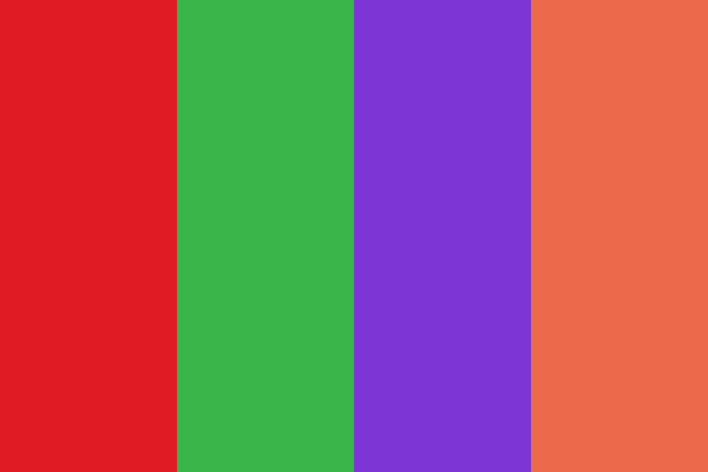
The same font can feel completely different depending on its color. Red creates a darker horror mood, while green feels more like slime, monsters, or playful zombie graphics. Purple and orange can make the overall branding feel more festive and seasonal.
Designers should test the font against the actual background colors. Strong contrast is especially important because decorative edges can already reduce clarity. The more detailed the typeface, the cleaner the surrounding color system should be.
Pair It with a Simple Supporting Font
A dripping font should rarely handle every piece of information. Use it for the event title, short tagline, or major promotional message, then switch to a clean sans serif for details. This creates hierarchy and keeps the branding easy to scan.
Dates, locations, ticket prices, and call-to-action text should remain functional. A simple supporting typeface gives the headline enough space to become the main visual element. This balance also makes the overall system feel more professional.
Think Beyond the Main Poster
Strong Halloween branding should remain consistent across multiple touchpoints. Test the dripping font on Instagram posts, stories, invitations, tickets, and event signage. A font that only works in one large format may create problems later.
Try both short and long text combinations. Some dripping fonts look excellent in one-word headlines but become visually crowded in longer phrases. Testing early helps reveal those limits.
Understand Why Dripping Typography Works
Dripping typography is effective because it suggests movement, instability, slime, blood, or melting surfaces. These visual associations quickly communicate Halloween without requiring much explanation. That is why the style remains popular in seasonal design.
For a deeper look at the visual psychology behind this effect, read Why Slime and Drip Work So Well in a Halloween Poster Design. It explains how shape, movement, color, and irregularity help build a stronger Halloween atmosphere.
Final Thoughts
Choosing a dripping font for Halloween party branding is about balancing mood, readability, and flexibility. The strongest options have enough personality to establish the theme while keeping the event name clear. Color, spacing, scale, and supporting typography all influence how successful the final result feels.
Instead of choosing the most extreme font available, look for one that fits the audience and works across multiple formats. When the typeface feels intentional, it can become one of the most memorable elements in the entire Halloween identity.

One Comment