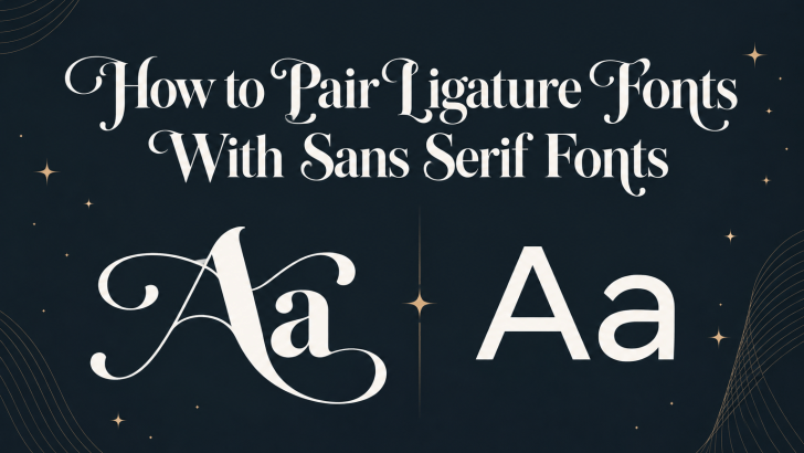
Learning how to pair ligature fonts with sans serif fonts can help you create typography that feels expressive without becoming overwhelming. Ligature fonts often bring personality, elegance, and decorative detail, while sans serif fonts provide clarity, structure, and readability. When both styles work together, the result can feel balanced, modern, and visually distinctive.
The challenge is knowing how much contrast is enough. A ligature font may already have strong character, so pairing it with another expressive typeface can make the design feel crowded. A clean sans serif usually works better because it gives the decorative font room to stand out.
Whether you are designing a logo, packaging, social media graphics, a website, or an editorial layout, a thoughtful pairing can make your typography feel intentional rather than accidental.
Why Ligature Fonts and Sans Serif Fonts Work Together
Ligature fonts and sans serif fonts often create a natural contrast. Ligature typefaces can include connected letters, unusual shapes, or decorative details. Sans serif fonts usually have simpler structures and cleaner letterforms. This difference allows each font to serve a separate visual role.
The ligature font can attract attention, while the sans serif keeps supporting information easy to read. This combination works especially well in designs where personality and functionality need to exist together.
For example, a beauty brand may use an elegant ligature font for the logo and a minimal sans serif for product descriptions. A fashion editorial could use a decorative ligature font for headlines and a neutral sans serif for body copy.
If you want to explore how ligatures influence brand identity before building a pairing, read Ligature Design in Branding: Elegant Detail or Visual Distraction? for a deeper look at when decorative letter connections strengthen or weaken a visual identity.
Start With One Dominant Typeface
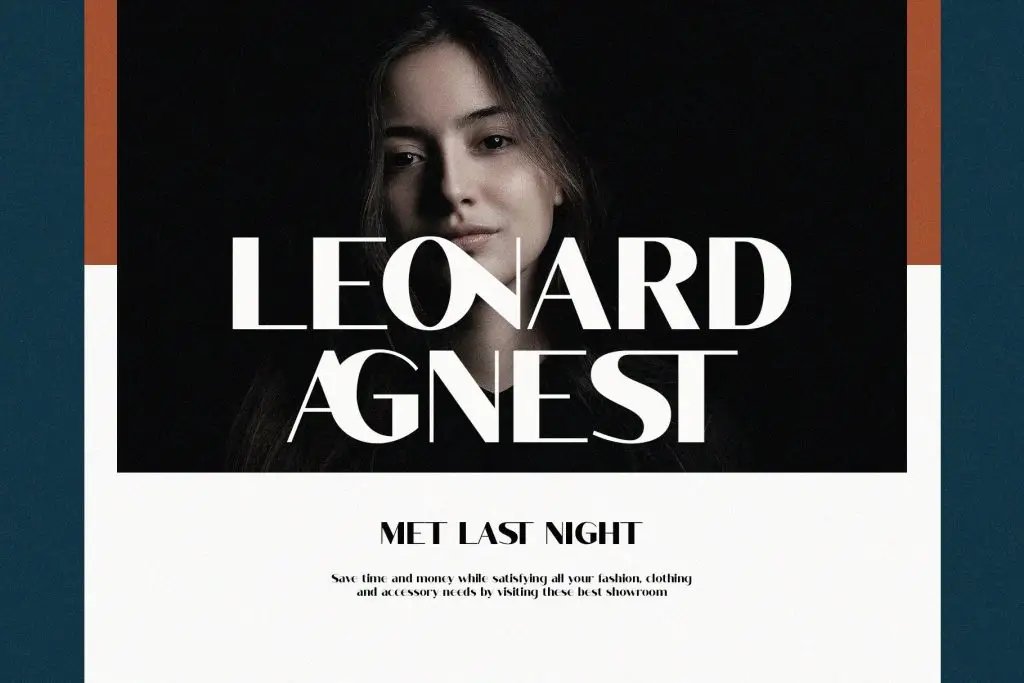
A successful pairing begins with hierarchy. Choose which font should become the visual focus before selecting the second typeface. In most cases, the ligature font works best as the dominant typeface because it already contains expressive features.
Use it for:
- logos
- headlines
- short titles
- product names
- campaign statements
Then use the sans serif for supporting information such as paragraphs, captions, navigation, labels, or calls to action. This separation helps prevent the two fonts from competing.
Let the Sans Serif Support the Ligature Font
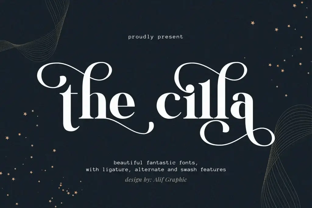
The sans serif does not need to be boring, but it should usually be quieter. Look for a sans serif with clean proportions and enough flexibility to work at different sizes. Neutral or geometric sans serif fonts often pair well with decorative typefaces because they provide structure without stealing attention.
If you need a stronger understanding of how different sans serif styles behave in modern layouts, Sans Serif Fonts: Complete Guide for Modern Designers can help you compare their characteristics and choose one that fits your project.
Match the Mood, Not the Details
Contrast is important, but the two fonts should still belong to the same visual world. A romantic ligature font may pair well with a soft, refined sans serif. A sharp experimental ligature typeface may work better with a geometric sans serif. A vintage-inspired ligature font may need a sans serif with slightly warmer proportions rather than an ultra-futuristic style.
Focus on the overall mood instead of trying to match every letterform. Ask yourself what the design should communicate. Should it feel luxurious, modern, playful, editorial, artistic, or minimal? Once the mood is clear, it becomes easier to choose two fonts that feel different but still connected.
Pay Attention to Contrast
Good font pairing needs visible contrast. If the ligature font and sans serif look too similar, the pairing can feel weak. If they are extremely different in every way, the design may feel disconnected.
Try creating contrast through a few specific characteristics. You might combine a high-contrast ligature serif with a clean sans serif, or an expressive script-inspired ligature font with a structured geometric sans. You can also use differences in weight and scale.
For example, use a large decorative headline with a smaller regular-weight sans serif underneath. This creates hierarchy without adding more fonts.
Avoid Too Much Decorative Detail
One of the easiest mistakes is adding too many expressive elements. If your ligature font already includes complex letter connections, swashes, or alternate characters, keep the second font simple.
You should also be selective with discretionary ligatures. Just because a font includes many alternatives does not mean you need to use all of them. Choose the details that strengthen the message and leave the rest unused. A few distinctive ligatures often look more sophisticated than a design filled with decorative connections.
Compare Proportions and Letter Shapes
Two fonts can have different styles and still feel balanced when their proportions work well together. Look at x-height, letter width, spacing, and overall rhythm.
A ligature font with very tall, narrow letters may feel awkward beside an extremely wide sans serif. Likewise, a delicate display font can be visually overwhelmed by a very heavy supporting typeface.
Test both fonts together using real content instead of relying only on specimen images. Place them in the same layout and compare how they behave at different sizes.
Test the Pairing in Real Applications
A font combination that looks attractive in a mood board may not always work in a finished design. Test your pairing in the places where it will actually appear.
For branding, try the fonts in a logo, business card, website header, packaging label, and social media post. For editorial design, test headlines, subheadings, pull quotes, and body copy. Pay close attention to smaller sizes.
Decorative ligature fonts can lose clarity when reduced. In those situations, the sans serif should handle most functional text. This approach keeps the design expressive while protecting readability.
Keep the Typography System Consistent
Once you find a combination that works, create simple rules for using it. Decide where the ligature font appears and where the sans serif takes over. Define font sizes, weights, spacing, and alignment.
For example, you might use the ligature font only for primary headlines and use the sans serif for everything else. Consistency makes the pairing feel intentional across different touchpoints. It also prevents future layouts from becoming visually cluttered.
Final Thoughts
Knowing how to pair ligature fonts with sans serif fonts is mostly about balance. Let the ligature font bring personality and distinction, while the sans serif provides clarity and structure.
Start with a clear hierarchy, match the overall mood, create enough contrast, and avoid unnecessary decorative details. Most importantly, test the fonts with real content before committing to the combination.
When both typefaces have a clear role, the pairing can feel expressive without losing readability. That balance makes ligature and sans serif combinations especially useful for branding, packaging, editorial design, and other projects that need both personality and function.
