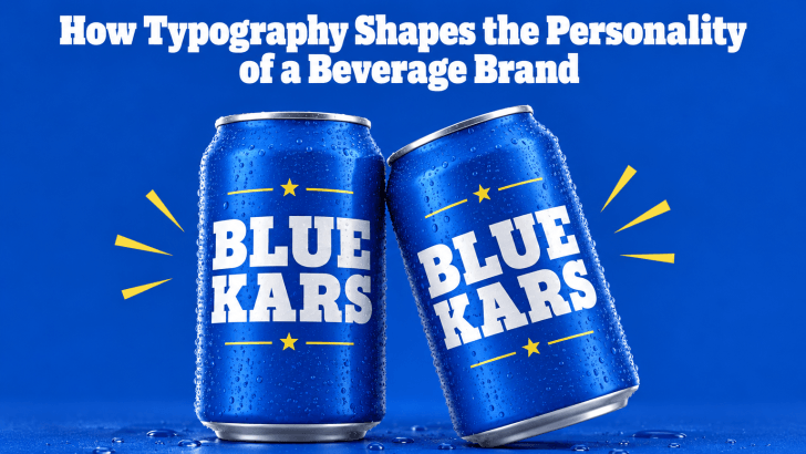
How Typography Shapes the Personality of a Beverage Brand

Understanding how typography shapes the personality of a beverage brand can help designers create packaging, menus, advertisements, and social media content that feel more consistent and memorable. Before customers taste a drink, they often notice the bottle, can, cup, label, or menu first. Typography becomes one of the fastest ways to communicate whether the product …
Continue reading →

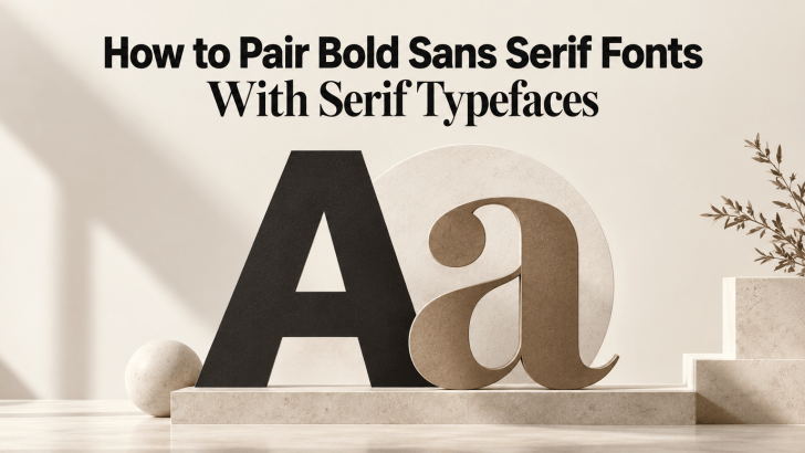
How to Pair Bold Sans Serif Fonts With Serif Typefaces

Learning how to pair bold sans serif fonts with serif typefaces can help designers create stronger contrast without making a layout feel disconnected. Bold sans serif fonts bring clarity, confidence, and visual impact, while serif typefaces add refinement, texture, and personality. When both styles are balanced well, the result can feel modern, polished, and easier …

Continue reading →

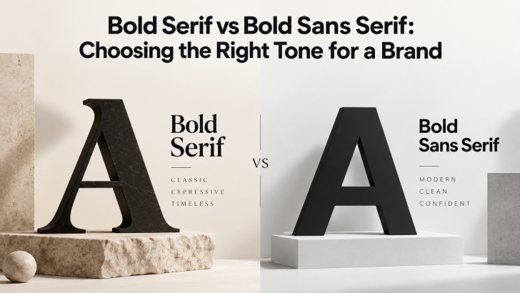
Bold Serif vs Bold Sans Serif: Choosing the Right Tone for a Brand

Comparing bold serif vs bold sans serif fonts can help you choose a typeface that matches the personality of your brand. Both styles can create strong visual impact, but they communicate very different moods. Bold serif fonts often feel more editorial, established, or sophisticated, while bold sans serif fonts usually feel cleaner, more direct, and …

Continue reading →

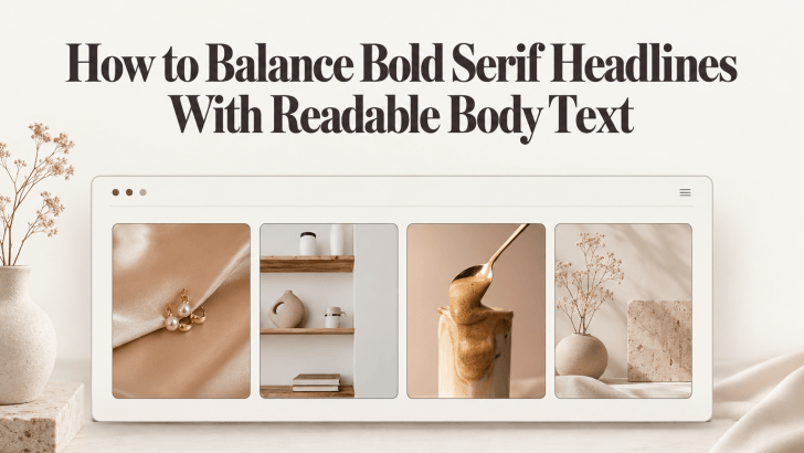
How to Balance Bold Serif Headlines With Readable Body Text

Understanding how to balance bold serif headlines with readable body text can help designers create layouts that feel expressive without becoming difficult to read. Bold serif fonts naturally attract attention through their strong weight and distinctive details, while cleaner body fonts help readers move through longer information comfortably. This combination works particularly well for fashion …

Continue reading →

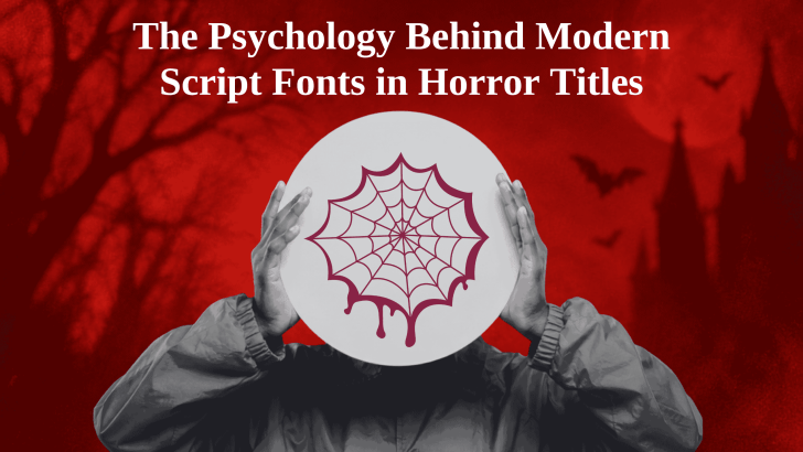
The Psychology Behind Modern Script Fonts in Horror Titles

The psychology behind modern script fonts in horror titles comes from the way handwritten letterforms can feel intimate, unpredictable, and emotionally charged. Unlike a clean geometric font, a script typeface often looks as if a person created it by hand. In horror design, that human quality can make a title feel more personal, unstable, or …

Continue reading →