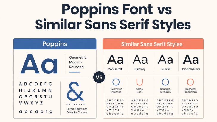
Poppins Font vs Similar Sans Serif Styles

Comparing Poppins font vs similar sans serif styles can help designers decide whether to keep a familiar geometric look or move toward a more distinctive visual identity. Poppins is popular for its clean shapes, balanced proportions, and flexible weights, but many modern sans serif fonts offer a similar sense of clarity with different personalities. The …

Continue reading →

How to Replace Poppins Without Losing a Clean Modern Look

Learning how to replace Poppins without losing a clean modern look is useful when you want a fresher brand identity without changing the overall visual direction. Poppins is popular because its geometric shapes, balanced proportions, and clean sans serif structure work well across websites, logos, social media, and packaging. However, using a different typeface can …

Continue reading →

Modern Fonts Similar to Poppins for Modern Branding

Choosing modern fonts similar to Poppins for modern branding can help designers keep a clean, geometric, and contemporary look while creating a more distinctive visual identity. Poppins is widely recognized for its modern sans-serif structure, balanced proportions, and versatility across digital and print projects. However, using a similar font can add personality while preserving the …

Continue reading →