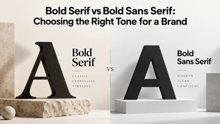
Bold Serif vs Bold Sans Serif: Choosing the Right Tone for a Brand

Comparing bold serif vs bold sans serif fonts can help you choose a typeface that matches the personality of your brand. Both styles can create strong visual impact, but they communicate very different moods. Bold serif fonts often feel more editorial, established, or sophisticated, while bold sans serif fonts usually feel cleaner, more direct, and …
Continue reading →

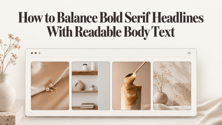
How to Balance Bold Serif Headlines With Readable Body Text

Understanding how to balance bold serif headlines with readable body text can help designers create layouts that feel expressive without becoming difficult to read. Bold serif fonts naturally attract attention through their strong weight and distinctive details, while cleaner body fonts help readers move through longer information comfortably. This combination works particularly well for fashion …

Continue reading →

Modern Fonts Similar to Poppins for Modern Branding

Choosing modern fonts similar to Poppins for modern branding can help designers keep a clean, geometric, and contemporary look while creating a more distinctive visual identity. Poppins is widely recognized for its modern sans-serif structure, balanced proportions, and versatility across digital and print projects. However, using a similar font can add personality while preserving the …

Continue reading →

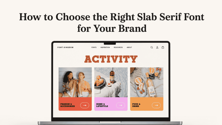
How to Choose the Right Slab Serif Font for Your Brand

Choosing how to choose the right slab serif font for your brand starts with understanding what your brand needs to communicate. Slab serif fonts are known for their strong, block-like serifs and confident presence, but they are not all the same. Some feel editorial and sophisticated, while others look playful, industrial, retro, or bold. That …

Continue reading →

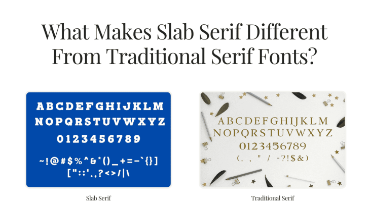
What Makes Slab Serif Different From Traditional Serif Fonts?

Understanding what makes slab serif different from traditional serif fonts can help designers choose typography with the right personality for branding, editorial layouts, packaging, websites, and advertising. Both styles belong to the serif family, but they communicate very different moods. Traditional serif fonts tend to feel refined and literary, while slab serifs often look stronger, …

Continue reading →

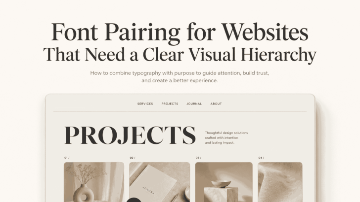
Font Pairing for Websites That Need a Clear Visual Hierarchy

Good font pairing for websites that need a clear visual hierarchy helps visitors understand a page before they read every word. The right combination separates headlines, supporting text, body copy, navigation, and calls to action without making the layout feel crowded. A website may have strong content and beautiful images, but unclear typography can make …

Continue reading →