
Understanding florist typography tips is essential for creating beautiful and engaging social media content. In the floral business, visuals play a major role in attracting customers. However, it is not just about flowers; typography also helps communicate elegance, freshness, and emotion.
On platforms like Instagram, Pinterest, and Facebook, users scroll quickly. Therefore, your design must stand out instantly. The right typography can highlight your message, strengthen your branding, and create a soft, romantic atmosphere that matches floral themes.
In this article, we will explore florist typography tips, recommended fonts, and practical ways to improve your social media designs.
Why Florist Typography Tips Matter in Social Media Design
Applying florist typography tips helps designers create content that feels consistent and visually appealing. Social media is highly competitive, so every detail matters.
Good typography can:
- Attract attention quickly
- Improve readability
- Strengthen brand identity
- Create an emotional connection
Moreover, floral designs often rely on aesthetics. As a result, typography must complement the softness and beauty of flowers.
Characteristics of Florist Typography
Before choosing fonts, it is important to understand the characteristics of florist typography.
1. Elegant and Soft Style
Florist typography often uses smooth curves and delicate lines. This creates a romantic and calming feel.
2. Natural and Organic Look
Some fonts mimic handwritten styles, which feel more personal and natural.
3. Light and Airy Appearance
Spacing and thin strokes help create a clean and breathable design.
4. Balanced Readability
Even decorative fonts must remain readable, especially for social media.
Florist Typography Tips for Social Media Designs
Now, let’s explore practical florist typography tips you can apply immediately.
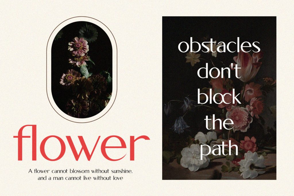
1. Use Script Fonts for Headlines
Script fonts are perfect for floral branding because they feel elegant and emotional.
Use them for:
- Brand names
- Quotes
- Headlines
However, avoid using script fonts for long paragraphs.
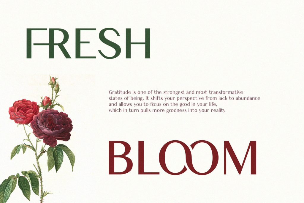
2. Combine with Clean Fonts
Pair script fonts with simple sans-serif fonts.
Example:
- Script font → Headline
- Sans-serif → Description
This creates balance and improves readability.
3. Use Soft Color Palettes
Typography works best when combined with colors like:
- Pastel pink
- Cream
- Light green
- Lavender
These colors enhance the floral theme.
4. Create Visual Hierarchy
Use different font sizes and weights:
- Large → Main message
- Medium → Supporting text
- Small → Details
As a result, users can easily understand your content.
5. Use White Space Effectively
White space helps your design feel clean and elegant. Moreover, it allows typography to stand out.
Recommended Fonts for Florist Typography
Here are some of the best fonts to apply florist typography tips in your designs.
Hoodger
Hoodger is an elegant sans serif typeface featuring sleek, minimalist letterforms.
Characteristics:
- Modern design
- Clean and minimalist letterforms
- Sharp edges and balanced proportions
Best for:
- Branding
- Social media posts
- Promotional content
Hoodger’s sleek design exudes clarity and efficiency, making it a perfect choice for a florist project.
Nebos

Nebos is an elegant serif typeface with unique ligatures and modern letter alternatives.
Characteristics:
- Modern letterforms
- Elegance typeface
- Unique ligatures
Best for:
- Elegant Creations
- Social media design
- Advertising Campaigns
Nebos adds a sophisticated touch to a florist’s creation.
Conquer

Conquer is a modern and elegant serif font that blends creativity and individuality.
Characteristics:
- Playfulness
- Elegant serif font
- Distinctive and expressive style
Best for:
- Invitations
- Luxury floral brands
- Social media captions
Conquer’s distinctive and expressive style guarantees to infuse your project with character and personality, making it stand out with creativity and flair.
Yasmen

Yasmen is a modern ligature serif font with beautiful characters.
Characteristics:
- Luxury style
- Timeless elegance
- Refined aesthetic appearance
Best for:
- Quotes
- Instagram content
- Luxury branding projects
Yasmen elevates your designs with its refined aesthetic.
Cheryl
Cheryl is a decorative sans-serif typeface that offers a clean, modern design.
Characteristics:
- Modern elegance
- Simplicity and functionality
- Balance and minimalist design
Best for:
- Elegant creations
- Small business posts
- Flower shop promotions
Cheryl adds clarity and precision with its contemporary, versatile style.
If you want to learn about font psychology, read this article: The Psychology of Fonts in Branding.
How Florist Typography Improves Social Media Engagement
Good typography improves engagement by making content:
- Easier to read
- More visually appealing
- Emotionally engaging
As a result, users are more likely to like, share, and save your posts.
Conclusion
Applying the right florist typography tips can transform your social media designs into elegant and eye-catching visuals. Fonts like Hoodger, Nebos, Conquer, Yasmen, and Cheryl provide a variety of styles that suit different floral branding needs.
Moreover, by combining typography with proper spacing, color, and layout, you can create designs that feel both professional and emotional. In the end, typography is not just about text; it is about creating a visual experience that reflects the beauty of flowers.
WilliamCerge
Если вы решили потратить всего один день в жемчужине Адриатики, советую заранее продумать пеший маршрут по лагуне на 1 день, чтобы успеть рассмотреть главные ориентиры. Допустим, навигация по Венеции на 1 день с подробной картой обеспечит понять маршрут и не запутаться в дебрях узких переулков. Осмотр Венеции за день — задача непростая, но абсолютно реальная, если знать, что увидеть в Венеции за 1 день, и каков тариф на гондольная прогулка — прайс на гондолу варьируется, так что на стоимость следует закладывать заранее.
Путешественникам, кто намерен посетить и другие города, рекомендую внести в маршрут красавицу Флоренцию: план прогулки по Флоренции на 1 день поможет посетить лучшие выставки и магазины, а также выяснить, где вкусно и дёшево поесть во тосканской столице. Если планируется более крупных впечатлений, можно рассмотреть маршрут по живописным Альпам — автотур по Доломитовым Альпам и как доехать туда регулярно обсуждаются на туристических форумах. Развёрнутый маршрут и ценные подсказки найдёте здесь [url=https://holidaygid-italy.ru]флоренция за один день[/url] .
Muh Sodikin
Thank you for sharing these travel tips! Venice and Florence are truly beautiful destinations, and having a well-planned one-day itinerary can make the experience much more enjoyable. The gondola pricing advice and the Dolomites road trip suggestion are also very helpful for travelers visiting Italy for the first time. Appreciate the recommendations!
LucianoTal
Тем, кто хочет найти самые бюджетные билеты на самолет из Москвы и области в другие страны, я считаю, стоит изучить на портал lowcost pro. На нем регулярно появляются интересные варианты по маршрутам из разных городов: cheap flights from Helsinki, Brussels, Copenhagen, Amsterdam а также других городов. Отлично то, что есть возможность найти дешевые авиабилеты с Праги, и кроме того прямые направления от Ташкента в Европу.
Еще советую исследовать платформы lowcost.pro либо lowcostpro, где собираются варианты по cheap flights from Riga, Paris, Frankfurt, Berlin, Vienna, Lisbon и многим другим городам. Если вас интересуют варианты бюджетных перелетов из московских аэропортов или с других европейских направлений, имеет смысл посмотреть по таким городам, как Bucharest, Malaga, Dublin или же Sofia — часто бывают очень хорошие цены. Смотрите ссылку, с помощью которой найдете оптимальный рейс lowcost.pro .
Michaelweice
Si vas buscabas actividades costeras en la zona costera Tenerife, rentar motos marinas es una fantastica opcion para navegar por la linea de playa y vivir del agua de modo amena y vibrante. En el sur de Tenerife, sobre todo en puntos como Costa Adeje o Los Gigantes, existe desde alquileres individuales hasta tours en moto de agua que son apropiadas a todo tipo de niveles.
Para quienes pretenden comparar costes y posibilidades, te invito a mirar servicios de operadores que tienen disponible tours y alquiler en motos de agua en Tenerife, incluyendo opciones como safari en jet ski o alquiler de motos de agua en la capital de Tenerife. Mas informacion y referencias sobre tarifas y recorridos estan disponibles en este sitio: alquiler y excursiones en motos de agua en golf sur . ?Excelente para planear un dia memorable y vivir del costa canaria!