Modern Fonts Similar to Poppins for Modern Branding

Choosing modern fonts similar to Poppins for modern branding can help designers keep a clean, geometric, and contemporary look while creating a more distinctive visual identity. Poppins is widely recognized for its modern sans-serif structure, balanced proportions, and versatility across digital and print projects. However, using a similar font can add personality while preserving the …
Continue reading →

How to Choose the Right Ligature Font for Your Brand

Learning how to choose the right ligature font for your brand can help you create a more distinctive visual identity without sacrificing readability. Ligature fonts can add elegant connections, custom-looking letterforms, and subtle personality to logos, packaging, websites, and campaign graphics. However, not every ligature style works for every brand. The best choice depends on …

Continue reading →

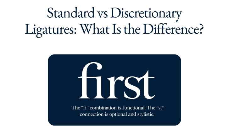
Standard vs Discretionary Ligatures: What Is the Difference?

Understanding standard vs discretionary ligatures can help designers make better typography decisions, especially when working with branding, editorial layouts, packaging, websites, and display type. Both types combine two or more characters into a specially designed glyph, but they serve different purposes. Standard ligatures mainly improve spacing and prevent awkward letter collisions, while discretionary ligatures are …

Continue reading →

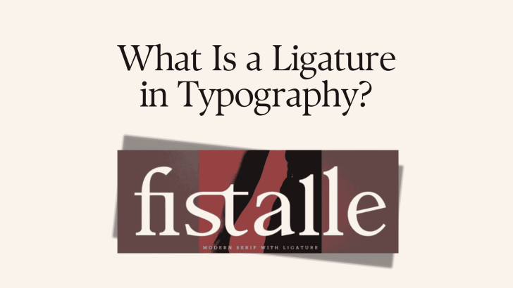
What Is a Ligature in Typography?

Understanding ligatures in typography can help designers create text that feels more polished, connected, and visually distinctive. A ligature is a special character created when two or more letters are combined into one glyph. Instead of displaying each letter separately, the typeface replaces certain combinations with a custom shape that improves spacing, appearance, or stylistic …

Continue reading →