Looking for fresh Halloween 2026 design ideas does not mean every project needs to rely on dark gothic lettering or predictable orange-and-black graphics. Designers can explore a much broader spectrum, from energetic, retro-inspired typography to playful, slime-themed lettering, transforming the horror aesthetic into something entertaining rather than frightening. The most compelling Halloween visuals often emerge from blending familiar, eerie elements with unexpected stylistic choices.
Typography plays a major role in creating that balance. A font can make the same Halloween message feel nostalgic, humorous, mysterious, or chaotic depending on its proportions and details. Choosing the right direction early also makes it easier to build posters, social posts, packaging, invitations, and party branding as one visual system.
Retro Typography Can Make Halloween Feel Fresh
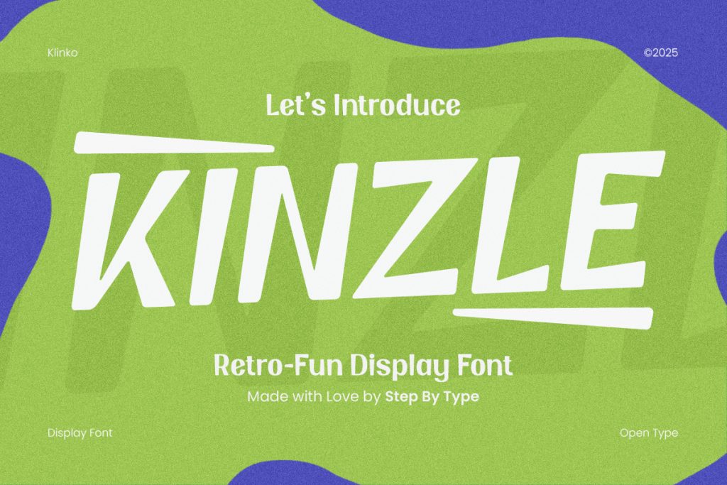
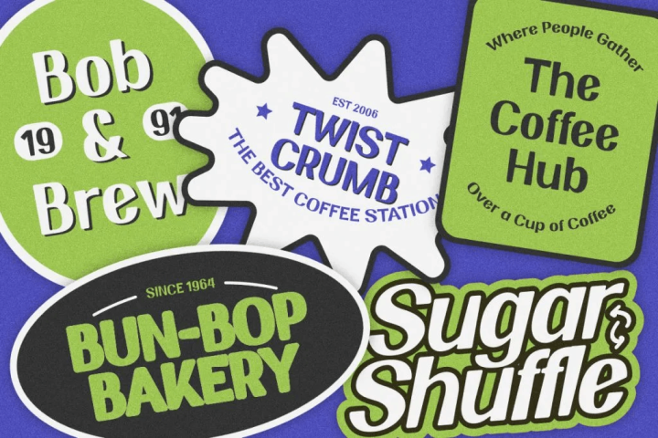
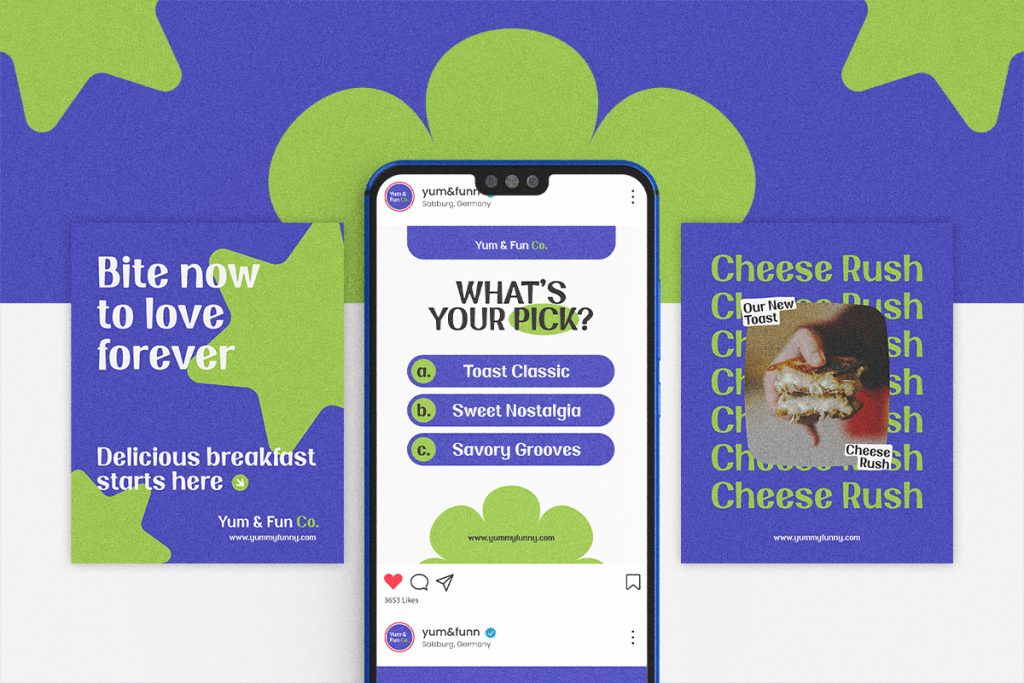
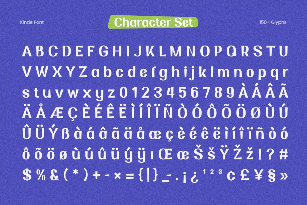
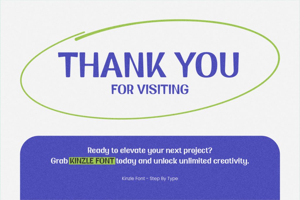
Retro design provides an interesting alternative to traditional horror aesthetics. Instead of sharp gothic shapes, designers can use energetic display fonts with unusual proportions, angled strokes, and slightly imperfect forms. The result can feel nostalgic without looking like a direct copy of an old horror poster.
Bright combinations such as lime green, violet, cream, and electric blue can push this direction even further. These colors keep the design seasonal while moving away from the most common Halloween palette.
Why Retro-Fun Fonts Work for Seasonal Design
Retro-fun fonts often have enough personality to become the main graphic element. Their unusual angles, bold shapes, and exaggerated proportions can make a simple wordmark feel energetic. This works well when the design needs Halloween character without obvious blood, skulls, or haunted imagery.
The surrounding layout can stay relatively clean. Large typography, a simple background shape, and limited supporting text are often enough. This gives the font room to establish the tone of the entire composition.
Imperfection Adds Personality
Perfectly geometric typography can sometimes feel too controlled for Halloween. Slight irregularity makes letterforms feel more expressive and handmade. That looseness also helps retro designs feel less corporate and more playful.
However, the letters should still be easy to recognize. Halloween typography works best when personality enhances the message rather than competing with it. A visually unusual font still needs to communicate quickly.
Playful Horror Is a Strong Alternative to Pure Gore
Halloween does not always need to feel terrifying. Playful horror combines familiar spooky elements with rounded shapes, exaggerated effects, and colorful palettes. It works especially well for party graphics, games, youth campaigns, or monster-themed events.
Slime-inspired typography is a good example. Thick letters and dripping extensions immediately suggest monsters or supernatural creatures, but their rounded construction keeps the tone entertaining. This creates a visual style that feels Halloween-specific without becoming too graphic.

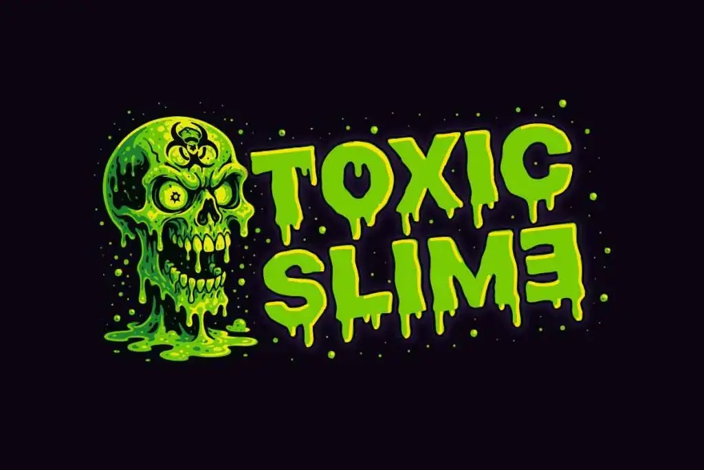
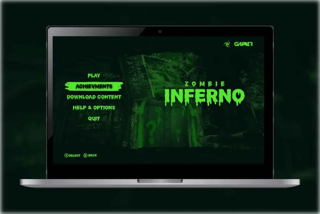
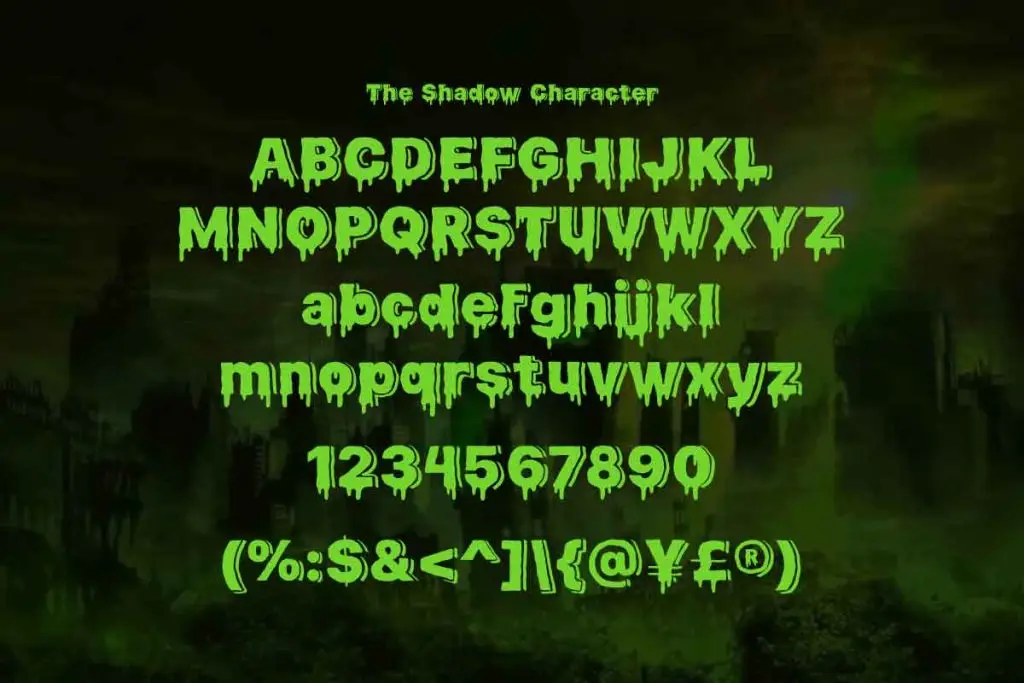
Slime Typography Creates Instant Atmosphere
Slime fonts communicate the theme almost immediately. Their melting edges and downward drips create the impression that the lettering is alive, unstable, or covered in something strange. Bright green strengthens the connection with monsters, toxic goo, and cartoon horror.
The style is especially useful when typography needs to carry most of the visual concept. A bold slime headline can establish the Halloween mood even when the background contains relatively few decorative elements. This makes it useful for posters and social graphics that need immediate impact.
If you want to explore this approach more deeply, read How to Choose a Dripping Font for Halloween Party Branding. It explains how to evaluate dripping typography based on readability, mood, color, and its ability to work across different event formats.
Combine Horror Details with Friendly Shapes
One useful direction for Halloween 2026 is mixing scary details with approachable letterforms. A rounded font can include dripping edges, while a retro font can use eerie colors or distressed texture. The contrast creates personality without making the design visually exhausting.
This approach also gives designers more control over the target audience. Strong red drips can push a concept toward horror, while lime green and rounded letters make the same idea feel much lighter. The basic font structure influences how far the design can lean toward creepy or fun.
Use Typography as the Main Visual Element
Halloween graphics often become overloaded with pumpkins, bats, cobwebs, skulls, ghosts, and smoke. A stronger approach can be to let the typography do most of the storytelling. Expressive fonts already contain enough shape and movement to create atmosphere.
Large headline typography can fill much of the composition while illustrations take a supporting role. This creates clearer hierarchy and helps the design feel more contemporary. It also makes seasonal graphics easier to adapt across different sizes.
Explore Unexpected Halloween Color Palettes
Traditional orange and black remain useful, but they are not the only options. Acid green, purple, electric blue, dirty cream, and deep burgundy can create equally recognizable Halloween visuals. The right font often makes these less obvious palettes still feel seasonal.
Retro typography works particularly well with brighter combinations. Slime and monster fonts naturally support green and violet, while distressed horror styles can use darker or faded tones. Color should strengthen the personality already present in the typeface.
Keep Supporting Typography Simple
Expressive display fonts need contrast. If the headline uses extreme angles, slime drips, or irregular shapes, the supporting information should remain much cleaner. A neutral sans serif can handle dates, venues, descriptions, and calls to action.
This hierarchy improves readability and makes the decorative type feel more deliberate. One memorable display font usually creates more impact than several competing novelty styles. Simplicity gives the Halloween personality room to stand out.
Design for More Than One Format
Seasonal campaigns rarely exist as a single poster. A Halloween concept may need to extend into Instagram posts, stories, banners, invitations, tickets, and merchandise. That makes typography flexibility an important consideration from the beginning.
Test the headline in wide, square, and vertical layouts. Retro display fonts may need different line breaks, while slime effects can lose detail when reduced. A font that adapts well makes the entire visual identity easier to maintain.
Final Thoughts
The strongest Halloween 2026 design ideas do not depend on making every layout darker or scarier. Retro typography, bright unexpected colors, playful horror, and slime-inspired display fonts can create Halloween visuals that feel expressive and memorable. These approaches give designers more room to match the mood with different audiences and events.
Start with typography as the foundation rather than adding it at the end. Choose whether the concept should feel nostalgic, playful, strange, or intensely spooky, then build the color and imagery around that direction. When the font carries a clear personality, even a simple Halloween composition can feel distinctive.
