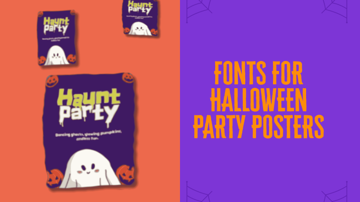
Choosing the right fonts for Halloween party posters can completely change the mood of a design. Typography can make a poster feel creepy, playful, mysterious, retro, or dramatic before people even read the event details. For Halloween, the best font usually does more than look spooky—it also helps the headline stand out and keeps the poster easy to understand.
That balance matters because party posters often contain several pieces of information at once. The event name, date, venue, dress code, and call to action all need their own place. A strong display font can attract attention, while simpler supporting type keeps everything else readable.
Why Typography Matters in Halloween Party Posters
Halloween posters rely heavily on atmosphere. Dark backgrounds, eerie illustrations, pumpkins, ghosts, and dramatic lighting can create the setting, but typography often becomes the strongest visual cue. The font tells viewers whether the event feels playful, gothic, creepy, or inspired by classic horror.
This is why choosing a random decorative font can weaken the design. The typeface should match the personality of the event and the audience. A family-friendly party needs a different visual tone from a late-night horror event or a costume club night.
Spooky Display Fonts Create Instant Impact
Display fonts are one of the easiest choices for Halloween headlines because they are designed to attract attention. Thick strokes, exaggerated shapes, unusual terminals, and decorative details can make a simple event name feel much more memorable. They work especially well for short phrases such as “Halloween Party,” “Spooky Night,” or “Haunted Fest.”
The key is to keep them in the headline area. Decorative fonts can become difficult to read when used for paragraphs or smaller details. Pairing them with a clean sans serif keeps the poster expressive without making it confusing.
Dripping Fonts Add a Classic Horror Feel
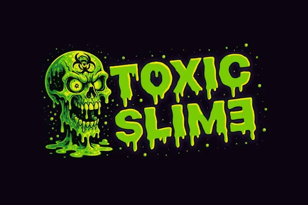
Dripping typography is strongly associated with Halloween because it can suggest slime, blood, melting surfaces, or supernatural creatures. These fonts are especially useful for posters inspired by zombies, haunted houses, horror movies, or spooky attractions. The effect immediately creates a darker and more theatrical mood.
The same idea can feel playful depending on the color and shape of the letters. Green drips can suggest slime or monsters, while red drips feel more intense and horror-driven. If you want to understand why this effect works so well, read Why Slime and Drip Work So Well in a Halloween Poster Design.
Gothic Fonts Create a Darker Atmosphere

Gothic and blackletter-inspired fonts are useful when the event needs a darker, more dramatic direction. Their sharp shapes and historical feel can work well for haunted castle themes, vampire parties, masquerade events, or occult-inspired visuals. They create a sense of mystery without relying on obvious horror effects.
However, gothic fonts can become difficult to read if used too heavily. They usually work best for a short headline or event title. For longer information, switch to a simpler typeface that complements the mood without competing with it.
Playful Halloween Fonts Work for Casual Events
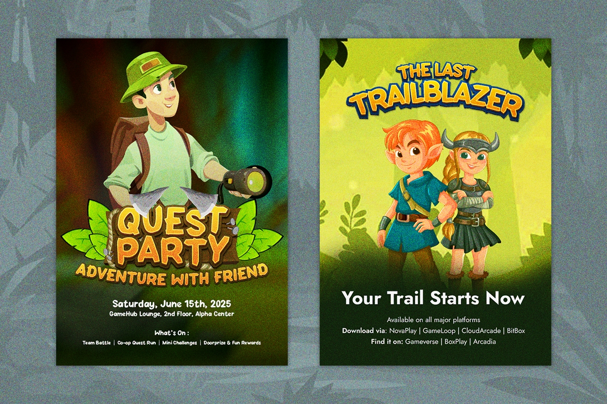
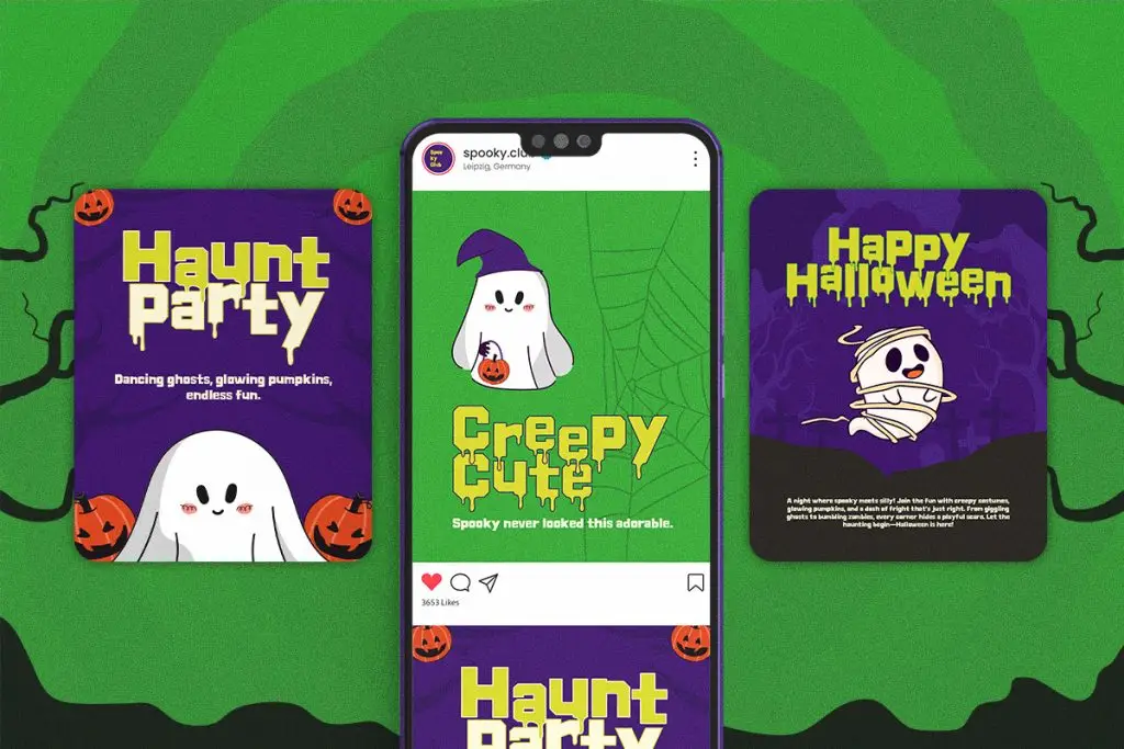
Not every Halloween party needs to look frightening. Rounded letters, cartoonish shapes, chunky fonts, and soft irregular forms can create a friendlier atmosphere. These styles are a better fit for school events, family parties, children’s activities, or casual community celebrations.
Color also plays a big role here. Purple, orange, green, yellow, and black can make playful typography feel festive rather than scary. The font should still stay clear enough for younger audiences to read easily.
Retro Horror Fonts Bring Nostalgia
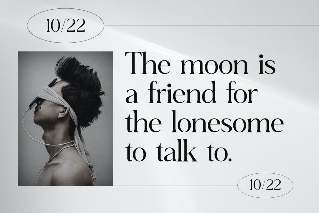
Retro horror typography can give Halloween posters a strong cinematic or vintage personality. Fonts inspired by old movie posters, pulp covers, VHS graphics, and 1970s horror titles can make an event feel more distinctive. They are especially useful when the poster already has grain, distressed textures, or retro illustrations.
These fonts often work well with warm reds, cream backgrounds, faded orange, and black. The combination creates a more stylized Halloween look rather than a generic seasonal design. It also gives designers a clear visual direction for the rest of the poster.
Handwritten Fonts Can Feel Unsettling
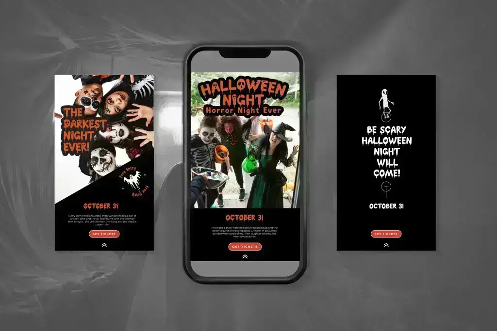
A rough handwritten font can create a different kind of horror. Uneven strokes, scratchy lines, and irregular baselines can feel personal, chaotic, or slightly unsettling. This makes them useful for thriller-inspired posters or designs that need a more raw atmosphere.
Still, readability should remain a priority. If the handwriting is too distorted, the title may become difficult to understand. Short phrases and large type sizes usually work best.
Match the Font to the Party Theme
The best fonts for Halloween party posters depend on the event concept. A zombie party may benefit from slime-inspired lettering, while a gothic masquerade may need sharper and more elegant typography. A children’s Halloween event may work better with chunky cartoon lettering.
Think about the audience before choosing the font. The same word “Halloween” can look completely different depending on the typeface. A good choice helps viewers understand the personality of the event immediately.
Pair Decorative Fonts with Clean Type
Font pairing becomes especially important in Halloween poster design. Decorative fonts provide atmosphere, but clean fonts provide structure. Using both creates a stronger hierarchy and makes the information easier to scan.
A simple approach is to use one expressive display font for the headline and one sans serif for everything else. This keeps the design cohesive and reduces visual clutter. Two fonts are usually enough for most party posters.
Consider the Poster from a Distance
A Halloween party poster often needs to work quickly. People may see it on social media, on a wall, or while scrolling through an event feed. If the headline cannot be understood within a few seconds, the font may be too complicated.
Zoom out when testing the design. The title should still be easy to identify, even when the poster appears smaller. Strong contrast between the text and background also helps maintain readability.
Test Different Font Sizes
Some decorative fonts look impressive at large sizes but lose detail when reduced. Drips, scratches, and unusual edges may disappear or merge. This can make the font look weaker in mobile formats.
Test the same design in several sizes before finalizing it. A font that works on a printed poster should also be checked in square posts, stories, and promotional banners. This makes the design more flexible across different platforms.
Final Thoughts
The best fonts for Halloween party posters combine atmosphere with readability. Dripping fonts, gothic styles, playful display type, retro horror fonts, and handwritten lettering can all work, but each creates a different mood. The strongest choice is the one that fits the event theme and supports a clear hierarchy.
Keep the decorative font focused on the headline, then use simpler typography for supporting information. This approach makes the poster easier to read while still feeling visually exciting. When the font, color, and theme work together, even a simple Halloween party poster can feel much more memorable.
