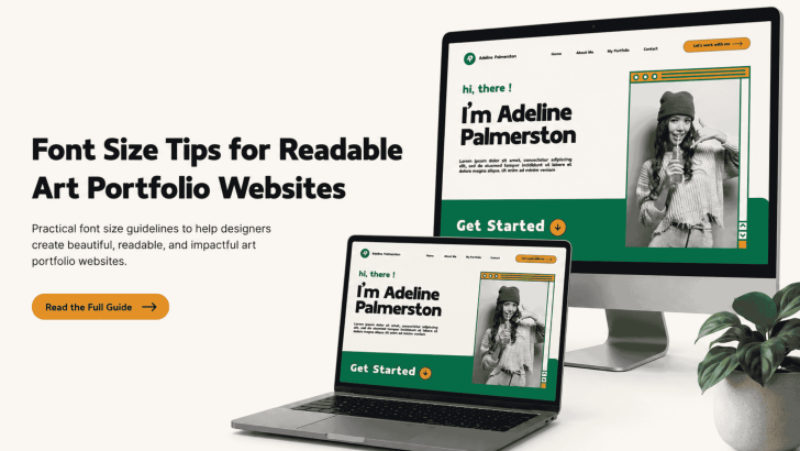
Fitness Typography Tips: Create Strong and Energetic Designs

Understanding fitness typography tips is essential for designers who want to create bold, energetic, and motivating visuals. In the fitness industry, design is not just about aesthetics; it is about energy, movement, and strength. Typography plays a major role in delivering that message. Whether you are designing gym posters, fitness apps, social media content, or …

Continue reading →

Typography Tips for Improving User Experience

Understanding typography tips for improving user experience is essential for designers who want to create clear, engaging, and effective designs. Typography is not just about choosing fonts; it directly affects how users read, navigate, and interact with content. In today’s digital world, users expect fast and effortless experiences. Therefore, good typography plays a key role …

Continue reading →

How to Use Condensed Sans Serif Fonts in Graphic Design

Understanding how to use condensed sans-serif fonts in graphic design can significantly improve the visual impact of your work. Typography is not just about style; it is about structure, readability, and communication. Condensed sans-serif fonts are widely used in modern design because they offer a clean look while saving space. However, using them incorrectly can …

Continue reading →

How to Advertise Your Business with Strong Visual Typography

Learning how to advertise your business with strong visual typography can completely transform your marketing results. Typography is not just about choosing a font; it is about how your message is presented visually to attract attention, communicate clearly, and influence customer decisions. In today’s competitive digital world, people scroll quickly and make instant judgments. Strong …

Continue reading →

How to Choose the Perfect Spooky Font for Your Design

Understanding how to choose the perfect spooky font for your design is essential if you want to create strong and memorable Halloween visuals. Typography plays a key role in setting the mood, especially in spooky or horror-themed designs. A well-chosen spooky font can instantly create feelings of fear, mystery, or even fun. On the other …

Continue reading →

How to Pick a Font That Matches Your Brand Personality

Choosing the right font is one of the most important steps in building a strong brand identity. Typography is not just about aesthetics; it communicates your brand’s tone, personality, and values before people even read your message. When someone sees your logo, website, or marketing material, the font you use creates an immediate impression. A …

Continue reading →