Using slime and drip in Halloween poster design is one of the easiest ways to make a layout feel instantly spooky, strange, and playful. These visual details suggest movement, mess, decay, and something slightly unnatural, which fits the mood of Halloween perfectly. They also work especially well in typography because they can transform simple letterforms into something more expressive and memorable.
The appeal is not only about horror. Slime and drip effects can move between creepy, funny, grotesque, and cartoonish depending on the font style and color palette. That flexibility is why they appear so often in Halloween posters, party graphics, horror branding, and seasonal social media design.
Slime and Drip Create Instant Visual Associations
Certain visual cues are understood almost immediately. A dripping red shape can suggest blood, while bright green slime may suggest monsters, zombies, toxic substances, or supernatural creatures. Designers can use these associations to establish a Halloween mood before the viewer reads the full message.
This makes slime and drip especially useful in poster design, where communication needs to happen quickly. A strong headline can instantly signal horror, comedy, or spooky entertainment through its shape alone. Typography becomes part of the storytelling rather than simply carrying information.
Dripping Shapes Add a Sense of Movement
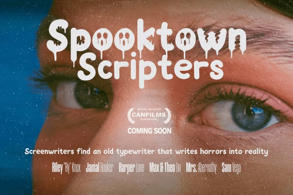
Static letterforms can feel much more dynamic when parts of them appear to melt or drip downward. The effect suggests gravity and motion, which gives the typography a more physical presence. Even though the letters are still, they can feel like they are changing or slowly breaking apart.
That sense of movement helps create tension. A clean geometric font feels stable and controlled, while a dripping font can feel unstable and unpredictable. For Halloween design, that instability often makes the composition more engaging.
Slime Works Especially Well with Playful Horror
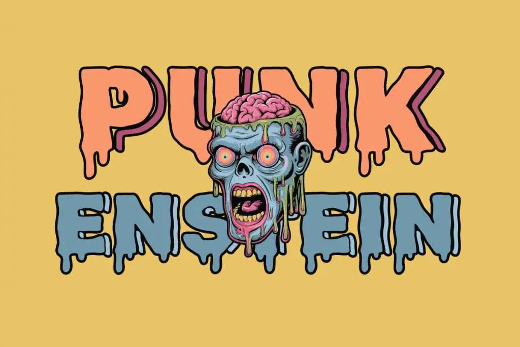
Green slime creates a different mood from red dripping effects. Instead of immediately suggesting danger, it can feel cartoonish, strange, and entertaining. This makes it a strong choice for family-friendly Halloween events, zombie themes, monster graphics, or game-inspired posters.
Bright green also contrasts well with common Halloween colors such as black, purple, orange, and dark blue. That contrast helps headlines stand out even in busy layouts. The result can feel spooky without becoming visually heavy.
If you want to explore this style further, Best Zombie Fonts for Halloween Poster Design looks at typefaces that use bold shapes, slime details, and playful horror characteristics.
Drip Effects Make Display Fonts More Dramatic
Dripping details are most effective in display typography because larger text gives the effect enough room to be visible. In small body copy, those shapes can disappear or reduce readability. In a headline, however, they become part of the font’s personality.
This is why horror posters often use clean supporting type alongside expressive display lettering. The headline carries the mood, while smaller text handles practical information. That contrast keeps the design readable and visually controlled.
Blood-Inspired Drips Create a Darker Mood
Red drips immediately push a poster toward a more intense horror direction. They can reference classic slasher movies, haunted attractions, thriller graphics, or dramatic Halloween events. The visual impact is stronger when the typography uses thick letters with enough negative space around them.
Designers should be careful not to rely only on the color red. Letter shape, spacing, weight, and overall composition still matter. A strong horror font should remain recognizable even before the dripping effect is added.
For a closer look at this darker approach, read Bloody Display Fonts for Halloween Posters, which explores blood-inspired typography, distressed shapes, and slasher-style lettering.
Slime and Drip Help Build Stronger Hierarchy
A poster needs a clear focal point. Slime or drip effects naturally draw attention because their shapes are unusual compared with normal text. This makes them useful for titles, event names, or short promotional phrases.
The effect should not appear everywhere. If every word uses the same dripping treatment, the design loses contrast and becomes difficult to scan. One expressive headline is usually stronger than several competing decorative elements.
Color Changes the Meaning of the Effect
The same dripping style can create completely different moods depending on color. Red feels intense and threatening, while bright green feels toxic or cartoonish. Purple can feel supernatural, while black creates a darker and more mysterious tone.
This gives designers plenty of flexibility. A Halloween poster does not always need to follow the same orange-and-black formula. Slime and drip typography can help create a recognizable seasonal feel even with an unexpected palette.
Texture Makes the Effect More Convincing
Flat dripping shapes can already work well, but texture adds another layer of atmosphere. Rough edges, grain, scratches, or subtle highlights can make slime feel sticky or make blood-inspired lettering feel more physical. These details help create depth without relying on complex illustrations.
Still, texture should remain secondary to readability. If the surface treatment becomes too detailed, letters may lose their structure. Designers should test the headline at different sizes before finalizing the effect.
Keep the Supporting Layout Simple
Expressive typography needs space to work. A poster filled with webs, pumpkins, smoke, ghosts, splatters, and distressed textures can quickly become chaotic. When the headline already contains strong slime or drip details, the surrounding layout can remain relatively simple.
This also improves hierarchy. The viewer understands immediately where to look first, then moves naturally toward supporting information. The poster feels more deliberate instead of overloaded.
Slime and Drip Work Across Different Halloween Styles
One reason these effects remain popular is their versatility. They can appear in retro horror posters, cartoon Halloween graphics, zombie designs, party invitations, game promotions, and social media campaigns. The same basic concept can shift from funny to frightening depending on how it is styled.
That makes slime and drip useful beyond one specific aesthetic. Designers can adjust the weight, color, texture, and amount of distortion to suit different audiences. The effect becomes a flexible visual language rather than a single trend.
Final Thoughts
The effectiveness of slime and drip in Halloween poster design comes from how quickly these shapes communicate mood. They suggest movement, decay, danger, monsters, or playful horror without requiring complex explanation. When used in display typography, they can turn an ordinary headline into the main visual element of the poster.
The key is balance. Keep the letterforms readable, control the amount of distortion, and avoid adding too many competing effects. When slime and drip are used with intention, they can make Halloween typography feel more expressive, memorable, and visually distinctive.
