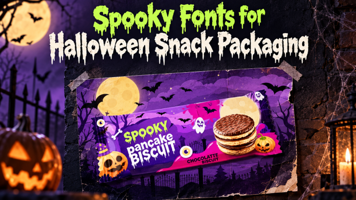
Choosing the right spooky fonts for Halloween snack packaging can make a seasonal product feel more exciting before the package is even opened. Typography helps communicate whether a snack feels creepy, playful, mysterious, or family-friendly. For Halloween products, that first visual impression matters because shoppers often make quick decisions based on color, illustration, and type.
The best spooky fonts do more than look scary. They help the product stand out on a shelf, support the flavor or theme, and make the package easier to recognize. A strong font can turn a simple candy bag or cookie box into something that feels designed specifically for Halloween.
Why Typography Matters in Halloween Packaging
Packaging has very little time to attract attention. A shopper may only glance at the front panel for a few seconds, so the product name and main message need to feel clear immediately. Halloween typography helps create that seasonal signal without requiring a complicated design.
A dripping font can suggest slime or monsters, while a rough serif can feel like an old horror poster. Rounded display fonts can make the product feel more playful, which works well for family snacks or children’s treats. The typography sets the tone before the customer reads the details.
Spooky Does Not Always Mean Scary
One of the biggest mistakes in Halloween packaging is assuming that every font needs to feel frightening. Snack products often need to remain fun and approachable, especially when they target families or younger audiences. A font can still feel seasonal without looking aggressive.
Chunky letters, soft irregular shapes, and friendly drips can create a creepy-cute effect. These details keep the Halloween mood while making the product feel enjoyable rather than intimidating. The result is often more suitable for candy, cookies, popcorn, gummies, and themed beverages.
Playful Horror Can Improve Shelf Appeal
Playful horror works because it combines two emotions at once. The typography feels unusual enough to catch attention, but it still looks friendly enough to invite interaction. That contrast is especially useful in crowded seasonal displays.
Bright green, orange, purple, and yellow can make spooky lettering feel more energetic. Darker colors can then be used for shadows or backgrounds to maintain the Halloween atmosphere. The font becomes the bridge between fun and creepy.
Dripping Fonts Work Well for Candy and Gummies
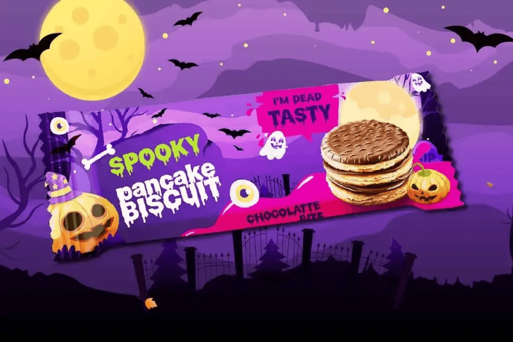
Dripping fonts naturally fit products that already feel sticky, chewy, or gooey. Gummies, sour candy, jelly snacks, and novelty sweets can benefit from slime-inspired typography because the visual style connects with the texture of the food. This creates a stronger relationship between product and design.
Green drips can suggest monster slime, while red drips create a more dramatic effect. However, packaging aimed at children usually benefits from softer colors and rounded shapes. The design should feel imaginative rather than disturbing.
Rough and Distressed Fonts Add a Vintage Horror Mood
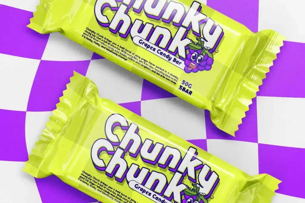
Some Halloween snack brands may want a more retro or cinematic look. Distressed fonts with rough edges, faded texture, or uneven strokes can create that effect. They often reference old monster movies, pulp graphics, or vintage Halloween advertisements.
This style works well for limited-edition packaging or products aimed at older audiences. It can make a snack feel more collectible and visually distinctive. Pairing the font with grain, muted color, or vintage illustration can strengthen the overall concept.
Rounded Fonts Make Halloween Feel More Friendly
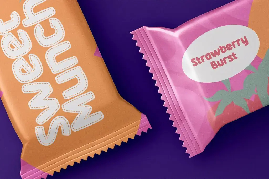
Rounded typography is a strong choice when the packaging needs to appeal to children or families. Soft shapes reduce the aggressive feeling of horror elements and make the product feel more cheerful. Designers can still add small spooky details without losing that sense of friendliness.
For example, a rounded headline might include subtle dripping edges or slightly uneven letterforms. These additions create personality without making the text difficult to read. The result works especially well for cookies, cereal, candy, or lunchbox snacks.
Match the Font with the Product Personality
The same Halloween font will not work for every snack. A spicy chip brand may benefit from sharper and more dramatic lettering, while a marshmallow product may need softer and more playful typography. The font should support both the Halloween theme and the product itself.
Think about texture, flavor, audience, and price point. Premium chocolate packaging may need a more refined spooky serif, while novelty candy can use something bold and exaggerated. The most effective choice feels specific rather than generic.
Color Changes How the Font Feels
A spooky font can shift dramatically depending on color. Black and deep red create a darker mood, while lime green and purple feel more playful. Orange can make the design feel classic Halloween without becoming too intense.
Designers should also consider contrast against the packaging background. Decorative fonts need enough separation to remain readable on shelves and in product photos. A strong color system can make the same typeface feel either premium, fun, or theatrical.
Keep Product Information Easy to Read
Spooky display fonts should usually be reserved for the product name, flavor, or seasonal message. Nutrition information, ingredients, weight, and supporting copy need a cleaner typeface. This creates a clear hierarchy and prevents the package from becoming visually noisy.
A simple sans serif works well for functional information. It also creates contrast with the expressive Halloween font. This balance makes the packaging easier to understand while preserving the seasonal personality.
One Main Display Font Is Usually Enough
Using several decorative fonts on one package can make the design feel chaotic. Each typeface brings its own personality, so too many styles can compete for attention. One main spooky font paired with one neutral font usually creates a stronger result.
This approach also makes the brand easier to recognize. The customer sees one dominant visual idea instead of several unrelated effects. Simplicity helps seasonal packaging feel more intentional.
Test the Font on Different Package Sizes
A font that works on a large cereal box may not work on a small candy wrapper. Decorative details can disappear when the design is reduced. This is why designers should test typography across several package sizes.
Small formats usually require simpler letterforms and stronger contrast. Larger packages can support more detail, texture, and ornament. Testing early helps avoid readability problems later in production.
Final Thoughts
Choosing spooky fonts for Halloween snack packaging is about balancing seasonal personality with product clarity. Dripping fonts, distressed type, rounded display styles, and retro horror lettering can all work, but each creates a different mood. The strongest choice depends on the product, audience, and visual direction.
Use decorative typography where it has the most impact, then keep functional text simple. Match the font with the snack’s personality, test the design at real packaging sizes, and control the color palette carefully. When those elements work together, Halloween packaging can feel fun, memorable, and easy to recognize.
