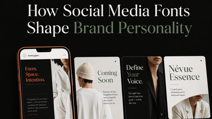
How Social Media Fonts Shape Brand Personality

Understanding how social media fonts shape brand personality can help brands create posts that feel more consistent, recognizable, and emotionally relevant. On platforms such as Instagram, TikTok, Pinterest, and Facebook, typography often works alongside photography, color, and layout to communicate a brand’s tone within seconds. A bold display font can make a brand feel energetic, …

Continue reading →

How to Replace Poppins Without Losing a Clean Modern Look

Learning how to replace Poppins without losing a clean modern look is useful when you want a fresher brand identity without changing the overall visual direction. Poppins is popular because its geometric shapes, balanced proportions, and clean sans serif structure work well across websites, logos, social media, and packaging. However, using a different typeface can …

Continue reading →

How to Choose the Right Ligature Font for Your Brand

Learning how to choose the right ligature font for your brand can help you create a more distinctive visual identity without sacrificing readability. Ligature fonts can add elegant connections, custom-looking letterforms, and subtle personality to logos, packaging, websites, and campaign graphics. However, not every ligature style works for every brand. The best choice depends on …

Continue reading →

How to Choose the Right Slab Serif Font for Your Brand

Choosing how to choose the right slab serif font for your brand starts with understanding what your brand needs to communicate. Slab serif fonts are known for their strong, block-like serifs and confident presence, but they are not all the same. Some feel editorial and sophisticated, while others look playful, industrial, retro, or bold. That …

Continue reading →

How to Choose Fonts for User Interface Design

Choosing fonts for user interface design is not only about finding a typeface that looks modern. A UI font needs to help users read labels, understand navigation, complete forms, scan content, and recognize important actions without unnecessary effort. The right typography can make an interface feel clear and professional, while the wrong choice can make …

Continue reading →