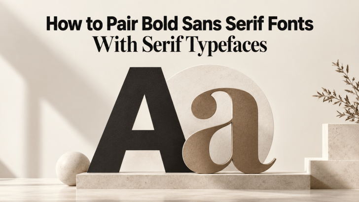
How to Pair Bold Sans Serif Fonts With Serif Typefaces

Learning how to pair bold sans serif fonts with serif typefaces can help designers create stronger contrast without making a layout feel disconnected. Bold sans serif fonts bring clarity, confidence, and visual impact, while serif typefaces add refinement, texture, and personality. When both styles are balanced well, the result can feel modern, polished, and easier …
Continue reading →

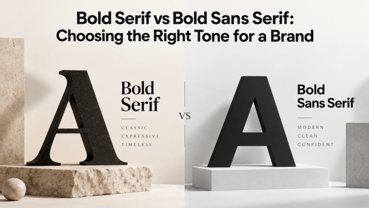
Bold Serif vs Bold Sans Serif: Choosing the Right Tone for a Brand

Comparing bold serif vs bold sans serif fonts can help you choose a typeface that matches the personality of your brand. Both styles can create strong visual impact, but they communicate very different moods. Bold serif fonts often feel more editorial, established, or sophisticated, while bold sans serif fonts usually feel cleaner, more direct, and …

Continue reading →

How to Balance Bold Serif Headlines With Readable Body Text

Understanding how to balance bold serif headlines with readable body text can help designers create layouts that feel expressive without becoming difficult to read. Bold serif fonts naturally attract attention through their strong weight and distinctive details, while cleaner body fonts help readers move through longer information comfortably. This combination works particularly well for fashion …

Continue reading →

The Rise of Bold Typography in Modern Graphic Design

The rise of bold typography in modern graphic design has transformed the way designers communicate visually. In today’s fast-paced digital world, capturing attention quickly is more important than ever. Bold typography has become a powerful tool for creating strong visual impact, conveying confidence, and delivering clear messages. From social media graphics to branding and web …

Continue reading →

5 Best Bold Fonts for Digital Design That Stand Out

Choosing the best bold fonts can dramatically improve the impact of your digital design. Bold typography is not just about thickness; it’s about visibility, hierarchy, and personality. In websites, apps, social media graphics, and branding projects, bold fonts help capture attention instantly and guide users through content. In this guide, we’ll explore five of the …

Continue reading →

Creative Ways to Use Bold Fonts in Digital Design

Using bold fonts effectively is one of the simplest yet most powerful ways to improve digital design. Bold typography instantly draws attention, creates hierarchy, and helps users understand what matters most on a screen. However, bold fonts are not just about making text thicker; they are about using emphasis strategically. In digital design, where users …

Continue reading →