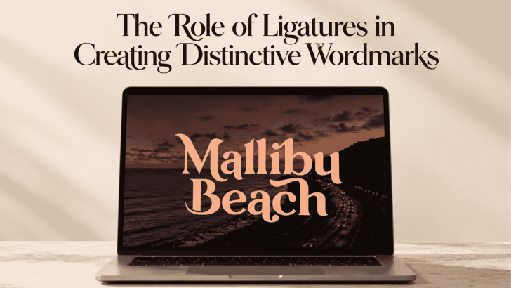
The Role of Ligatures in Creating Distinctive Wordmarks

Using ligatures in wordmark design can turn an ordinary sequence of letters into something more recognizable and distinctive. By connecting or reshaping specific character pairs, designers can create visual relationships that make a brand name feel custom rather than typeset straight from a font. When handled carefully, ligatures can add personality without making the wordmark …
Continue reading →

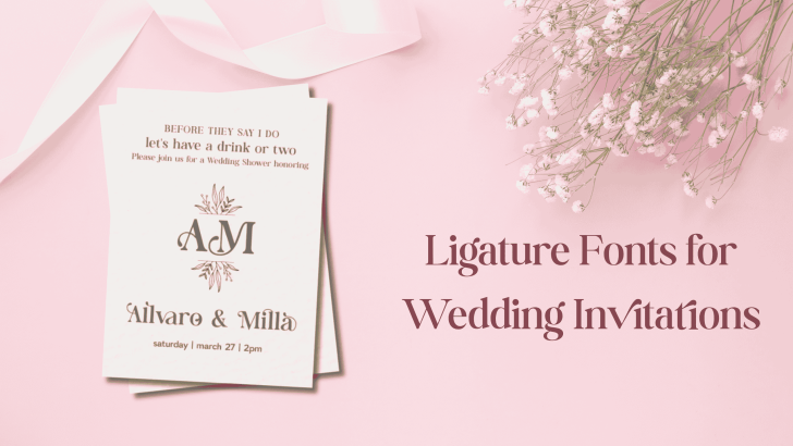
Ligature Fonts for Wedding Invitations

Choosing the right ligature fonts for wedding invitations can completely change the mood of your design. Wedding stationery often needs to feel personal, elegant, and memorable, and ligature fonts can add that extra level of detail without making the layout feel overly decorative. Unlike standard typefaces, ligature fonts connect or reshape certain letter combinations to …

Continue reading →

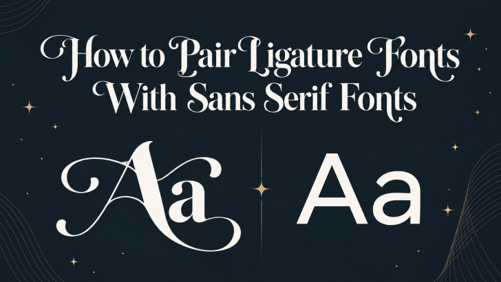
How to Pair Ligature Fonts With Sans Serif Fonts

Learning how to pair ligature fonts with sans serif fonts can help you create typography that feels expressive without becoming overwhelming. Ligature fonts often bring personality, elegance, and decorative detail, while sans serif fonts provide clarity, structure, and readability. When both styles work together, the result can feel balanced, modern, and visually distinctive. The challenge …

Continue reading →

Ligature Design in Branding: Elegant Detail or Visual Distraction?

Ligature design in branding can make a logo or visual identity feel refined, distinctive, and more memorable. By connecting or combining letterforms, ligatures introduce subtle details that can give typography a custom-made appearance. However, when they are overused or applied without purpose, they can also reduce readability and make a brand look unnecessarily complicated. For …

Continue reading →

How to Choose the Right Ligature Font for Your Brand

Learning how to choose the right ligature font for your brand can help you create a more distinctive visual identity without sacrificing readability. Ligature fonts can add elegant connections, custom-looking letterforms, and subtle personality to logos, packaging, websites, and campaign graphics. However, not every ligature style works for every brand. The best choice depends on …

Continue reading →

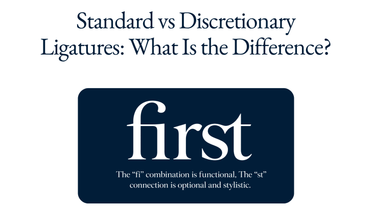
Standard vs Discretionary Ligatures: What Is the Difference?

Understanding standard vs discretionary ligatures can help designers make better typography decisions, especially when working with branding, editorial layouts, packaging, websites, and display type. Both types combine two or more characters into a specially designed glyph, but they serve different purposes. Standard ligatures mainly improve spacing and prevent awkward letter collisions, while discretionary ligatures are …

Continue reading →