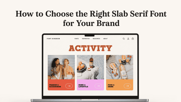
Choosing how to choose the right slab serif font for your brand starts with understanding what your brand needs to communicate. Slab serif fonts are known for their strong, block-like serifs and confident presence, but they are not all the same. Some feel editorial and sophisticated, while others look playful, industrial, retro, or bold.
That range makes slab serif fonts useful for fashion, food, lifestyle, retail, packaging, editorial design, and creative businesses. However, choosing a font simply because it looks attractive in a preview can lead to problems later. The typeface also needs to work with your audience, logo, website, packaging, social media, and other brand materials. A better approach is to evaluate the font as part of a complete visual system.
Understand What Makes Slab Serif Fonts Unique
Before choosing one, it helps to understand what separates slab serif typography from other serif styles. Slab serif fonts usually feature thicker and more prominent serifs. Their overall structure can feel heavier and more graphic than many traditional serif typefaces.
This visual weight gives slab serifs a stronger presence in headlines and branding. They can stand up well against photography, colorful backgrounds, and busy layouts. Traditional serif fonts often use more delicate terminals and stronger contrast between thick and thin strokes. As a result, they may communicate refinement, heritage, or elegance more naturally.
If you want to understand these differences before selecting a typeface, read What Makes Slab Serif Different From Traditional Serif Fonts? Knowing the basic characteristics makes it easier to decide whether a slab serif truly fits your brand.
1. Start With Your Brand Personality
The right typeface should support how you want people to describe the brand. Before browsing fonts, define three to five personality traits.
Your brand might be:
- Bold
- Friendly
- Premium
- Urban
- Playful
- Reliable
- Editorial
- Traditional
These words can immediately narrow the choices.
Bold and Contemporary Brands
Look for slab serifs with strong geometric structures, substantial weight, and clean letterforms. These fonts can work well for streetwear, creative agencies, sports brands, entertainment, or modern lifestyle products. A bold slab serif can make short brand names and campaign headlines feel confident without needing additional graphic effects.
Refined and Editorial Brands
Not every slab serif needs to feel heavy or industrial. Some designs combine noticeable serifs with more elegant proportions and controlled stroke contrast. These styles may suit fashion labels, boutique businesses, magazines, hospitality brands, and premium packaging. Generous spacing and restrained color palettes can make the typeface feel even more sophisticated.
For fashion-specific inspiration, explore Slab Serif Fonts for Fashion Brand Identity to see how slab serifs can create both colorful lifestyle branding and contemporary editorial identities.
2. Consider Your Target Audience
Typography communicates differently depending on who sees it. A slab serif for a youth-focused clothing brand may need more energy than a font used by a premium interior studio. Think about the visual language your audience already understands.
A younger fashion audience may respond to oversized typography, bold colors, and strong slab serif headlines. A premium customer may prefer more refined proportions, muted tones, and generous whitespace. The goal is not to copy competitors. Instead, understand which visual characteristics will make the brand feel relevant without losing its individuality.
3. Evaluate the Serif Shape
One of the biggest differences between slab serif fonts is the serif itself.
Square Slab Serifs
Square or rectangular serifs create a solid, structured appearance. They often feel confident, industrial, or geometric. These styles can work well for logos, packaging, posters, apparel, and brands that want a strong visual presence.
Rounded Slab Serifs
Rounded serifs feel softer and more approachable. They can retain the confidence of a slab serif while reducing some of its visual hardness. This makes them suitable for lifestyle brands, cafés, children’s products, casual fashion, and friendly consumer businesses.
Bracketed Slab Serifs
Some slab serif fonts use curved transitions where the serif connects to the main stroke. This detail can make the typeface feel closer to traditional serif typography. Bracketed slabs are useful when a brand needs strength without appearing overly rigid.
4. Check the Font Weight
Weight affects both personality and usability. A heavy slab serif can create an excellent campaign headline but may become overwhelming when used everywhere.
Heavy Weights for Impact
Bold and black weights can work well for posters, packaging fronts, website hero sections, logos, and social media campaigns. Because slab serifs already have strong forms, large heavy text can become a major part of the visual composition.
Regular Weights for Flexibility
Regular and medium weights are often more flexible. They can support smaller section headings, subheadings, and selected supporting text while maintaining the slab serif character. If the font family includes several weights, you can create hierarchy without introducing additional typefaces.
5. Test Readability at Different Sizes
A good brand font needs to work outside a large preview image. Test the slab serif with real brand content. Type your company name, product categories, campaign headlines, prices, short descriptions, and website navigation. Some slab serif fonts have tight counters or highly stylized shapes that become difficult to recognize when reduced.
Test Small Applications
Consider how the font looks on product labels, clothing tags, business cards, mobile headers, and small social media graphics. If important letters lose clarity, reserve the typeface for larger display applications and pair it with a simpler font for supporting information.
Test Large Applications
Also review the font on signs, posters, packaging, banners, and website hero sections. At large sizes, details that looked subtle in a font preview may become much more noticeable. The right slab serif should still feel connected to the intended brand personality.
6. Decide Where the Slab Serif Will Be Used
You do not have to use one typeface for everything. A slab serif often works best as the personality font within a broader typography system.
Logo and Brand Name
Using a slab serif for the logo can create strong recognition. Make sure the lettering remains identifiable at both large and small sizes.
Campaign Headlines
This is one of the strongest applications for slab serif typography. Large serifs can help campaign titles compete with photography and graphics.
Packaging
Slab serifs can make product names and categories easy to notice on shelves. They work particularly well when paired with simpler typography for ingredients, specifications, and legal information.
Websites
Use the slab serif for hero headlines and major section titles. A clean sans serif can handle navigation, paragraphs, buttons, forms, and product information. This creates contrast while preserving usability.
7. Choose the Right Supporting Font
A strong slab serif does not need another attention-grabbing typeface beside it. In many cases, the best partner is a simple sans serif. The slab serif can communicate brand personality, while the sans serif provides clarity.
For example:
Slab Serif: Logo and main headlines
Sans Serif: Body text, navigation, buttons, product descriptions
You could also pair a bold slab serif with a more traditional serif for editorial projects, but make sure there is enough contrast between the two families. Similar serif fonts can make the hierarchy unclear.
8. Consider Color and Photography
Fonts do not exist in isolation. The colors and images surrounding them will change how they feel. A heavy black slab serif on a bright orange background can look energetic and youthful. The same font in cream against dark brown may feel more heritage-inspired.
Likewise, a slab serif paired with street photography can communicate urban fashion, while the same typeface with minimalist product photography may feel contemporary and premium. Test the typography inside realistic brand compositions before committing to it.
9. Check Flexibility Across Print and Digital
Brand identities rarely stay in one format. The font may appear on websites, social media, packaging, merchandise, advertisements, signage, and printed materials. Make sure it performs consistently in all of them.
For digital use, check whether the available font files support your website requirements and whether the typeface remains clear on different screens.
For print, test actual samples. Fine details, letter spacing, and weight may look different when printed on textured paper, fabric, cardboard, or other packaging materials.
9. Check Flexibility Across Print and Digital
Brand identities rarely stay in one format. The font may appear on websites, social media, packaging, merchandise, advertisements, signage, and printed materials. Make sure it performs consistently in all of them.
For digital use, check whether the available font files support your website requirements and whether the typeface remains clear on different screens.
For print, test actual samples. Fine details, letter spacing, and weight may look different when printed on textured paper, fabric, cardboard, or other packaging materials.
10. Avoid Choosing a Font Only Because It Is Trending
Typography trends can be useful inspiration, but brand identities usually need to last longer than one design season. A trendy slab serif may attract attention today but feel disconnected from the brand a year later.
Ask whether the font still makes sense without current design trends around it. Does it reflect the product? Does it fit the customer? Can it support future campaigns and new product categories?
A strong brand typeface should have enough personality to be recognizable but enough flexibility to grow with the business.
Build a Slab Serif System, Not Just a Logo
Learning how to choose the right slab serif font for your brand means looking beyond a single attractive wordmark. The typeface should support brand personality, audience expectations, hierarchy, readability, and real-world applications.
Start by defining the mood you want to communicate. Then compare serif structures, weights, proportions, and readability. Test the font on packaging, websites, social media, and printed materials before making the final decision.

One Comment