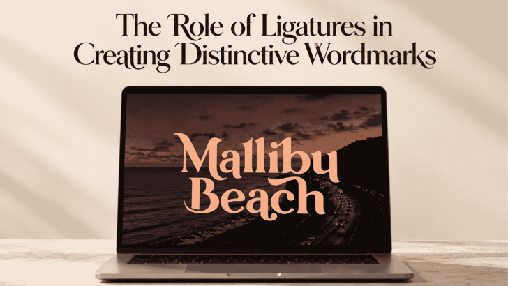
The Role of Ligatures in Creating Distinctive Wordmarks

Using ligatures in wordmark design can turn an ordinary sequence of letters into something more recognizable and distinctive. By connecting or reshaping specific character pairs, designers can create visual relationships that make a brand name feel custom rather than typeset straight from a font. When handled carefully, ligatures can add personality without making the wordmark …
Continue reading →

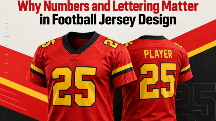
Why Numbers and Lettering Matter in Football Jersey Design

A strong football jersey design isn’t just about team colors, logos, or sponsor placement. Numbers and lettering also play a major role in how a jersey looks, feels, and performs visually. From the player’s name on the back to the large number below it, typography helps turn a basic sports uniform into a recognizable identity. …

Continue reading →

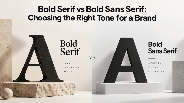
Bold Serif vs Bold Sans Serif: Choosing the Right Tone for a Brand

Comparing bold serif vs bold sans serif fonts can help you choose a typeface that matches the personality of your brand. Both styles can create strong visual impact, but they communicate very different moods. Bold serif fonts often feel more editorial, established, or sophisticated, while bold sans serif fonts usually feel cleaner, more direct, and …

Continue reading →

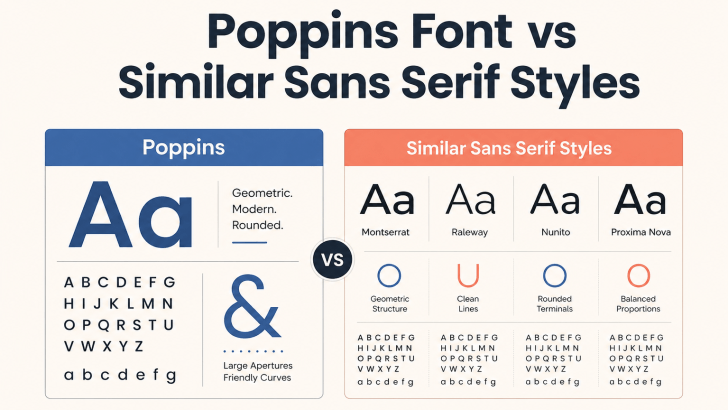
Poppins Font vs Similar Sans Serif Styles

Comparing Poppins font vs similar sans serif styles can help designers decide whether to keep a familiar geometric look or move toward a more distinctive visual identity. Poppins is popular for its clean shapes, balanced proportions, and flexible weights, but many modern sans serif fonts offer a similar sense of clarity with different personalities. The …

Continue reading →

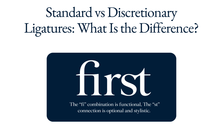
Standard vs Discretionary Ligatures: What Is the Difference?

Understanding standard vs discretionary ligatures can help designers make better typography decisions, especially when working with branding, editorial layouts, packaging, websites, and display type. Both types combine two or more characters into a specially designed glyph, but they serve different purposes. Standard ligatures mainly improve spacing and prevent awkward letter collisions, while discretionary ligatures are …

Continue reading →

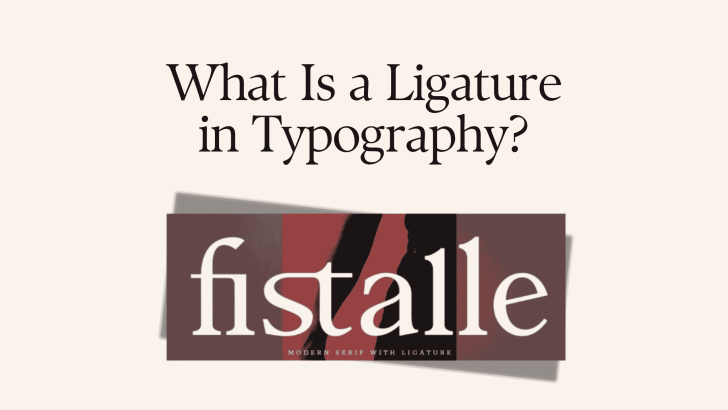
What Is a Ligature in Typography?

Understanding ligatures in typography can help designers create text that feels more polished, connected, and visually distinctive. A ligature is a special character created when two or more letters are combined into one glyph. Instead of displaying each letter separately, the typeface replaces certain combinations with a custom shape that improves spacing, appearance, or stylistic …

Continue reading →