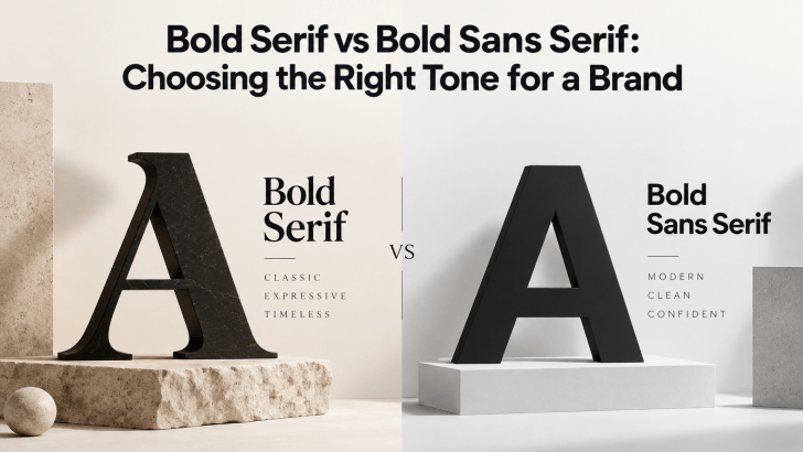
Comparing bold serif vs bold sans serif fonts can help you choose a typeface that matches the personality of your brand. Both styles can create strong visual impact, but they communicate very different moods. Bold serif fonts often feel more editorial, established, or sophisticated, while bold sans serif fonts usually feel cleaner, more direct, and more contemporary.
The right choice depends on what your brand wants people to feel. A premium fashion label may need elegance and authority, while a sports or technology brand may benefit from a stronger, more modern tone. Understanding the visual differences makes it easier to choose typography that supports the brand instead of simply following a trend.
What Is a Bold Serif Font?

A bold serif font uses thick letterforms combined with visible serifs, the small strokes attached to the ends of letters. These details add structure and personality, especially at larger sizes. Bold serif fonts can feel confident without losing refinement. They are often used in fashion, editorial design, premium packaging, beauty, hospitality, publishing, and luxury branding.
Common Characteristics of Bold Serif Fonts
Bold serif fonts usually have strong contrast, prominent serifs, and a more traditional or editorial appearance. Some feel elegant and high-end, while others look more dramatic or vintage.
Examples of well-known bold serif styles include Circle Amolens, Candy Psyche, and Easter Kelly. Each one creates a different mood, from structured and authoritative to soft and expressive.
What Is a Bold Sans Serif Font?

Bold sans serif fonts remove serifs and rely on thick, clean strokes. This gives them a more straightforward appearance and often makes them feel modern, energetic, and highly visible. They are commonly used in technology, sports, lifestyle, streetwear, digital products, advertising, and contemporary corporate branding.
Common Characteristics of Bold Sans Serif Fonts
Bold sans serif fonts often have simple shapes, strong weight, and minimal decoration. They can communicate confidence without feeling traditional.
Examples include Kazime, Keneth, and Vaneska. These styles work well in logos, headlines, digital interfaces, posters, and advertising.
Key Differences: Bold Serif vs. Bold Sans Serif
The biggest difference is not simply the presence or absence of serifs. The two categories also influence tone, hierarchy, and visual perception differently.
1. Bold Serif Feels More Editorial
A bold serif naturally introduces more detail into the letterforms. This can make a brand feel established, sophisticated, or expressive. For example, a fashion campaign using an oversized serif headline may resemble the visual language of a magazine cover. The same approach can work for beauty products, boutique hotels, or premium food packaging. Bold serif typography is especially effective when the brand wants personality without using decorative script fonts.
2. Bold Sans Serif Feels More Direct
Bold sans serif fonts usually create a cleaner visual statement. Their simple construction makes messages feel immediate and easy to scan. This is useful for brands that want to communicate speed, functionality, confidence, or modernity. Sports promotions, apps, fitness brands, and digital advertising often use bold sans serif typography because it remains clear even at smaller sizes.
Examples of Bold Serif in Branding
Bold serif fonts can work particularly well for brands that need strong personality and visual authority. A fashion label might use a bold serif for collection names and campaign headlines. Meanwhile, a coffee brand could use it on packaging to create a more handcrafted or premium feel. An editorial website may use it for article titles to create contrast against simpler body text.
The surrounding design matters too. Bold serif typography paired with dark photography, neutral colors, and generous whitespace can feel luxurious. The same font used with bright colors and playful illustrations may feel more retro or expressive.
Examples of Bold Sans Serif in Branding
Bold sans serif fonts are especially effective when clarity and visibility are priorities. A sports brand may use large uppercase sans serif headlines to communicate movement and strength. Meanwhile, a technology company may use bold geometric sans serif typography to feel modern and efficient. A streetwear campaign can use condensed bold sans serif lettering to create a more urban and energetic visual language.
Because these fonts are usually simpler, they can also support busy photography or colorful backgrounds without creating too much visual competition.
How to Choose Between Bold Serif and Bold Sans Serif
The best choice starts with the brand personality.
1. Choose Bold Serif for Sophistication
A bold serif may be the better option if your brand needs to feel:
- Premium
- Editorial
- Elegant
- Established
- Artistic
- Heritage-inspired
It works well when the typography itself should become part of the brand personality.
2. Choose Bold Sans Serif for Modern Clarity
A bold sans serif is often better when the brand needs to feel:
- Modern
- Energetic
- Minimal
- Functional
- Confident
- Accessible
Its clean structure makes it especially useful across digital platforms.
3. Consider the Audience
Different audiences may respond to typography differently. A high-end fashion customer may expect a more refined visual identity, while a younger sports audience may respond better to bold, direct lettering.
Think about how the audience should describe the brand after seeing it. If the goal is “sophisticated and editorial,” a bold serif is worth testing. Meanwhile, if the goal is “fast, modern, and confident,” a bold sans serif may feel more natural.
4. Test the Font Across Real Applications
Do not choose a bold font based only on a logo mockup. Test it across the full brand system.
Use it on:
- Website hero sections
- Packaging
- Social media posts
- Advertising
- Product labels
- Posters
- Mobile layouts
A bold serif that looks excellent at 72 pixels may become too detailed on a small mobile interface. In comparison, a bold sans serif may remain clear at smaller sizes but feel too neutral for a premium campaign. Testing helps reveal those differences early.
5. Pair Bold Fonts With Simpler Body Text
Bold fonts are most effective when they have enough contrast with supporting typography. If you use a bold serif for the headline, pair it with a clean sans serif for body copy. If the headline uses a bold sans serif, a lighter sans serif or readable serif can create contrast. Avoid using heavy weights everywhere. When the headline, subheading, and body text are all equally bold, hierarchy disappears.
For a more detailed explanation of this approach, read How to Balance Bold Serif Headlines With Readable Body Text. It shows how size, weight, spacing, and contrast can make strong typography easier to read.
Conclusion
The choice between bold serif vs bold sans serif comes down to the tone your brand needs to communicate. Bold serif fonts often feel more editorial, premium, and expressive, while bold sans serif fonts usually create a cleaner, more modern, and direct impression.
Neither style is automatically better. The most effective choice is the one that matches the audience, works across real applications, and supports the brand personality consistently.

One Comment