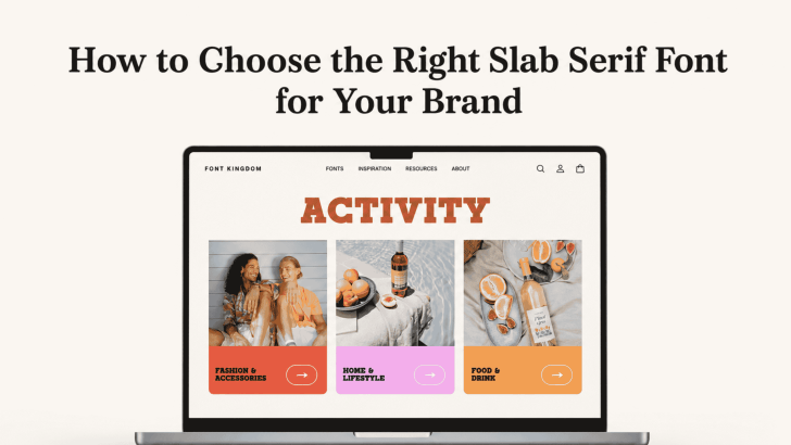
How to Choose the Right Slab Serif Font for Your Brand

Choosing how to choose the right slab serif font for your brand starts with understanding what your brand needs to communicate. Slab serif fonts are known for their strong, block-like serifs and confident presence, but they are not all the same. Some feel editorial and sophisticated, while others look playful, industrial, retro, or bold. That …
Continue reading →

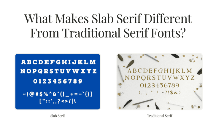
What Makes Slab Serif Different From Traditional Serif Fonts?

Understanding what makes slab serif different from traditional serif fonts can help designers choose typography with the right personality for branding, editorial layouts, packaging, websites, and advertising. Both styles belong to the serif family, but they communicate very different moods. Traditional serif fonts tend to feel refined and literary, while slab serifs often look stronger, …

Continue reading →

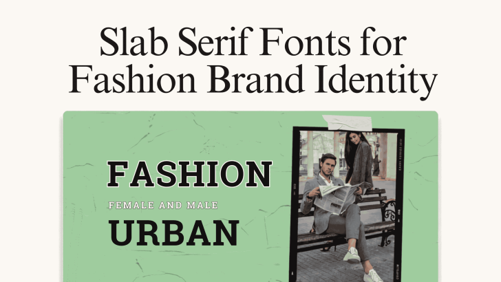
Slab Serif Fonts for Fashion Brand Identity

Choosing slab serif fonts for fashion brand identity can give a clothing or lifestyle brand a stronger, more recognizable visual personality. With their bold serifs, structured shapes, and confident presence, slab serif fonts can work particularly well for fashion labels that want to feel expressive without relying on overly decorative typography. Fashion branding appears across …

Continue reading →