Understanding how to balance bold serif headlines with readable body text can help designers create layouts that feel expressive without becoming difficult to read. Bold serif fonts naturally attract attention through their strong weight and distinctive details, while cleaner body fonts help readers move through longer information comfortably.
This combination works particularly well for fashion campaigns, editorial graphics, social media posts, websites, advertising, and luxury branding. The key is not simply choosing two attractive fonts. Both styles need clear roles, so they support each other rather than compete for attention.
Why Bold Serif Headlines Need Simpler Body Text
Bold serif fonts have a strong visual personality. Thick strokes, prominent serifs, and noticeable contrast can make even a short phrase dominate the composition. That makes them excellent for headlines, but less practical for long paragraphs.
Body text needs a different function. Its job is to communicate information smoothly, not become the main visual attraction. A clean sans serif usually creates an effective contrast because its simpler structure gives the eye a place to rest after the stronger headline. The relationship creates hierarchy: the serif catches attention, while the sans serif keeps the message accessible.
How to Balance Bold Serif Headlines With Readable Body Text

Give Each Typeface a Clear Role
Start by defining which font handles each type of information. A simple system might look like this:
Bold serif: Main headline
Bold sans serif: Subheading or short callout
Regular sans serif: Body text, captions, and supporting information
This structure prevents every element from competing for attention. The bold serif becomes the visual anchor, while the sans serif handles practical communication.
If you want more inspiration for strong headline typography, explore 5 Best Bold Fonts for Digital Design That Stand Out for font styles that can create more impact in digital layouts.
Create Enough Difference in Size
A bold serif headline should be noticeably larger than the supporting copy. If the headline and body text are too similar in size, the visual hierarchy becomes unclear. For example, a digital design might use a 48–64 px serif headline and 16–20 px body text. The exact sizes depend on the font, but the difference should be immediately visible. Subheadings can sit between those levels to guide readers into the next section.
Pair Bold Serif With a Clean Sans Serif
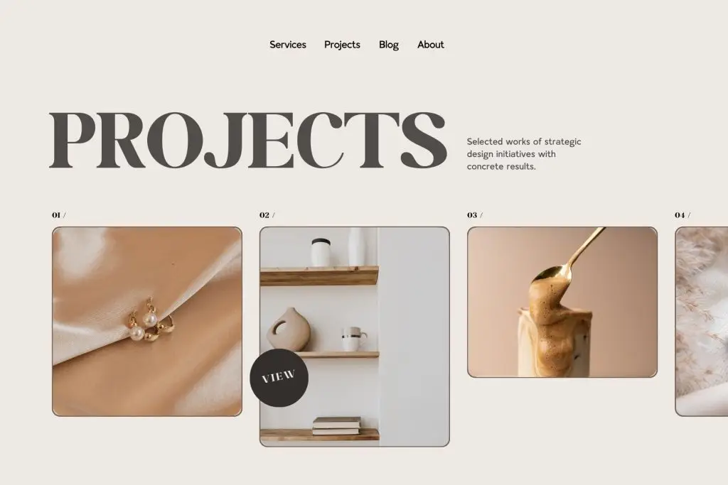
Keep the Body Font Neutral
The body typeface should not have too many unusual details. Clean letterforms, open counters, and balanced spacing help longer text feel more comfortable. A neutral sans serif allows the personality of the bold serif headline to remain dominant.
Use Bold Sans Serif Carefully
Bold sans serif can still play a useful role, especially for short supporting text. It may be used for labels, small campaign statements, categories, or calls to action. However, avoid making both the serif headline and every supporting line equally bold. If too many elements have strong weight, the composition begins to feel heavy.
Use Whitespace to Control Visual Weight
Bold typography can quickly make a layout feel dense. Whitespace is one of the easiest ways to create balance. Leave enough space between the headline and body copy. Avoid placing supporting information directly against large serif letterforms. Line spacing also matters. A multi-line bold headline can use relatively compact leading to feel powerful, while body text should have more breathing room for comfortable reading.
Keep Line Length Comfortable
Readable body text should not stretch across the entire layout. Very wide lines make it harder for readers to move from the end of one line to the beginning of another. Use a controlled text width, particularly on websites and editorial layouts. A narrower text column also creates stronger visual contrast with an oversized headline.
For social media graphics, body copy should be even shorter. A few concise lines are usually more effective than a paragraph inside the design.
Match the Font Personality
Contrast does not mean the fonts should feel completely unrelated. The serif and sans serif still need to belong to the same visual world. A sophisticated high-contrast serif can pair with a refined modern sans serif for fashion or luxury branding. A heavier slab-style serif may work better with a geometric sans serif for a bolder contemporary identity. Compare proportions, letter width, and overall tone rather than choosing fonts only by category.
Test the Pairing on Different Screens
A pairing that feels balanced on a desktop may behave differently on mobile. Large serif headlines may wrap into too many lines, while supporting copy may become too small. Adjust headline scale and spacing at smaller breakpoints instead of simply shrinking everything proportionally. Also check contrast. Thin body text beside a very heavy headline can appear weaker on small screens, so a regular or medium sans serif weight may work better.
Build Hierarchy Without Overdesigning
The strongest font pairing does not require multiple colors, shadows, outlines, or decorative effects. Typography itself can create enough contrast through size and structure. This is a useful principle for fashion, editorial, and premium brand design: let the typefaces create the hierarchy first, then use other visual effects only when they add a clear purpose.
Conclusion
Knowing how to balance bold serif headlines with readable body text comes down to giving each typeface a specific role. Let the serif create personality and visual impact, while a clean sans serif supports longer reading, captions, labels, and practical information.
Use size contrast, whitespace, controlled font weights, and clear spacing to establish the hierarchy. As shown in the attached design, one strong serif headline paired with restrained sans serif support can create a sophisticated layout without making the typography feel crowded.

One Comment