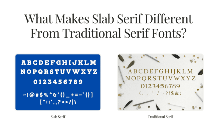
Understanding what makes slab serif different from traditional serif fonts can help designers choose typography with the right personality for branding, editorial layouts, packaging, websites, and advertising. Both styles belong to the serif family, but they communicate very different moods. Traditional serif fonts tend to feel refined and literary, while slab serifs often look stronger, heavier, and more direct.
The difference comes mainly from the shape of the serifs, stroke contrast, and overall proportions. These details may seem small, but they can significantly change how a brand or design feels.
What Is a Slab Serif Font?
A slab serif is a serif typeface known for thick, block-like serifs. These serifs may be angular and geometric or slightly rounded, depending on the design. Some slab serif families have minimal contrast between thick and thin strokes, while others are closer to traditional serif structures but use much heavier terminals. Popular slab serif styles include Clarendon, Rockwell, and geometric designs inspired by nineteenth-century display typography.
If you want a broader introduction to the serif category before comparing the two styles, explore What Is a Serif Font? History, Features, and Examples.
A Brief History of Slab Serif Fonts
Slab serif typography emerged in the early nineteenth century, when printed advertising, posters, and commercial signage needed typefaces that could attract attention from a distance. Earlier serif fonts had mainly developed around books and long-form reading, where elegance and comfortable text flow were important. Slab serifs answered a different need: impact.
These early styles were sometimes called Egyptian or antique typefaces. Their large serifs and heavier structures made them useful in the expanding world of advertising and industrial printing.
One important development was Clarendon, released in 1845 and credited to Robert Besley. Clarendon retained some characteristics of traditional serif typography but strengthened the serifs and reduced the contrast between strokes, helping establish a style that later influenced many slab serif designs.
As printing methods evolved, slab serifs moved beyond posters and signage. Designers began using them for newspapers, editorial headlines, packaging, corporate identities, and eventually digital interfaces.
Slab Serif vs Traditional Serif: Key Differences in Appearance
The easiest way to understand the difference is to look closely at the letterforms.
1. Serif Shape
Traditional serif fonts often have thinner, more tapered serifs. These small finishing strokes may transition smoothly into the main letterform. Slab serif fonts use much heavier serifs. They can appear rectangular, square, or rounded, giving the letters a more solid foundation.
For example, compare a traditional serif headline with a geometric slab serif. The traditional serif usually feels lighter and more elegant, while the slab serif looks stronger and more graphic.
2. Stroke Contrast
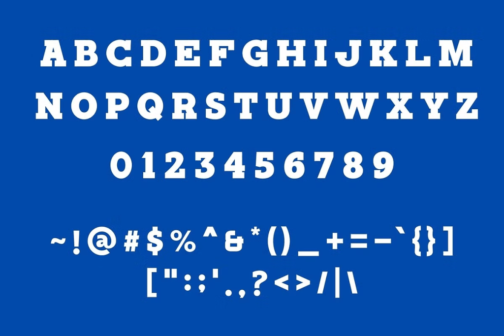
Many traditional serif typefaces use noticeable contrast between thick and thin strokes. This contrast can create an elegant rhythm that works beautifully in books, magazines, luxury branding, and editorial design.
Slab serifs often reduce that contrast. Some styles use almost uniform stroke widths, which creates a more stable and substantial appearance. Geometric slab serif designs such as Karens are especially associated with this construction.
3. Visual Weight
Traditional serifs can range from delicate to bold, but they usually retain a sense of refinement. Slab serifs often feel heavier even at similar font sizes because their serifs add more visual mass. This makes slab serif typography particularly noticeable in headlines, posters, logos, and campaign graphics.
4. Overall Personality
A traditional serif may communicate elegance, heritage, authority, or sophistication, whereas slab serif can communicate confidence, strength, friendliness, retro character, or an editorial attitude.
However, these are not strict rules. A modern slab serif can feel luxurious, while a contemporary traditional serif can feel bold and experimental. The final impression depends on spacing, weight, color, imagery, and layout.
Differences in Usage
Traditional serif and slab serif fonts also tend to perform different roles.
Traditional Serif for Long-Form and Refined Design
Traditional serif fonts are commonly used for books, editorial articles, luxury branding, fashion publications, invitations, and premium packaging. Their more delicate structures can create a sophisticated reading experience. This is one reason serif typography remains popular in industries where heritage and elegance matter.
Slab Serif for Bold Headlines and Branding
Slab serif fonts naturally attract attention because of their stronger forms. They can be effective for campaign titles, posters, packaging, apparel branding, product names, and logos. The style works particularly well when typography needs to compete with strong photography or colorful backgrounds.
For fashion-related examples, read Slab Serif Fonts for Fashion Brand Identity to see how slab serif typography can support editorial, urban, and lifestyle-focused identities.
Slab Serif for Editorial Layouts
Slab serifs are also useful for magazine-style compositions. Their strong shapes can create contrast against lighter body text. A designer might use a slab serif for article headlines and a traditional serif or sans serif for paragraphs. This creates a clear hierarchy while keeping the page comfortable to read.
Traditional Serif for Luxury Branding
Traditional serif fonts often feel natural in premium fashion, jewelry, beauty, hospitality, and high-end lifestyle branding. Their thin strokes and elegant proportions can support restrained visual identities. However, brands that want luxury with a stronger and less delicate personality may prefer a slab serif instead.
Choosing Between Slab Serif and Traditional Serif
What makes slab serif different from traditional serif fonts comes down to more than the size of the serifs. Slab serifs usually feature stronger terminals, heavier visual weight, and less stroke contrast, while traditional serifs often use more refined forms and greater variation between thick and thin strokes.
That difference changes where each style works best. Traditional serif fonts can support elegance and long-form reading, while slab serifs can bring more confidence to branding, posters, packaging, and display typography.

One Comment