Learning how to choose the right ligature font for your brand can help you create a more distinctive visual identity without sacrificing readability. Ligature fonts can add elegant connections, custom-looking letterforms, and subtle personality to logos, packaging, websites, and campaign graphics. However, not every ligature style works for every brand.
The best choice depends on how the font balances function and expression. Some ligatures improve spacing, while others exist mainly to create a more decorative look. Understanding that difference is a good place to start.
1. Understand the Difference Between Standard and Discretionary Ligatures
Standard Ligatures
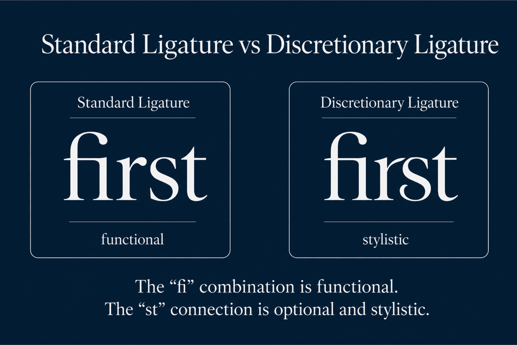
Standard ligatures are mainly functional. They combine common letter pairs such as fi, fl, ff, ffi, or ffl to prevent awkward spacing or collisions. These ligatures usually feel subtle and natural. They work well for brands that want polished typography without making every word look decorative. Standard ligatures are especially useful for editorial branding, premium packaging, websites, and businesses that need the same font to work across both headlines and longer text.
Discretionary Ligatures
Discretionary ligatures are optional stylistic combinations. They may connect pairs such as st, ct, th, or other letters that do not need to be combined for technical reasons. Their purpose is visual expression. They can make a logo, campaign headline, or product name feel more custom and memorable.
For a deeper comparison, read Standard vs Discretionary Ligatures: What Is the Difference? before deciding which type fits your branding needs.
2. Match the Ligature Style to Your Brand Personality
A ligature should support the personality of the brand rather than become a decorative feature with no clear purpose.
For Elegant and Premium Brands
Look for ligatures with smooth curves, refined connections, and controlled proportions. These styles can suit fashion, beauty, jewelry, hospitality, and luxury packaging. Use the most expressive ligatures in short brand names or campaign headlines. Keep supporting text simpler so the identity remains sophisticated.
For Modern and Creative Brands
A clean sans serif with unusual ligatures can help a contemporary brand feel more distinctive. These fonts may work well for creative studios, lifestyle businesses, digital products, and modern apparel labels. Choose connections that feel intentional rather than overly ornamental.
For Playful or Artistic Brands
More expressive discretionary ligatures can work well when the brand is built around personality. Extended strokes, unexpected connections, and stylized alternates can make short words visually memorable. However, test them carefully. The brand name should still be readable within a few seconds.
3. Check How the Font Performs in the Brand Name
A ligature font can look impressive in a specimen but offer few useful connections in your actual brand name. Type the complete name before making a decision. Check which letter pairs activate ligatures and whether those combinations improve the word.
For example, a font with beautiful st and th ligatures may be a strong choice if those pairs appear in your brand name. If none of the available ligatures appear in your text, another font may offer more value.
You can explore 20 Beautiful Ligature Fonts Designers Love in 2026 to compare different styles and find options with character combinations that suit your project.
4. Test Readability at Different Sizes
Ligatures often look best at display sizes, but a brand identity must usually work in smaller applications too.
Test the font on:
- Logos
- Product labels
- Social media profiles
- Website headers
- Business cards
- Packaging
- Mobile screens
If a decorative connection becomes difficult to recognize when reduced, reserve it for large headlines and use a standard version of the font at smaller sizes.
5. Avoid Using Every Available Ligature
A font may include dozens of stylistic combinations, but using all of them can make a brand look busy. Choose one or two distinctive connections that become part of the identity. This approach creates a recognizable detail without overwhelming the typography. For example, one unique ligature in the logo can become a signature feature that appears again in campaign headlines or packaging.
Build a Consistent Ligature System
Once you choose a font, define where standard and discretionary ligatures should appear. You might use standard ligatures throughout the website and packaging, while reserving discretionary ligatures for the logo and major campaign titles. This creates consistency while maintaining readability.
Knowing how to choose the right ligature font for your brand means balancing personality, function, and flexibility. Start by understanding the difference between standard and discretionary ligatures, then test the font with your actual brand name and real applications.
