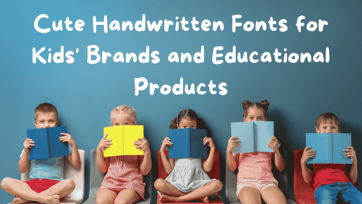
Cute Handwritten Fonts for Kids’ Brands and Educational Products

Choosing cute handwritten fonts for kids can instantly change the mood of a children’s brand or educational product. These fonts often feel more playful, personal, and approachable than rigid geometric typefaces. Used carefully, they can make worksheets, packaging, activity books, and learning materials feel warmer without sacrificing readability. The challenge is balancing personality and function. …

Continue reading →

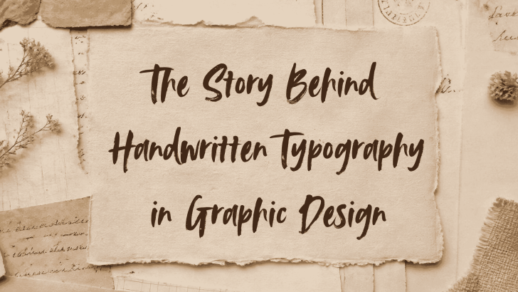
The Story Behind Handwritten Typography in Graphic Design

Handwritten typography in graphic design has always carried something that digital type can struggle to reproduce: a sense of human presence. Long before designers worked with vector tools and font libraries, letters were drawn, painted, carved, and written by hand. That history still influences the way handwritten styles are used today, especially in branding, packaging, …

Continue reading →

What Designers Should Look for in a Poppins Alternative

Choosing the right Poppins alternative is not simply about finding another geometric sans serif that looks similar. Designers also need to consider readability, personality, flexibility, and how the typeface behaves across different brand applications. A good replacement should preserve the clean modern feeling that makes Poppins popular while giving the design enough distinction to avoid …

Continue reading →

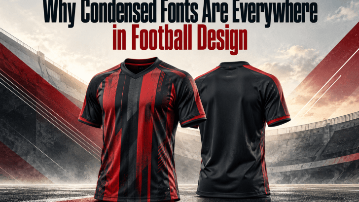
Why Condensed Fonts Are Everywhere in Football Design

Condensed fonts in football design have become a familiar visual language across jerseys, match posters, social media graphics, and club branding. Their tall, narrow letterforms help designers create bold typography without taking up too much horizontal space. More importantly, they bring a sense of speed, strength, and competition that feels naturally connected to football. That …

Continue reading →

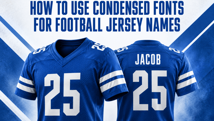
How to Use Condensed Fonts for Football Jersey Names

Using condensed fonts for football jersey names can help designers fit longer player names into limited back-of-shirt space without making the typography feel cramped. Their narrow proportions also create a strong athletic appearance that works naturally with large jersey numbers. However, choosing a condensed typeface is only the first step. You also need to manage …

Continue reading →