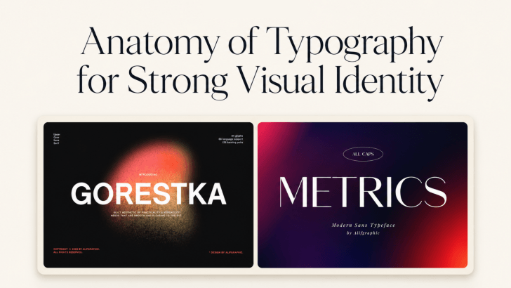
Understanding the anatomy of typography for strong visual identity is not only about knowing technical terms such as baseline, x-height, or counter. It is also about recognizing how the structure of a typeface shapes the way a brand feels. Letter width, curves, angles, and stroke contrast can make the same word appear luxurious, friendly, bold, modern, or editorial.
For designers and brands, this matters because typography often becomes one of the most repeated visual elements across logos, packaging, websites, social media, and advertising. The right letterform structure can help all of those touchpoints feel connected.
Why Letterform Structure Shapes Brand Identity
Every typeface has its own visual rhythm. Some letters feel compact and structured, while others appear open and relaxed. These differences influence how people perceive a brand before they even focus on the actual message.
A fashion label may use narrow letterforms to create an editorial feeling. A wellness brand may prefer softer curves that feel welcoming. Meanwhile, a creative studio could use sharper forms to communicate energy and individuality. This is why choosing a font based only on whether it looks attractive can be limiting. Designers should also consider whether the structure supports the brand personality and remains recognizable across different applications.
If you want to understand the technical parts behind these forms first, explore The Anatomy of Typography: A Beginner-Friendly Guide. It provides a useful foundation before evaluating how letter structure affects branding.
How Typography Anatomy Creates Brand Personality
Typography can express personality through several structural characteristics. Rather than focusing only on font categories such as serif or sans serif, look more closely at the proportions and shapes inside the typeface.
Wide vs Condensed Letterforms
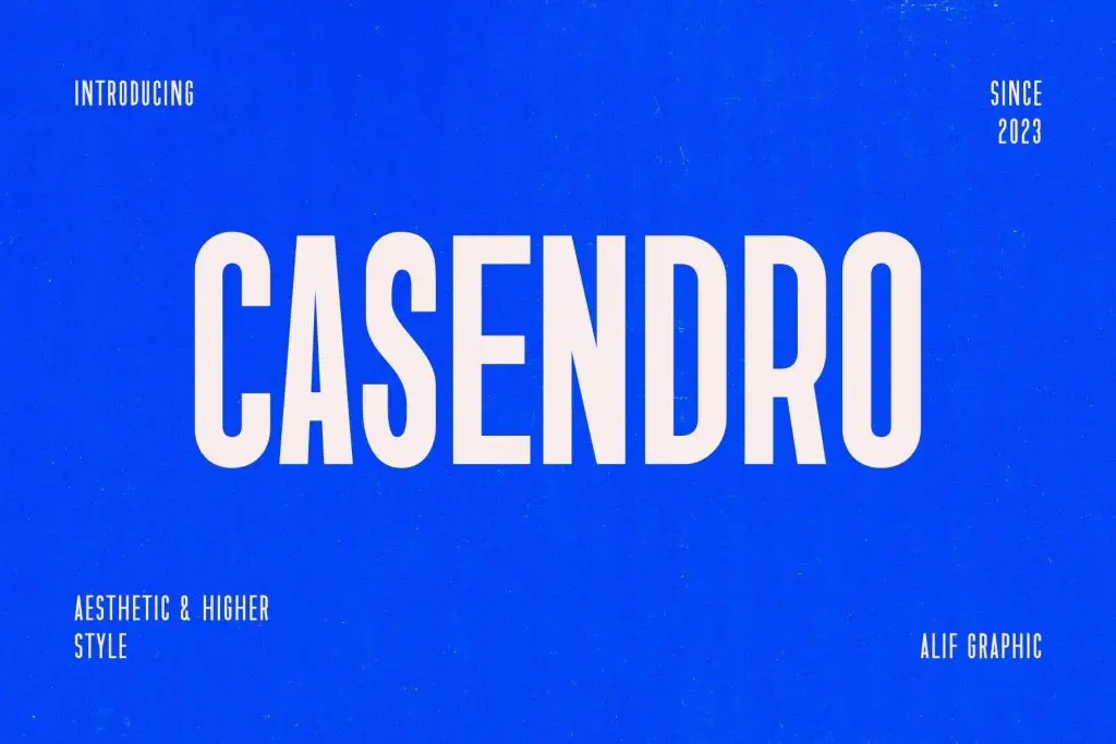
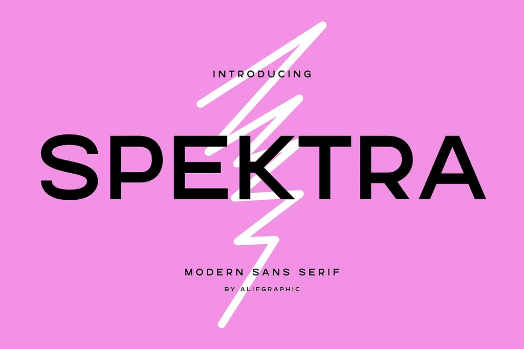
Letter width can dramatically change the mood of a visual identity. Wide typefaces often feel open, confident, and relaxed because each character occupies more horizontal space. They can work well for lifestyle brands, modern retail, hospitality, or businesses that want an approachable presence.
Condensed letterforms create a different impression. Their narrower proportions can feel more editorial, urban, efficient, or bold. They also work well for fashion posters, packaging, and headlines where designers need strong typography in limited space.
The key is to match the proportion with the intended brand experience. A condensed font may give a streetwear campaign more impact, while a wider typeface can help a casual lifestyle brand feel more welcoming.
Curves vs Sharp Angles
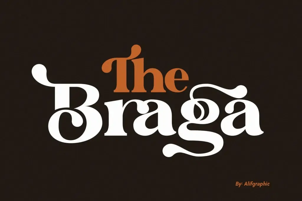

Curves and angles also influence how typography feels emotionally. Rounded shapes often create a softer and friendlier appearance. They can work well for beauty, wellness, food, children’s products, or lifestyle brands that want to feel approachable.
Sharp angles communicate something different. They can make typography feel modern, energetic, edgy, or precise. Fashion labels, technology brands, creative studios, and sports-related identities may benefit from these stronger details.
For a deeper look at how these visual choices influence emotional response, read How Typography Affects Visual Perception in Graphic Design.
High vs Low Stroke Contrast
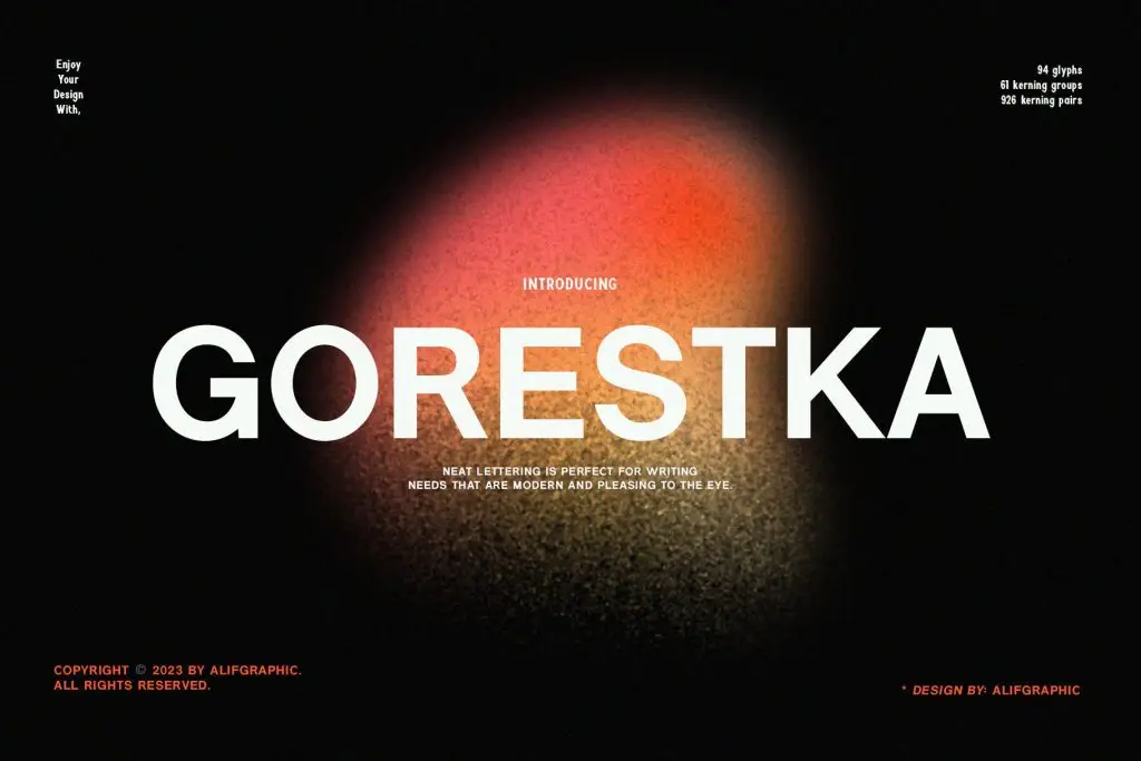
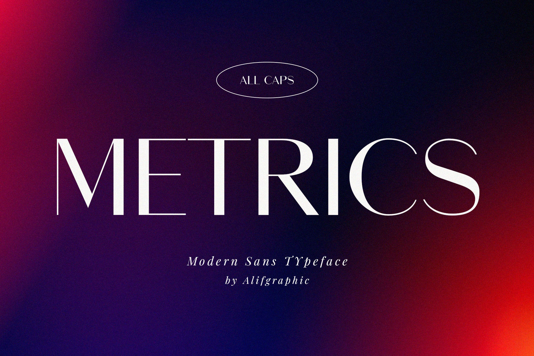
Stroke contrast describes the difference between thick and thin parts of a letter. High-contrast typefaces often create a refined and elegant appearance. They are commonly associated with luxury fashion, editorial design, beauty, and premium branding.
Low-contrast fonts have more consistent stroke thickness. This can create a stronger, cleaner, and more stable visual impression. They often work well for contemporary brands, packaging, digital products, and modern websites.
A brand that wants to feel sophisticated might choose high contrast for its logo or campaign headline. Meanwhile, a company that values simplicity and accessibility may prefer lower contrast throughout its typography system.
Turn Letterform Choices Into a Consistent Identity
A strong visual identity does not come from one beautiful logo alone. The chosen typography should work across different formats while keeping the same personality.
Test the font on website headlines, packaging labels, social media posts, printed materials, and small interface elements. A distinctive letterform may look impressive at a large size but lose its personality or readability when reduced.
Consistency is equally important. If the brand uses wide, soft typography in its logo but suddenly switches to narrow, angular fonts in promotional graphics, the identity may feel disconnected.
The goal is to build a system where the same visual characteristics repeat naturally across every touchpoint.
Choose Typography by Structure, Not Trend Alone
The anatomy of typography for strong visual identity becomes most useful when designers look beyond current font trends. Instead of asking only whether a typeface feels stylish, ask what its structure communicates.
Are the letters wide or condensed? Do the forms rely on soft curves or sharp angles? Is the stroke contrast dramatic or subtle? These characteristics can reveal whether a font truly supports the intended brand personality.

2 Comments