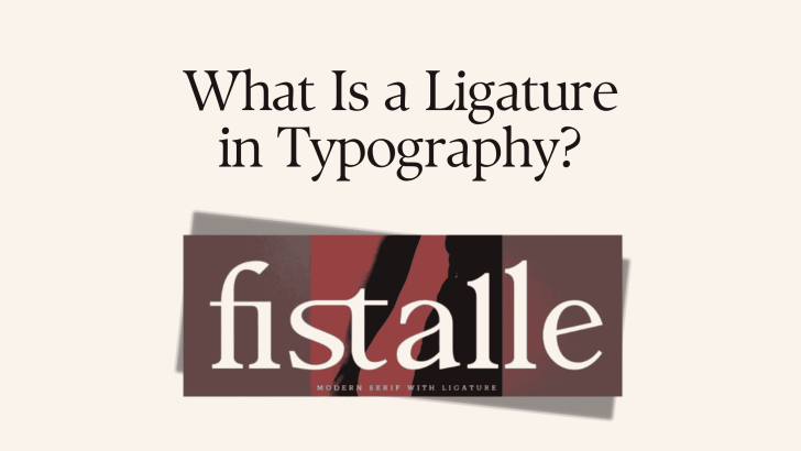
Understanding ligatures in typography can help designers create text that feels more polished, connected, and visually distinctive. A ligature is a special character created when two or more letters are combined into one glyph. Instead of displaying each letter separately, the typeface replaces certain combinations with a custom shape that improves spacing, appearance, or stylistic character.
Ligatures have existed for centuries, long before digital fonts. They developed from handwriting, calligraphy, and early printing methods where connecting letters could make writing faster and solve awkward spacing between specific characters. Today, ligatures remain an important OpenType feature in many serif, sans serif, script, and display fonts.
For designers, understanding how they work can make it easier to choose fonts for logos, editorial layouts, packaging, websites, quotes, and branding projects.
What Is a Ligature in Typography?
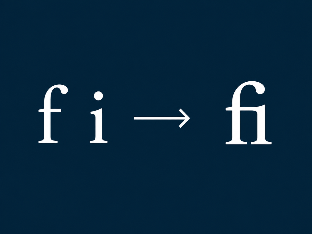
A ligature combines multiple characters into one specially designed glyph. Common examples include letter combinations such as fi, fl, ff, ffi, and ffl. Without a ligature, certain letters may collide or create uncomfortable spacing. For example, the dot of the lowercase “i” can sit too close to the upper part of an “f.” A designer can solve this by creating a single “fi” glyph where both letters fit together more naturally.
Modern typefaces may also include decorative ligatures that are not necessary for readability. These alternatives are designed to give words more personality.
Why Do Ligatures Exist?
Ligatures originally solved practical problems. In handwritten manuscripts, scribes often connected frequently used letter combinations to write more efficiently. When movable type became common, printers continued using combined characters because certain metal letters could physically interfere with each other. Over time, ligatures became both functional and decorative.
Today, digital typography no longer has the same physical limitations as metal type. However, ligatures continue to improve spacing and provide designers with stylistic options.
If you want to explore how these forms developed over time, read History of Ligature Fonts: From Calligraphy to Digital Typography for a deeper look at their transition from handwriting to contemporary font technology.
Key Characteristics of Ligatures
Although ligatures vary significantly between fonts, several characteristics make them easy to identify.
1. Multiple Letters Become One Glyph
The most important characteristic is that two or more characters are represented by a single glyph. The original letters are still understood as separate characters in the text, but the font displays a custom combined form.
For example:
f + i = fi
The result may look connected or slightly redesigned depending on the typeface.
2. They Improve Problematic Spacing
Some letter combinations naturally create awkward gaps or collisions. Ligatures allow the type designer to control those relationships more precisely. This can make words appear smoother and more professionally typeset.
3. They Can Add Personality
Not all ligatures exist for technical reasons. Contemporary display fonts often include highly stylized combinations that transform ordinary words into distinctive typography. These ligatures can add curves, extended strokes, overlapping characters, or unusual connections.
4. They Are Often Built Into OpenType Fonts
Many modern fonts use OpenType technology to provide ligatures and other alternate glyphs. Design software can automatically activate standard ligatures, while discretionary or stylistic ligatures may need to be enabled manually. The exact options depend on the font and software.
Main Types of Ligatures in Typography
Ligatures are generally divided into several groups based on their purpose.
1. Standard Ligatures
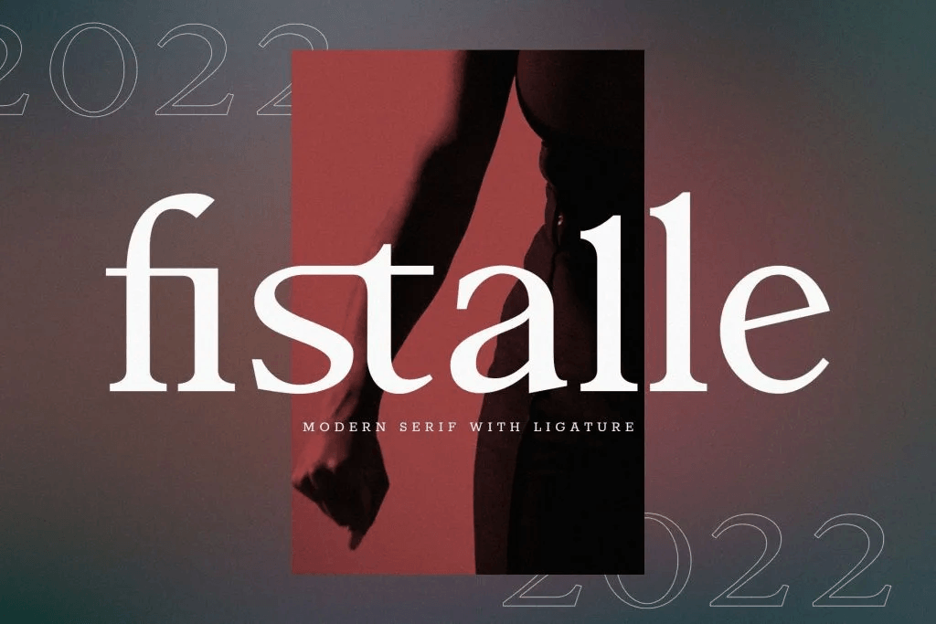
Standard ligatures are the most common type. They primarily exist to improve the appearance of letter combinations that might otherwise collide.
Typical examples include:
- fi
- fl
- ff
- ffi
- ffl
These ligatures are often enabled automatically in professional design and publishing software. They tend to be subtle. A reader may not even notice them, but the text usually feels more polished.
2. Discretionary Ligatures
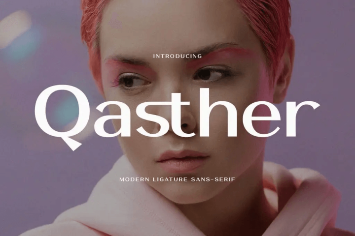
Discretionary ligatures are optional stylistic alternatives. Unlike standard ligatures, they are not required to solve spacing problems. Designers can activate them when they want typography to feel more decorative or distinctive.
For example, a font might connect st, ct, th, or other combinations with extended strokes. These details are common in display fonts, elegant serif fonts, and typefaces inspired by historical lettering.
Discretionary ligatures are particularly effective for logos, posters, packaging, and short headlines.
3. Historical Ligatures
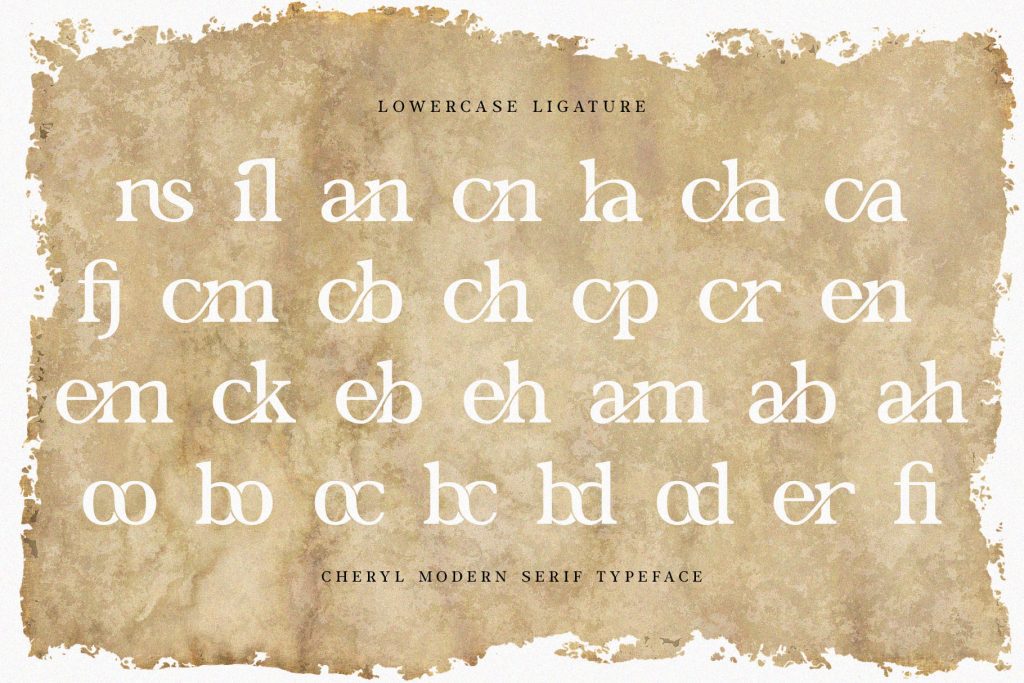
Historical ligatures reproduce combinations that were more common in older writing and printing traditions. Examples may include forms inspired by Renaissance typography, early European manuscripts, or traditional calligraphy.
These options can add authenticity to historical, editorial, luxury, or heritage-focused design projects. However, they should be used carefully because some forms may feel unfamiliar to modern readers.
4. Stylistic Ligatures
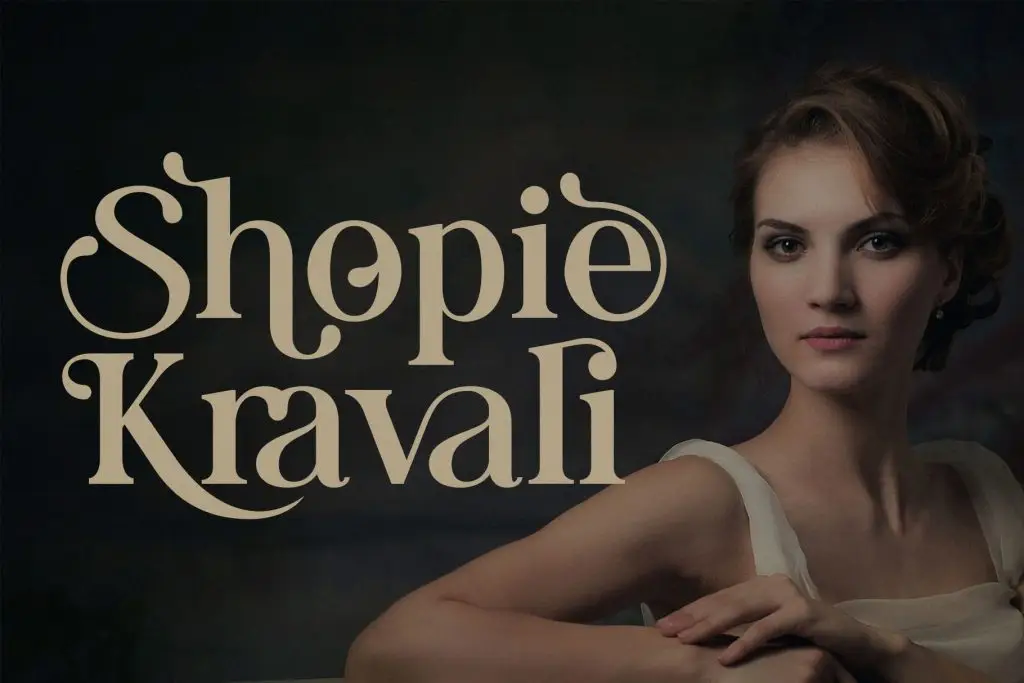
Stylistic ligatures focus primarily on visual expression. They can completely change how two letters interact. A type designer might extend the tail of one character into the next, create overlapping strokes, or build a decorative connection across multiple letters.
These ligatures are popular in modern branding because they can make a simple wordmark feel custom without requiring completely hand-drawn lettering.
When Should Designers Use Ligatures?
Ligatures can improve many design projects, but their usefulness depends on the context.
Logos and Branding
Custom-looking ligatures can make a brand name more distinctive. They can turn common letter combinations into recognizable visual signatures. However, readability should remain important. A logo should still be understandable without forcing viewers to decode unusual letterforms.
Quotes and Social Media Graphics
Short quotes are ideal for expressive ligatures because there is more space to appreciate individual characters. Designers can highlight one or two connected letterforms without making the message difficult to read.
Editorial Design
Standard ligatures can improve the polish of magazines, books, lookbooks, and long-form articles. They solve small spacing problems that can otherwise interrupt the visual rhythm of text.
Packaging
Ligature fonts can make product names feel more premium or handcrafted. They work particularly well for beauty, fashion, food, candles, and lifestyle brands that rely on typography as a major part of the packaging identity.
For curated inspiration, explore 20 Beautiful Ligature Fonts Designers Love in 2026 to see how different typefaces use connected characters in branding and creative layouts.
Why Ligatures Still Matter in Modern Typography
Understanding what a ligature in typography is gives designers another tool for controlling visual rhythm and personality. Standard ligatures can solve practical spacing problems, while discretionary and stylistic ligatures can make branding and display typography feel more distinctive.
The key is moderation. A well-placed ligature can make a word feel elegant and memorable, but too many decorative connections can reduce clarity.
