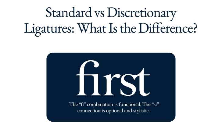
Understanding standard vs discretionary ligatures can help designers make better typography decisions, especially when working with branding, editorial layouts, packaging, websites, and display type. Both types combine two or more characters into a specially designed glyph, but they serve different purposes. Standard ligatures mainly improve spacing and prevent awkward letter collisions, while discretionary ligatures are optional alternatives designed to add more style and personality.
The difference may seem subtle at first. However, knowing when to use each one can make typography feel more polished without sacrificing readability. It can also help designers take full advantage of OpenType fonts that include a wider range of alternate characters.
What Is a Ligature in Typography?
A ligature is a single glyph that visually combines two or more characters. Instead of displaying each letter independently, the font provides a specially drawn version of the combination.
Common examples include fi, fl, ff, ffi, and ffl. These combinations developed partly because certain letters can create awkward spacing when placed next to each other. For instance, the upper stroke of an “f” may interfere with the dot of an “i.” A ligature solves this by redesigning both letters as one coordinated form.
Modern fonts can also contain much more expressive combinations. These decorative ligatures may connect letters through extended strokes, curves, overlaps, or unusual shapes.
If you want a broader introduction before comparing the two categories, read History of Ligature Fonts: From Calligraphy to Digital Typography to understand how connected letterforms developed from traditional writing and printing into modern digital fonts.
What Are Standard Ligatures?
Standard ligatures are the most functional type. They are designed primarily to improve the appearance and spacing of common letter combinations. In many professional fonts, standard ligatures are enabled automatically in design software. Readers may not consciously notice them because their purpose is usually subtle.
Common Standard Ligature Examples
Typical combinations include:
fi
fl
ff
ffi
ffl
The exact set depends on the typeface. Some fonts contain only a few standard ligatures, while others include a larger collection. For example, when “f” and “i” appear separately, the top of the “f” may sit too close to the dot of the “i.” The “fi” ligature gives the type designer more control over the spacing and shape.
Why Standard Ligatures Exist
The main goal is visual refinement rather than decoration. Standard ligatures help maintain a smooth reading rhythm by correcting combinations that would otherwise appear crowded or awkward. Because they are designed to blend naturally into text, they can work well in books, magazines, articles, product descriptions, and other long-form content. They are also commonly used in logos and headlines, but they are not limited to display typography.
What Are Discretionary Ligatures?
Discretionary ligatures are optional stylistic alternatives. Unlike standard ligatures, they are not usually necessary to fix spacing problems. Instead, they give designers more creative freedom. A discretionary ligature may combine characters such as st, ct, th, or other pairs that normally work perfectly well as separate letters. The type designer creates a special connection simply to give the word a more distinctive look.
Discretionary Ligatures Add Personality
These ligatures may feature long strokes, sweeping curves, overlapping characters, or unexpected shapes. They are especially common in display fonts, elegant serif typefaces, decorative sans serifs, and designs inspired by historical lettering. Because their appearance is more noticeable, discretionary ligatures can become an important part of a wordmark or headline.
They work particularly well in:
- Logos
- Packaging
- Posters
- Fashion campaigns
- Quotes
- Editorial headlines
- Invitations
- Social media graphics
However, they should usually be applied selectively rather than throughout long paragraphs.
Standard vs Discretionary Ligatures: The Key Difference
The simplest distinction is purpose. Standard ligatures are mostly functional. Discretionary ligatures are mostly stylistic. A standard ligature solves a visual problem between characters. A discretionary ligature introduces a creative alternative even when the original characters already look fine.
Standard Ligatures Prioritize Readability
Standard ligatures should feel almost invisible. They improve typesetting without attracting excessive attention. When used correctly, a reader may never realize that the individual letters have been replaced by a combined glyph. This makes them suitable for longer reading environments.
Discretionary Ligatures Prioritize Expression
Discretionary ligatures are meant to be noticed. They can help typography feel custom, artistic, luxurious, vintage, playful, or experimental. For this reason, they are especially effective when the typography itself is a major visual element. A perfume logo, fashion campaign title, or candle packaging design may benefit from one memorable letter connection that makes the name feel more distinctive.
If you want to understand the basics before exploring more advanced ligature features, read What Is a Ligature in Typography? to learn how ligatures work, why they are used, and the different types commonly found in modern fonts.
A Practical Example
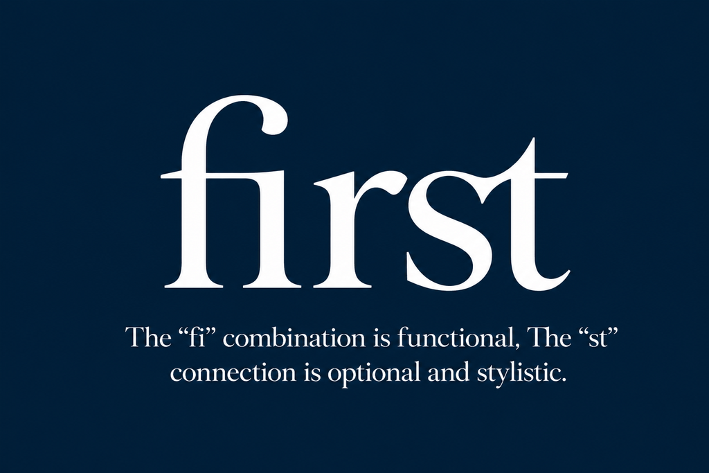
Imagine the word “first.” A typeface may automatically replace the “fi” combination with a standard ligature. This improves the relationship between the two characters without changing the overall appearance of the word dramatically. The same font might also offer a decorative “st” ligature. Activating it could connect the final two letters with a sweeping stroke. The “fi” combination is functional. The “st” connection is optional and stylistic. That is the practical difference between standard and discretionary ligatures.
When Should You Use Standard Ligatures?
Standard ligatures are generally safe to use whenever they improve the appearance of text.
Long-Form Editorial Content
Books, magazines, blogs, and digital publications can benefit from standard ligatures because they refine character spacing without interrupting readability.
Brand Typography
Standard ligatures can also make a logo or brand name look more polished. Because they are subtle, they usually do not overpower the identity.
Premium Packaging
Small typographic improvements can matter on elegant packaging. Standard ligatures can help product names and descriptions feel more carefully typeset.
However, always test them at the final print size. Very small text may not benefit from every ligature.
When Should You Use Discretionary Ligatures?
Use discretionary ligatures when the typography needs more personality.
Logo and Wordmark Design
One carefully chosen connection can make a wordmark feel more customized. This is particularly useful when working with an existing font rather than drawing every letter from scratch.
Short Headlines
Posters, campaigns, and editorial covers give decorative ligatures enough space to be appreciated. Because the text is short, unusual connections are less likely to interfere with comprehension.
Packaging and Product Names
Beauty, fashion, food, candles, and lifestyle packaging can benefit from discretionary ligatures when the product name needs to feel memorable. A ligature can act as a recognizable brand detail across boxes, labels, and digital promotions.
When Should You Avoid Discretionary Ligatures?
More ligatures do not automatically create better typography. Avoid decorative combinations when they make letters difficult to recognize. If a viewer has to stop and decode the word, the effect may be working against the message.
Discretionary ligatures should also be used cautiously in:
- Body copy
- Navigation
- Forms
- Prices
- Instructions
- Small captions
- Technical information
These areas prioritize quick recognition.
Use Ligatures With Intention
The difference between standard vs discretionary ligatures is ultimately a difference between function and expression. Standard ligatures solve awkward letter relationships and help text feel naturally polished. Discretionary ligatures provide optional visual alternatives that can add personality, uniqueness, and stronger brand character. Neither type is automatically better. The right choice depends on the context, size, message, and intended reading experience.
