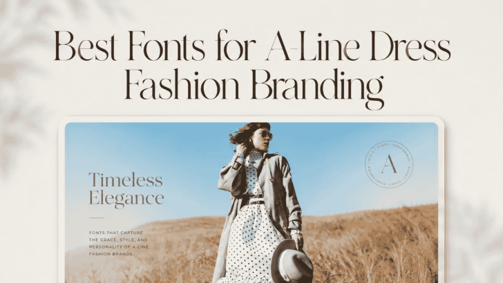
Choosing the best fonts for A-line dress fashion branding can help a fashion label communicate elegance, femininity, and style more clearly. A-line dresses are known for their balanced silhouette, flattering structure, and timeless appeal, so the typography used around them should support the same qualities. The right font can make a brand feel refined, contemporary, romantic, or editorial depending on the visual direction.
Typography also appears across many fashion touchpoints. It can shape the logo, lookbook, clothing tag, packaging, website, social media campaign, and seasonal promotion. Because of that, the font should not only look beautiful in a logo. It should also stay consistent and recognizable across both print and digital formats.
For A-line dress branding, this balance matters even more because the product itself often sits between classic and modern fashion. A strong font choice can help define where the brand belongs in that spectrum.
Best Fonts for A-Line Dress Fashion Branding
1. Vacation
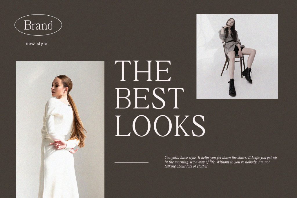
2. Flamengo
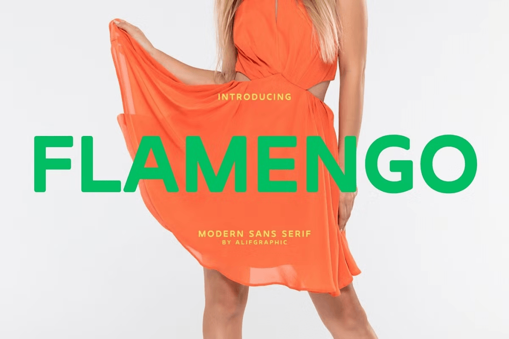
3. Biospace
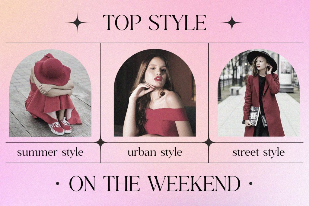
4. Joytig
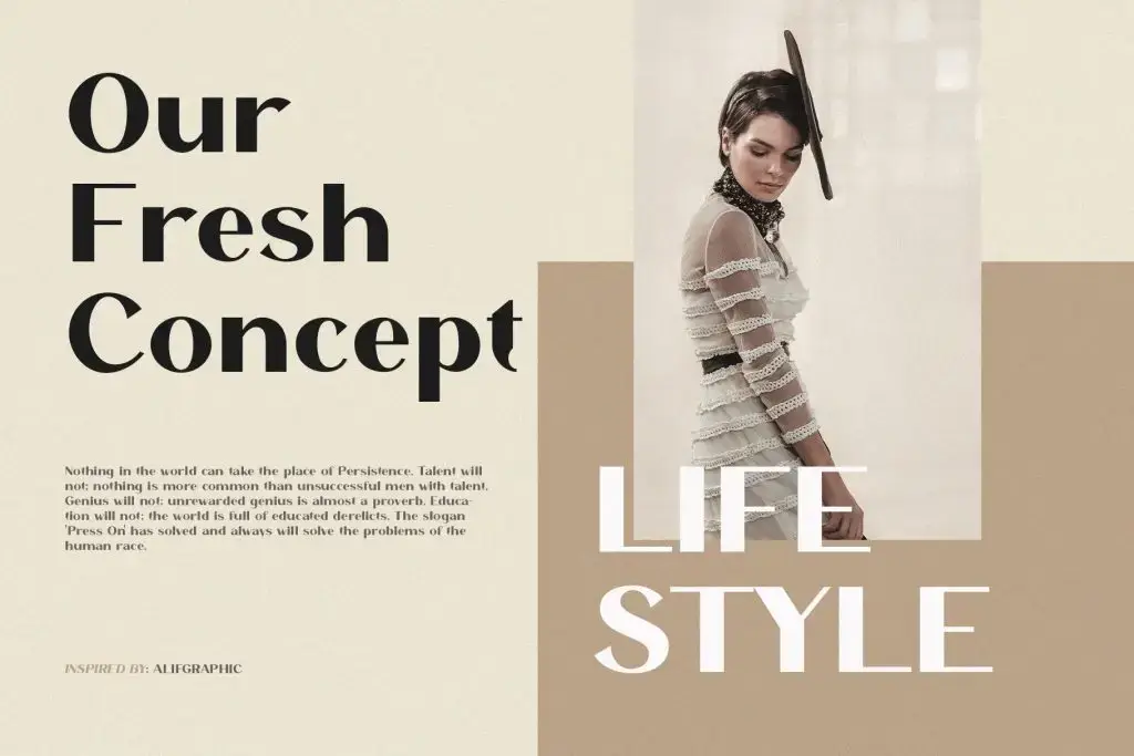
5. Schindler
Consider Typography Anatomy Before Choosing a Font
The way a font feels is closely connected to its structure. Letter width, stroke contrast, curves, angles, and spacing all influence how customers perceive the brand.
A typeface with soft curves may communicate femininity and elegance. Narrower proportions can create a more editorial feeling, while wider letters may feel open and contemporary. This is why two fonts in the same general category can create very different impressions.
For a deeper explanation of these structural differences, read Anatomy of Typography for Strong Visual Identity. Understanding typography anatomy can help you choose fonts based on brand personality rather than appearance alone.
Use Typography to Create Fashion Hierarchy
A fashion layout often includes the brand name, collection title, product name, price, description, and CTA. These elements should not all have the same visual weight.
Make the Collection Name Stand Out
Use the previously selected font for the most important headline—whether it is the brand name, a seasonal collection, or a campaign title. Give it enough size and whitespace so it can become a visual focal point.
Keep Product Information Simple
Product names, prices, sizing, and descriptions should remain easy to scan. A neutral sans serif can create a practical contrast against a more expressive display font. This hierarchy also makes e-commerce pages feel more organized.
Use the CTA as a Supporting Element
Buttons such as “Shop the Collection,” “Explore Dresses,” or “View New Arrivals” should remain visible but should not compete with the main headline. Use a medium-weight sans-serif and clear contrast to support the conversion path.
Apply the Font Across Brand Touchpoints
A fashion identity becomes stronger when typography remains consistent. Test the chosen font across several applications before finalizing the system.
Website
Use the primary font for hero headlines, collection titles, and selected promotional sections. Keep navigation and body copy simple.
Social Media
Use the same headline style across Instagram posts, Stories, Pinterest graphics, and campaign videos. This helps customers recognize the collection quickly.
Packaging and Clothing Tags
Check whether the font remains clear at smaller sizes. A typeface that works beautifully on a large poster may need different spacing when printed on a garment label.
Lookbooks
Aeloria can create a refined editorial presentation, while Fhunca Vinjhae can add a more expressive fashion direction. Pair either one with a neutral supporting font for captions and product information.
Apply the Font Across Brand Touchpoints
A fashion identity becomes stronger when typography remains consistent. Test the chosen font across several applications before finalizing the system.
Website
Use the primary font for hero headlines, collection titles, and selected promotional sections. Keep navigation and body copy simple.
Social Media
Use the same headline style across Instagram posts, Stories, Pinterest graphics, and campaign videos. This helps customers recognize the collection quickly.
Packaging and Clothing Tags
Check whether the font remains clear at smaller sizes. A typeface that works beautifully on a large poster may need different spacing when printed on a garment label.
Lookbooks
This font can create an elegant, editorial look and convey a more expressive fashion aesthetic. Pair it with a neutral supporting font for captions and product information.
Keep the Brand Consistent Without Making It Repetitive
Consistency does not mean every fashion graphic needs the same layout. The photography, colors, and composition can change while the typography system remains stable.
For example, use the same primary font for collection titles across several campaigns. Keep the supporting font and spacing rules consistent, even when the background photography changes. This creates recognition while still allowing each seasonal collection to feel fresh.
Choose a Font That Supports the Dress, Not Just the Trend
The best fonts for A-line dress fashion branding should reflect the product and the customer rather than follow a typography trend blindly. Before finalizing your choice, test the font on real applications such as product pages, labels, lookbooks, and social media posts. Make sure it remains readable and consistent across every format.
