Choosing the right Poppins alternative is not simply about finding another geometric sans serif that looks similar. Designers also need to consider readability, personality, flexibility, and how the typeface behaves across different brand applications. A good replacement should preserve the clean modern feeling that makes Poppins popular while giving the design enough distinction to avoid looking generic.
1. Look Beyond Visual Similarity
The first mistake designers often make is choosing a font only because its letterforms resemble Poppins. Similar shapes can be helpful, but they do not automatically mean the typeface will perform well in a real branding system. A strong alternative should also work across headings, body text, social media graphics, packaging, and digital layouts.
Instead of comparing fonts only through a specimen page, place them inside an actual design. Test the same headline, paragraph, button, and logo lockup with several options. This makes it easier to see which typeface feels natural in context rather than simply looking attractive on its own.
2. Prioritize Readability Across Different Sizes
A reliable Poppins alternative should remain readable at both large and small sizes. Many geometric sans serif fonts look impressive in headlines but become harder to scan in paragraphs or interface text. Designers should check letter spacing, counters, x-height, and the distinction between similar characters.
This becomes especially important for brands that communicate across multiple platforms. A font may appear clean on a desktop website but feel too tight on mobile screens. Testing different sizes early prevents readability problems later in the design process.
Check How the Typeface Handles Body Text
Poppins has a recognizable geometric structure, but it is also widely used because it remains relatively approachable in everyday layouts. When looking for a replacement, check whether the alternative feels comfortable in longer text. Some fonts are visually strong but too rigid or stylized for paragraphs.
Try using the font in two or three short blocks of body copy. If the text becomes tiring to read, the typeface may be better suited for display use only. A versatile alternative should give you more than one practical use case.
3. Consider the Brand Personality
Typography communicates personality before people consciously read the words. Two fonts can share similar geometric proportions while creating completely different impressions. One may feel friendly and soft, while another feels premium, technical, editorial, or futuristic.
That difference matters when choosing a Poppins replacement for branding. Designers should ask whether the alternative supports the brand’s tone rather than simply copying a familiar visual style. If you are comparing options specifically for identity work, read Modern Fonts Similar to Poppins for Modern Branding for more ideas on typefaces that fit contemporary brand systems.
4. Evaluate the Weight Range
A useful brand font needs enough flexibility to create hierarchy. Regular, medium, semibold, and bold weights can help designers separate headlines, subheadings, labels, and supporting text without introducing another font family. Limited weight options can make a typography system harder to scale.
Before committing to a typeface, review the complete family rather than just one weight. Check whether lighter and heavier versions still feel consistent. A strong font family should allow you to create contrast without losing the overall visual identity.
5. Check the Shape of Key Characters
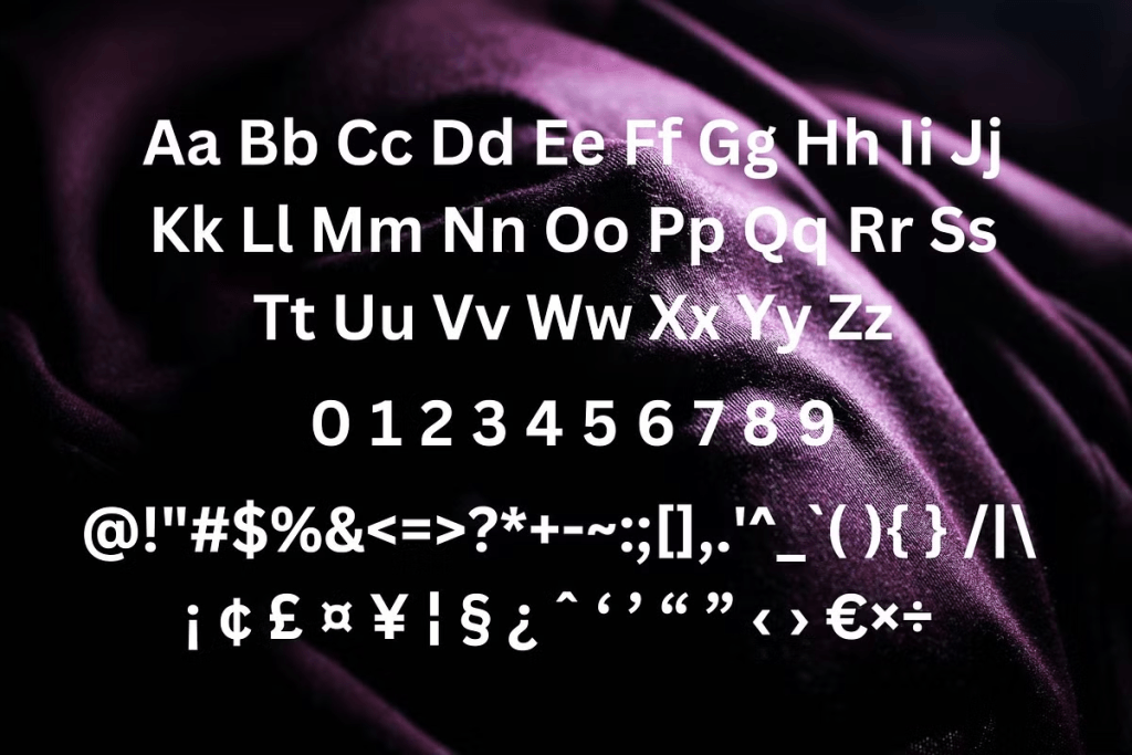
Small details can change how a font feels. Pay attention to characters such as a, g, R, G, M, and numbers because these often reveal the personality of a typeface. Fonts that look similar from a distance can feel very different once these details become visible.
This is also where designers can find alternatives that feel familiar without becoming direct substitutes. A slightly different terminal, curve, or proportion can give a brand more individuality. Those subtle differences often matter more than simply choosing the closest visual match.
6. Test Spacing and Layout Flexibility
A good Poppins alternative should be easy to use in different compositions. Some geometric sans serif fonts have wide proportions that work beautifully in logos but become difficult to manage in narrow layouts. Others are more compact and adapt better to responsive design.
Test short headlines, long headlines, uppercase text, and mixed-case paragraphs. Pay attention to how much manual tracking you need to apply. If the typeface constantly requires correction, it may create unnecessary work across a large design system.
7. Think About Font Pairing
Even if the alternative is intended to replace Poppins, it may still need to work alongside another typeface. For example, a geometric sans serif can pair with a serif for editorial branding or with a condensed font for stronger display contrast. The key is making sure the styles complement rather than compete with each other.
Designers should compare contrast in structure, weight, and mood. A pairing becomes more useful when each font has a clear role. This approach also gives the brand more visual flexibility without creating inconsistency.
8. Consider How Easy the Transition Will Be
Replacing an established font can affect spacing, line breaks, and layout proportions. Even fonts that look similar can behave differently when placed inside the same design. That means designers should test the transition before applying the new font across an entire project.
If your goal is to switch typefaces while maintaining a familiar visual direction, our article How to Replace Poppins Without Losing a Clean Modern Look explains how to make that transition more smoothly. It can help you compare proportions, hierarchy, and overall visual consistency before changing the typography system.
9. Avoid Choosing a Font Only Because It Is Trendy
Trend-driven typography can make a project feel current, but trends move quickly. A font that appears everywhere today may make a brand feel dated sooner than expected. Designers should balance contemporary appeal with long-term usability.
The better question is whether the font fits the brand strategy and content needs. If so, the typeface can remain useful even after visual trends change. This is especially important for identity systems designed to last several years.
Final Thoughts
Finding the right Poppins alternative requires more than visual comparison. Designers should evaluate readability, character shapes, weight range, spacing, personality, and how the typeface performs across real applications. The strongest replacement feels familiar enough to support a clean, modern style while still giving the brand its own identity.
Before making the final choice, test several alternatives inside actual layouts rather than judging them in isolation. Compare headlines, body copy, mobile screens, and branding applications side by side. A thoughtful selection process will help you find a typeface that does more than replace Poppins—it can strengthen the entire visual system.
