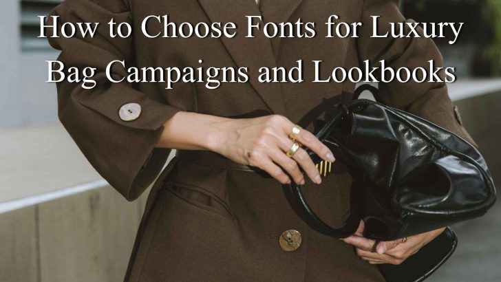
How to Choose Fonts for Luxury Bag Campaigns and Lookbooks

Knowing how to choose fonts for luxury bag campaigns and lookbooks can help a fashion brand create a more polished and memorable visual identity. In luxury fashion, typography needs to do more than look elegant. It should support the photography, communicate exclusivity, and keep every campaign page or lookbook spread easy to follow. A handbag …
Continue reading →

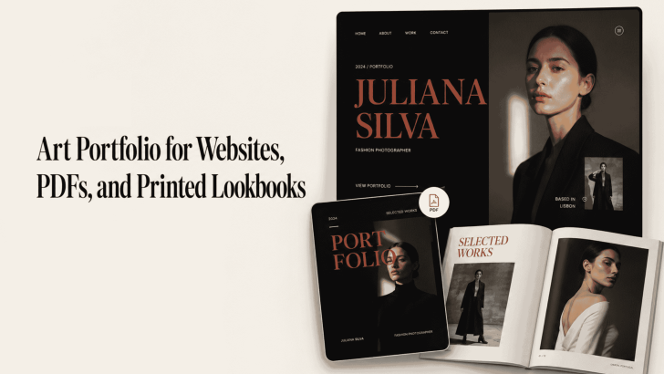
Art Portfolio for Websites, PDFs, and Printed Lookbooks

Creating an art portfolio for websites, PDFs, and printed lookbooks requires more than arranging attractive images on a page. Typography also affects how viewers understand your style, follow project descriptions, and remember your creative identity. A website portfolio needs clear and responsive text. Meanwhile, a PDF must remain readable across different screen sizes, and a …

Continue reading →

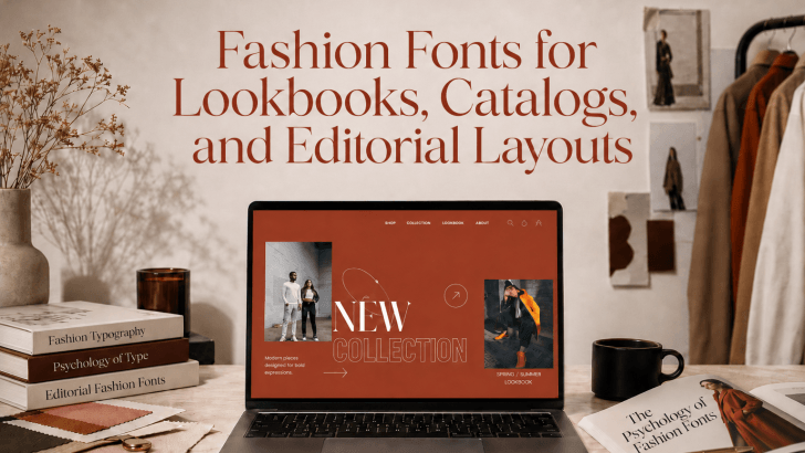
Fashion Fonts for Lookbooks, Catalogs, and Editorial Layouts

Choosing the right fashion fonts for lookbooks, catalogs, and editorial layouts can completely transform the way your designs are perceived. Many fashion brands struggle with layouts that feel cold, generic, or lacking personality. Even when photography is stunning and products are beautifully presented, weak typography can make an entire lookbook feel forgettable. The solution often …

Continue reading →