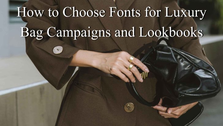
Knowing how to choose fonts for luxury bag campaigns and lookbooks can help a fashion brand create a more polished and memorable visual identity. In luxury fashion, typography needs to do more than look elegant. It should support the photography, communicate exclusivity, and keep every campaign page or lookbook spread easy to follow.
A handbag campaign may include product names, collection titles, short storytelling copy, prices, credits, and calls to action. If all of those elements use the same visual weight, the layout can feel flat or confusing. A well-planned typography system creates hierarchy while reinforcing the personality of the brand.
1. Start With the Mood of the Campaign
Before choosing a typeface, define the emotional direction of the campaign. A structured leather collection may need typography that feels precise and architectural. A softer feminine handbag collection may suit more graceful letterforms. Meanwhile, a bold seasonal campaign can use stronger type with sharper contrast.
Match the Font to the Product
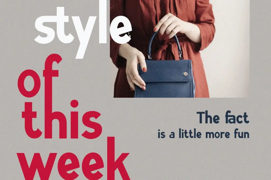
The typography should feel connected to the bag itself. For example, a minimalist top-handle bag may work well with a clean serif or refined sans serif. A more romantic collection with curved silhouettes can benefit from softer letterforms and elegant spacing.
Think about the visual cues already present in the collection, such as shape, material, hardware, color, and styling. The font should support those cues instead of introducing a completely different mood.
2. Choose One Primary Display Font
Luxury campaigns usually benefit from one strong display typeface rather than several competing styles.
The primary font can be used for:
- Collection names
- Hero headlines
- Cover titles
- Campaign statements
- Product category headings
Serif Fonts for Editorial Luxury
Serif fonts often create a more editorial and timeless feeling. High-contrast serif styles can work beautifully with fashion photography, especially when the design uses generous whitespace. They are a strong choice for premium bag campaigns, magazine-style layouts, and luxury lookbook covers.
Modern Sans Serif for Contemporary Luxury
A refined sans serif can create a more minimal and modern mood. This direction suits luxury bag brands that want to feel clean, architectural, or understated. Use larger sizing and thoughtful spacing to keep the typography from looking too corporate.
If you are still comparing possible font directions, read Elegant Fonts for Luxury Bag Brands for more inspiration on serif, sans serif, and ligature styles that suit premium fashion identities.
3. Add a Supporting Font for Readability
The display font does not need to handle every piece of information.
A simpler supporting font can take care of:
- Product descriptions
- Dimensions
- Materials
- Prices
- Website URLs
- Page numbers
- Credits
This creates a clearer hierarchy and makes the lookbook easier to scan.
Keep Supporting Text Neutral
The supporting font should not fight for attention. Choose a typeface with clean letterforms and comfortable spacing. A simple sans serif often pairs well with an expressive serif headline. If the primary font is already a minimalist sans serif, a restrained serif can add contrast to short descriptions or quotes.
4. Use Size to Create Visual Hierarchy
Size is one of the easiest ways to show which information matters most. The collection title should usually be much larger than product names or descriptions. Supporting details can remain smaller, as long as they stay readable.
Example Hierarchy
A luxury lookbook might use:
Collection Title: 48–72 pt
Product Name: 24–32 pt
Short Description: 14–18 pt
Supporting Details: 10–12 pt
These are only starting points. The exact sizes depend on the typeface, page size, and layout. The key is contrast. Readers should immediately understand what to read first.
5. Pay Attention to Letter Spacing
Luxury typography often relies on generous spacing, especially in uppercase headlines. Wide tracking can create a more exclusive and controlled appearance. It gives each letter more room and works well in collection names or short campaign phrases. However, too much spacing can make words feel disconnected. Always test the design at the final size.
For body text, keep tracking more natural. Longer paragraphs should feel easy to read rather than overly styled.
6. Let Photography and Typography Work Together
Luxury bag campaigns are highly visual, so typography needs to support the images.
Avoid Covering Important Product Details
Do not place large text over the most important parts of the bag, such as the logo hardware, handle, stitching, or silhouette. Use negative space within the photo or place text outside the image when possible.
Match the Type Scale to the Photography
Dramatic editorial photography can support larger, more expressive typography. Clean product photography may benefit from a more restrained typographic system. The relationship should feel intentional.
7. Create Consistency Across the Entire Lookbook
One of the biggest mistakes in fashion lookbooks is changing typography too often.
A consistent system should define:
- One main headline font
- One supporting font
- Approved font weights
- Standard spacing
- Repeated heading sizes
- Product description style
This consistency helps the lookbook feel more premium and professional. It also makes future campaigns easier to produce because the design team already has a clear system.
8. Keep the Layout Refined
Luxury does not require excessive decoration. Avoid combining several fonts, too many colors, or unnecessary effects. A strong headline, clean product photography, and generous whitespace often create more impact than a crowded composition.
Use Whitespace as Part of the Typography
Whitespace helps type feel more elegant. Leave enough space around headlines and product details so the layout does not feel rushed. This is especially important on cover pages and opening spreads where the typography needs to establish the mood.
9. Test the Font in Print and Digital Formats
A lookbook may appear as a printed booklet, downloadable PDF, website page, or social media campaign. Test the typeface in all of those formats.
For Print
Check whether fine strokes remain visible and whether small text prints clearly on the chosen paper.
For Digital
Make sure the type remains readable on laptops, tablets, and mobile screens. A font that looks beautiful in a large print layout may need slightly heavier weight or larger sizing online.
10. Choose Fonts That Support the Brand Long Term
A luxury bag campaign should feel current, but the typography also needs enough flexibility to work beyond one season. Choose fonts that can support future collections, product launches, packaging, website updates, and editorial content.
The goal is not to make every campaign look identical. Instead, create a recognizable visual language that can evolve while still feeling connected to the brand.
Conclusion
Learning how to choose fonts for luxury bag campaigns and lookbooks comes down to balance. Start with the mood of the collection, choose one strong display font, add a readable supporting typeface, and build hierarchy through size, weight, and spacing.
Typography should complement the photography, not compete with it. Keep the system consistent across pages and test the font in both print and digital formats before finalizing the campaign.
