Halloween 2026 Design Ideas: From Retro to Playful Horror Fonts

Looking for fresh Halloween 2026 design ideas does not mean every project needs to rely on dark gothic lettering or predictable orange-and-black graphics. Designers can explore a much broader spectrum, from energetic, retro-inspired typography to playful, slime-themed lettering, transforming the horror aesthetic into something entertaining rather than frightening. The most compelling Halloween visuals often emerge …
Continue reading →

How to Choose a Dripping Font for Halloween Party Branding

Choosing the right dripping font for Halloween party branding can instantly shape the mood of your visual identity. A good dripping font can feel spooky, playful, dramatic, or even slightly retro depending on its form and color. The challenge is finding one that looks expressive without making the event name difficult to read. Halloween branding …

Continue reading →

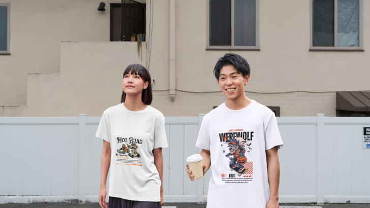
Halloween 2026 T-Shirt Styles: Fantasy, Retro, or Maximalist?

Exploring Halloween 2026 T-shirt styles means looking beyond the usual pumpkins, bats, and orange-and-black graphics. This season, three directions feel especially useful for designers: fantasy, retro, and maximalist. Each one creates a different mood, and typography often determines whether the final design feels playful, nostalgic, dramatic, or visually intense. The strongest T-shirt graphics usually combine …

Continue reading →

What Makes a Halloween Party Font Feel Creepy but Still Fun?

A good Halloween party font needs to create tension without making the design feel too dark or serious. The most effective styles usually combine spooky details with playful shapes, bright colors, or exaggerated proportions. This balance helps posters and event graphics feel seasonal, entertaining, and easy to enjoy. That combination is especially useful for Halloween …

Continue reading →