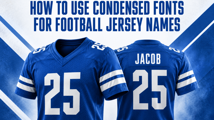
Using condensed fonts for football jersey names can help designers fit longer player names into limited back-of-shirt space without making the typography feel cramped. Their narrow proportions also create a strong athletic appearance that works naturally with large jersey numbers. However, choosing a condensed typeface is only the first step. You also need to manage spacing, weight, readability, and visual balance carefully.
1. Understand Why Condensed Fonts Work on Jerseys
Football jerseys have limited horizontal space, especially around the upper back where player names usually appear. Condensed fonts solve this problem by reducing character width while keeping letters tall enough to remain visible. As a result, designers can accommodate names with many characters without dramatically reducing the font size.
This proportion also gives jersey typography a strong and competitive personality. The taller letterforms can create a sense of speed, structure, and confidence. That makes condensed typography especially useful for football, soccer, basketball, and other sportswear designs.
2. Choose a Condensed Font with Clear Letterforms
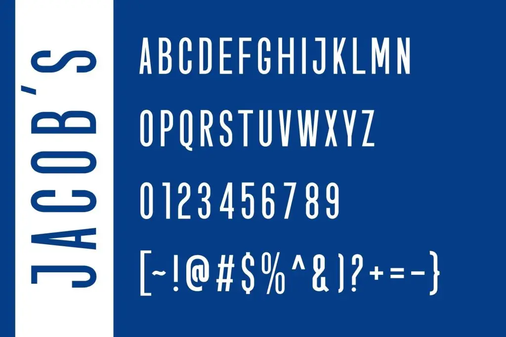
Not every narrow typeface works well on sportswear. When selecting condensed fonts for football jersey names, prioritize letterforms that remain recognizable from a distance. Letters such as I, J, M, N, and W should look different enough that viewers can identify names quickly.
Avoid condensed fonts with excessive decoration or extremely thin strokes. Jerseys need typography that works both on screen and when printed or applied to fabric. A bold sans serif or structured display font often provides a safer balance between personality and readability.
Look for Strong Shapes and Consistent Weight
Stroke consistency becomes especially important when letters are compressed. If some parts of the font appear much thinner than others, names may become difficult to read from stadium seating or in photographs. Therefore, choose typefaces with solid construction and enough weight to survive different production methods.
You should also test uppercase letters because player names commonly use all caps. Compare short names such as LEE with longer names such as ALEXANDER. A reliable condensed font should make both examples feel visually balanced.
3. Adjust Tracking Instead of Only Reducing Font Size
One common mistake is shrinking the entire player name until it fits. Although this solves the space problem, it can weaken the hierarchy between the name and number. Instead, start with a suitable condensed font and make small tracking adjustments.
Keep enough space between letters so the word remains easy to scan. Extremely tight tracking can cause characters such as NN, MM, or TT to merge visually. On the other hand, too much spacing can remove the compact character that makes condensed typography useful.
4. Balance Player Names with Jersey Numbers
A football jersey rarely uses player names in isolation. The name usually sits above a much larger number, so both elements need to work as one typography system. A condensed name can complement wide or bold numerals by creating contrast without competing for attention.
The number should normally remain the dominant element. Meanwhile, the player name provides identification and supports the overall composition. For a deeper explanation of this relationship, read our article Why Numbers and Lettering Matter in Football Jersey Design, which explores how these elements influence the identity and readability of a jersey.
5. Match the Font with the Team’s Visual Personality
Typography should reflect the personality of the team, club, or sports brand. A geometric condensed sans serif can create a modern and technical appearance. In contrast, a heavier industrial typeface can make the jersey feel more aggressive and powerful.
However, avoid selecting a font only because it looks dramatic in isolation. Place it inside a realistic jersey layout before making a final decision. This step helps you understand whether the font supports the badge, colors, number style, and overall sports identity.
If you are still comparing different typography directions, explore our Jersey Font Guide: Best Fonts for Sports Design. The guide can help you identify font styles that fit different sports branding concepts before you commit to a final typeface.
6. Test Long and Short Player Names
A successful jersey font needs to work with more than one name. Test several examples with different lengths before finalizing your typography system. Include short names, average-length names, and unusually long surnames in your mockups.
This process reveals problems that may not appear when you test only one word. For example, a font might look excellent with MARTIN but feel too compressed with ALEXANDER-ARNOLD. Testing variations early also helps you establish consistent rules for font size, tracking, and maximum name width.
7. Preview the Typography in Realistic Jersey Mockups
Always evaluate your typography at realistic dimensions. A name that looks perfectly readable while zoomed in on your design software may behave differently when printed on a shirt. Mockups allow you to check proportions, contrast, and visibility in a more practical setting.
View the design both close up and from a distance. You can also reduce the mockup size on your screen to simulate how the jersey might appear in photographs or match footage. If the name still reads clearly, your typography system is likely moving in the right direction.
Final Thoughts
Using condensed fonts for football jersey names is not simply about fitting more letters into a smaller area. The right font should combine compact proportions with strong readability, appropriate weight, and a personality that supports the team identity. Small decisions involving tracking, scale, and letterform construction can make a major difference.
Before choosing the final typeface, compare several condensed options inside actual jersey layouts. Test them with both long and short player names, then evaluate how they pair with jersey numbers. With the right approach, condensed typography can make football jersey designs feel cleaner, stronger, and more professional.

One Comment