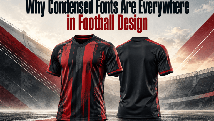
Why Condensed Fonts Are Everywhere in Football Design

Condensed fonts in football design have become a familiar visual language across jerseys, match posters, social media graphics, and club branding. Their tall, narrow letterforms help designers create bold typography without taking up too much horizontal space. More importantly, they bring a sense of speed, strength, and competition that feels naturally connected to football. That …
Continue reading →

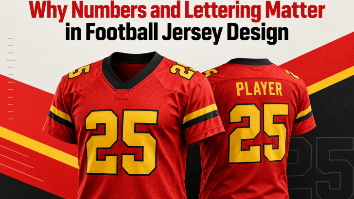
Why Numbers and Lettering Matter in Football Jersey Design

A strong football jersey design isn’t just about team colors, logos, or sponsor placement. Numbers and lettering also play a major role in how a jersey looks, feels, and performs visually. From the player’s name on the back to the large number below it, typography helps turn a basic sports uniform into a recognizable identity. …

Continue reading →

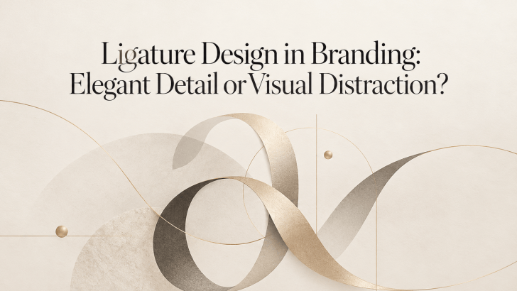
Ligature Design in Branding: Elegant Detail or Visual Distraction?

Ligature design in branding can make a logo or visual identity feel refined, distinctive, and more memorable. By connecting or combining letterforms, ligatures introduce subtle details that can give typography a custom-made appearance. However, when they are overused or applied without purpose, they can also reduce readability and make a brand look unnecessarily complicated. For …

Continue reading →

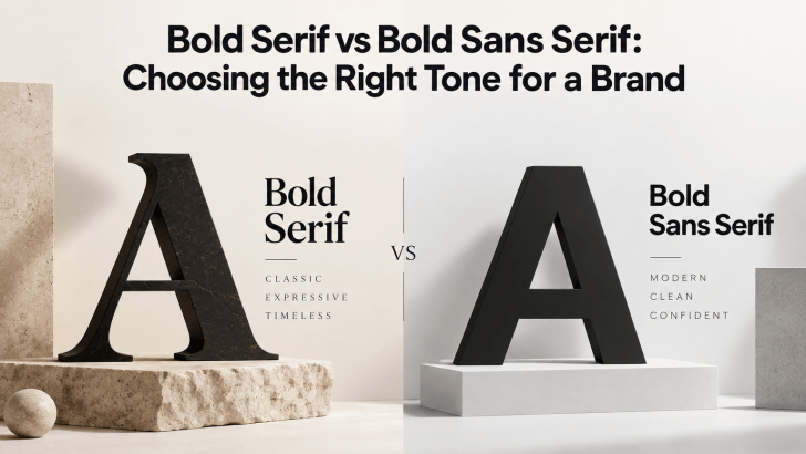
Bold Serif vs Bold Sans Serif: Choosing the Right Tone for a Brand

Comparing bold serif vs bold sans serif fonts can help you choose a typeface that matches the personality of your brand. Both styles can create strong visual impact, but they communicate very different moods. Bold serif fonts often feel more editorial, established, or sophisticated, while bold sans serif fonts usually feel cleaner, more direct, and …

Continue reading →

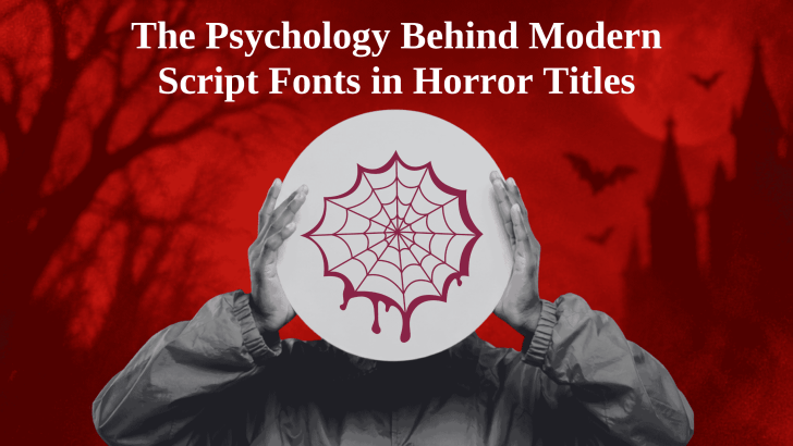
The Psychology Behind Modern Script Fonts in Horror Titles

The psychology behind modern script fonts in horror titles comes from the way handwritten letterforms can feel intimate, unpredictable, and emotionally charged. Unlike a clean geometric font, a script typeface often looks as if a person created it by hand. In horror design, that human quality can make a title feel more personal, unstable, or …

Continue reading →

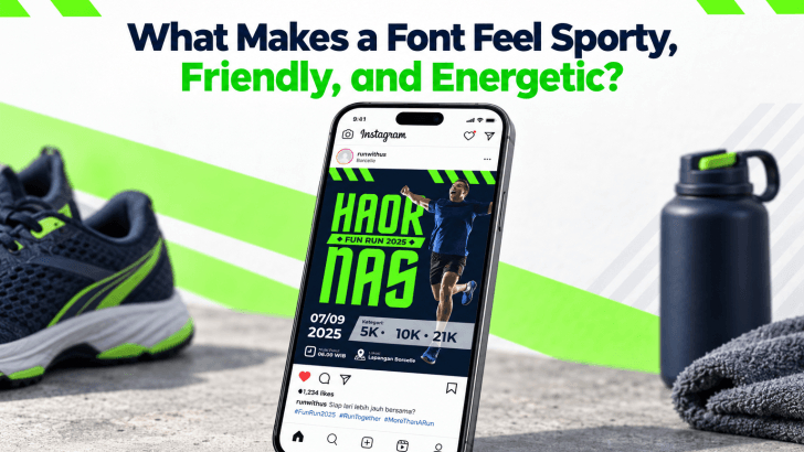
What Makes a Font Feel Sporty, Friendly, and Energetic?

Understanding what makes a font feel sporty, friendly, and energetic helps designers choose typefaces that match a campaign’s emotion instead of selecting a font only because it looks attractive. Every typeface has visual signals that affect perception. Weight, shape, spacing, curves, slant, and letter width can all influence whether a design feels fast, approachable, powerful, …

Continue reading →