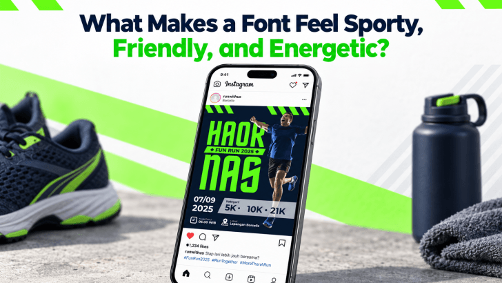
Understanding what makes a font feel sporty, friendly, and energetic helps designers choose typefaces that match a campaign’s emotion instead of selecting a font only because it looks attractive. Every typeface has visual signals that affect perception. Weight, shape, spacing, curves, slant, and letter width can all influence whether a design feels fast, approachable, powerful, playful, or active.
This is especially important in sports events, fun runs, fitness campaigns, youth branding, and community promotions. The right typography can make a message feel more dynamic before the audience even reads the full sentence.
How Typeface Shapes Influence Emotion
Typography works through association. People often connect certain visual characteristics with familiar experiences. A wide, heavy font may feel strong because it looks stable and substantial. Rounded letters can feel friendly because their curves resemble softer, less threatening shapes. Italic or slanted typography may suggest speed because the letters appear to move forward. These reactions are not strict rules, but they can help explain why certain fonts feel more appropriate for energetic or sporty designs.
What Makes a Font Feel Sporty?
Sporty typography often communicates movement, strength, and confidence.
Bold Weight Creates Strength
Heavy font weights naturally attract attention. They can suggest power and stability, which makes them useful for race posters, jerseys, fitness promotions, and event headlines. A bold typeface also remains visible from a distance. This is important when typography needs to compete with photography, bright colors, or motion graphics. However, bold does not mean every element should be heavy. Use stronger weights for titles and important information, then keep supporting text lighter.
Condensed Shapes Feel Fast and Efficient
Condensed fonts use narrower letterforms, so they often feel compact and active. They can also fit more information into limited space, which is useful for sports posters and event graphics. Their tall, narrow proportions can create an urban or performance-oriented personality. This makes them especially suitable for running events, cycling, football, motorsports, and training campaigns.
Slanted Forms Suggest Movement
Italic or angled letterforms can visually lean forward, which creates a sense of direction. This simple shape cue can make typography feel faster and more dynamic. Designers often use slanted text for race names, speed-focused campaigns, and athletic promotions. Even a slight angle can make a static layout feel more active.
What Makes a Font Feel Friendly?
Friendly typography usually relies on softer shapes and less aggressive contrast.
Rounded Curves Feel Approachable
Rounded terminals and circular letterforms tend to feel softer. They can make a typeface appear more welcoming and casual. This works well for community runs, children’s sports events, wellness brands, and recreational fitness campaigns. A friendly font can make the activity feel inclusive rather than competitive.
Open Letterforms Improve Clarity
Fonts with open counters and generous spacing often feel easier to read. That clarity can also make the design feel more relaxed and accessible. When viewers do not have to struggle with the typography, the overall experience feels more positive. This is useful for registration information, event schedules, and social media posts.
What Makes a Font Feel Energetic?
Energy often comes from contrast, rhythm, and visual tension.
Strong Size Contrast Creates Excitement
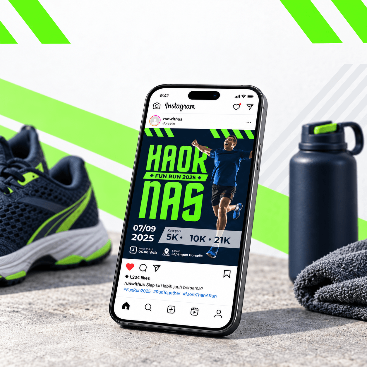
A large headline paired with much smaller supporting text can make the composition feel more dynamic. The sudden difference in scale gives the design a clear visual pulse. For example, a huge “5K RUN” headline followed by smaller event details creates more impact than using similar sizes throughout the layout.
Irregular Shapes Add Personality
Slightly unconventional letterforms can introduce excitement. Uneven angles, unusual terminals, or distinctive proportions make typography feel less static. This works well for fun runs, creative events, streetwear campaigns, and youth-focused sports promotions. However, readability should still come first.
Tight or Dynamic Spacing Can Increase Tension
Tighter letter spacing can make a word feel compact and intense. Wider spacing can make it feel more open and confident. Designers can use spacing to support the intended mood. For a fast, energetic headline, slightly tighter tracking may feel more powerful. For a friendly community event, more breathing room can feel more relaxed.
How Color and Layout Reinforce Font Personality
The font itself is only one part of the emotional effect. Color, photography, and composition can strengthen or weaken the personality of the typeface.
A bold condensed font paired with neon colors and diagonal shapes may feel highly energetic. The same font used in muted beige with centered alignment could feel more editorial. This is why typography should always be tested inside the actual design, not only in a font preview.
Recommended articles
For practical examples of how energetic typography works in event layouts, explore Energetic Fonts for Fun Run Posters. The article shows how font choice, hierarchy, and supporting design elements can help running promotions feel more active and inviting.
Match the Typeface to the Audience
A sporty font for a competitive marathon may need to feel stronger and more serious. A charity fun run may benefit from softer, friendlier typography. A children’s event may need playful shapes and bright colors.
Before choosing a font, ask what emotion the audience should feel first. Excitement? Confidence? Fun? Motivation? Community? The answer should guide the typography.
Conclusion
What makes a font feel sporty, friendly, and energetic comes from a combination of visual psychology and design context. Bold weights can communicate strength, condensed shapes suggest speed, rounded curves feel approachable, and slanted forms create movement. Spacing, scale, color, and layout then reinforce those signals.
The most effective typography does not simply look active. It supports the emotion of the event and helps the message feel clear at the same time.
