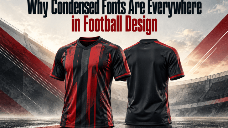
Condensed fonts in football design have become a familiar visual language across jerseys, match posters, social media graphics, and club branding. Their tall, narrow letterforms help designers create bold typography without taking up too much horizontal space. More importantly, they bring a sense of speed, strength, and competition that feels naturally connected to football. That combination makes condensed typefaces both practical and visually effective.
Why Condensed Fonts Fit Football So Well
Football design often needs to communicate information quickly. Player names, scores, fixtures, team names, and promotional headlines must remain visible even when space is limited. Condensed fonts let designers fit more characters into compact layouts while maintaining a strong visual presence.
This is especially useful in sports graphics where typography competes with player photography, club logos, sponsor marks, and other design elements. A wider font can consume valuable space and make the layout feel crowded. Condensed typography gives designers more flexibility without forcing them to reduce the text dramatically.
They Create a Strong Athletic Personality
Condensed typefaces often have tall proportions, bold strokes, and structured shapes. These characteristics can make words feel faster, sharper, and more energetic. In football visuals, that personality works well because the sport itself is associated with movement, competition, and intensity.
The style can also support different football identities. A geometric condensed font may feel modern and technical, while a heavy industrial style can create a tougher, more aggressive appearance. This versatility allows designers to match typography with the personality of a club or campaign.
Condensed Fonts Work Well on Football Jerseys
One of the most obvious uses of condensed typography is jersey lettering. Player names need to fit across the upper back of a shirt, but surnames can vary dramatically in length. A condensed typeface helps designers maintain a consistent height while fitting both short and long names into the available space.
This approach also prevents long names from becoming noticeably smaller than shorter ones. Instead of shrinking every difficult name, designers can use a naturally narrow letter structure. If you are working specifically on jersey typography, our guide How to Use Condensed Fonts for Football Jersey Names explains how to manage spacing, scale, readability, and name length in more detail.
They Improve Hierarchy in Match Graphics
Football graphics often contain several layers of information. A typical match poster might include team names, the competition, date, venue, score, and a strong headline. Without clear hierarchy, all of those elements can compete for attention.
Condensed fonts make it easier to build hierarchy because designers can use large text without overwhelming the composition. A tall headline can occupy strong vertical space while leaving room for supporting details. This makes the design feel bold while still keeping the overall layout organized.
Condensed Fonts Help Headlines Feel Bigger
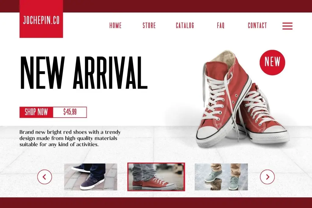
Large typography is a major part of modern football visual culture. Match-day posts, transfer announcements, player reveals, and championship graphics often rely on oversized headlines. Condensed fonts allow those headlines to appear large without extending too far across the canvas.
This is particularly valuable for vertical social media formats. Instagram posts, stories, and mobile-first graphics offer limited width, so traditional wide typefaces can quickly become difficult to manage. A condensed font helps designers create dramatic typography while preserving space for photography and other content.
They Pair Well with Numbers
Numbers are another essential part of football design. Scores, player numbers, seasons, dates, and statistics appear across almost every sports visual. Condensed letterforms can pair naturally with bold numerals because both can share a strong vertical structure.
Designers can also create contrast by combining condensed letters with wider numbers. For example, a narrow player name above a large jersey number creates a clear hierarchy while still feeling visually connected. This balance is one reason condensed typography works so well across football branding systems.
Condensed Fonts Support Modern Club Branding
Football clubs are increasingly building visual identities that extend far beyond the pitch. Their branding now appears across social media, merchandise, websites, stadium graphics, and digital campaigns. Typography needs to remain recognizable across all of these formats.
A strong condensed font can become part of that identity because its silhouette is easy to recognize. When used consistently, it can create a distinctive visual rhythm across different applications. However, the font still needs to offer enough flexibility for headlines, player names, statistics, and supporting text.
Readability Still Matters
Not every condensed font is suitable for football design. Some typefaces become too narrow, decorative, or dense when viewed from a distance. This can create problems on jerseys, stadium signage, or mobile screens.
Designers should test uppercase characters, numbers, and different word lengths before selecting a final typeface. Pay particular attention to letters such as M, W, N, I, and R because these shapes can become harder to distinguish in extremely narrow fonts. A good condensed font should feel compact without sacrificing clarity.
How to Choose the Right Condensed Font
Start by thinking about the final application. A font for jersey names may require strong uppercase readability, while a font for match posters can have more expressive character. Football branding systems may need a typeface that works across both promotional graphics and functional information.
You should also test several weights and spacing options. Medium or bold weights usually work well for football graphics because they remain visible across different sizes. Testing the font inside realistic layouts is more useful than judging it from a type specimen alone.
Final Thoughts
The popularity of condensed fonts in football design comes from a combination of function and personality. Their narrow proportions help designers manage limited space, while their tall and bold appearance brings energy to jerseys, posters, branding, and digital graphics. They can make typography feel more athletic without sacrificing layout flexibility.
For designers comparing font options, condensed typefaces are worth considering when the project needs strong headlines, compact lettering, or a modern sports identity. The key is choosing a font that remains readable while still delivering the visual impact football design demands. When those qualities work together, condensed typography becomes more than a trend—it becomes a practical part of the visual system.
