The psychology behind modern script fonts in horror titles comes from the way handwritten letterforms can feel intimate, unpredictable, and emotionally charged. Unlike a clean geometric font, a script typeface often looks as if a person created it by hand. In horror design, that human quality can make a title feel more personal, unstable, or unsettling.
Modern script fonts are especially effective when they avoid obvious horror clichés. They do not need blood effects, cracks, or extreme distortion to create tension. Sometimes, a slightly uneven baseline, sharp terminal, or unusual connection between letters is enough to make a title feel disturbing.
Why Script Fonts Can Feel Unsettling
Script typography carries a strong connection to handwriting. Because of this, viewers often read it as something more personal than a neutral sans serif or traditional serif. A handwritten title can feel like a note, confession, diary entry, warning, or message left by someone. That association can create psychological tension, especially in horror films built around mystery, memory, obsession, or isolation.
Imperfection Creates Uncertainty
Perfectly balanced letterforms feel controlled. Slightly irregular script fonts feel less predictable. Uneven stroke widths, changing letter angles, and inconsistent connections can make viewers feel that something is not quite right. This visual instability works well in psychological horror because it suggests tension without showing anything explicitly frightening.
How Shape Influences Fear
The emotional impact of a script font often comes from small structural details.
Sharp Terminals Feel More Aggressive
A script font with pointed endings can feel more dangerous than one with soft, rounded strokes. Sharp forms can visually resemble scratches, cuts, or quick gestures, creating a more threatening mood. These details work particularly well for thriller, supernatural, or revenge-focused titles.
Thin Strokes Can Feel Fragile
Very thin strokes may suggest delicacy, but in horror they can also feel fragile or ghostly. A light script against a dark background can create a sense of vulnerability or absence. This style works well for atmospheric horror, ghost stories, or slow-burn psychological films.
Heavy Strokes Feel More Intense
Thicker script fonts can create a more direct and aggressive feeling. They carry more visual weight and can make a title feel urgent, obsessive, or emotionally intense. Use heavier forms when the poster already has strong contrast or bold imagery.
Rhythm and Letter Connections Matter
Script fonts often create movement because one character flows into the next. That rhythm can either feel elegant or disturbing depending on the spacing and structure.
Smooth Connections Feel Emotional
Flowing connections can make a title feel intimate or romantic. In horror, this contrast can become unsettling when paired with dark photography or an uncomfortable subject. A graceful script on a disturbing poster can create tension because the typography and image communicate different emotions.
Broken Connections Create Unease
When some letters connect and others suddenly break apart, the visual rhythm becomes less stable. That interruption can make the word feel fragmented or nervous. Designers can use this effect to support themes such as memory loss, paranoia, fear, or psychological collapse.
Why Modern Script Fonts Work Better Than Obvious Horror Fonts
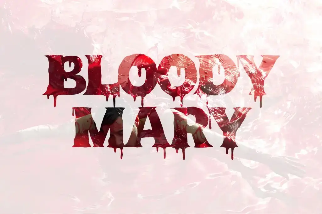
Traditional horror fonts often use dripping letters, rough textures, or extreme distortion. These styles can be effective, but they may also feel predictable. Modern script fonts offer a subtler approach. They can create fear through personality rather than decoration. This makes them useful for contemporary horror films that rely on mood, character, and psychological tension. A title can feel disturbing because it looks personal, controlled, or strangely elegant.
Pair Script Fonts With Simpler Supporting Type
A horror poster still needs readable credits, dates, actor names, and promotional details. Use the script font for the main title, then pair it with a clean serif or sans serif for supporting information. This creates stronger hierarchy and keeps the script as the emotional focal point. Avoid using multiple expressive fonts in one composition. Too much visual tension can make the design feel chaotic rather than intentional.
Use Contrast to Strengthen the Psychological Effect
Color and placement can amplify the personality of the script font. White script on a nearly black background can feel ghostly and distant. Red may create urgency, while faded gray can feel old or unsettling. A title placed slightly off-center may also feel more uncomfortable than a perfectly balanced composition. These decisions should support the story rather than simply make the poster look scary.
Recommended Articles
If you want to explore fresher cinematic typography directions, read A Modern Script Font That Has Never Been Used in a Movie Poster for ideas on building a more original film identity.
Conclusion
The psychology behind modern script fonts in horror titles is rooted in their human, imperfect, and expressive qualities. Sharp terminals can create aggression, thin strokes can feel fragile, irregular rhythms can suggest instability, and flowing connections can create an unsettling sense of intimacy.
The strongest horror typography does not need obvious visual effects. A script font can create tension simply by feeling personal, unpredictable, or slightly wrong.

One Comment