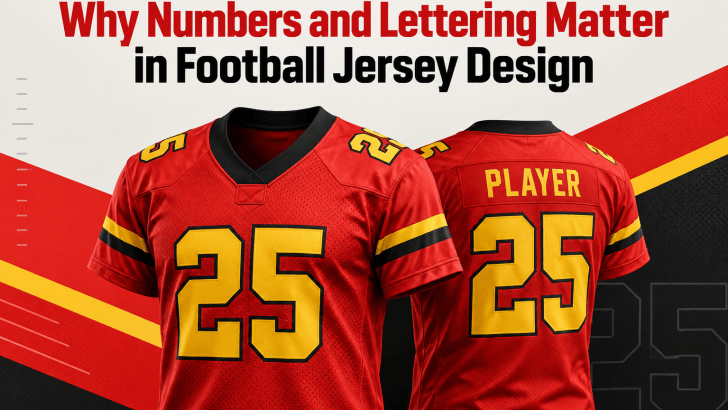
A strong football jersey design isn’t just about team colors, logos, or sponsor placement. Numbers and lettering also play a major role in how a jersey looks, feels, and performs visually. From the player’s name on the back to the large number below it, typography helps turn a basic sports uniform into a recognizable identity.
The right lettering can make a team look bold, modern, traditional, or aggressive. At the same time, jersey numbers need to remain readable from a distance and under different conditions. That balance between personality and function is what makes typography such an important part of football jersey design.
Typography Helps Build Team Identity
Football clubs often have a strong visual identity. Colors, badges, patterns, and symbols help supporters recognize a team instantly. Typography can strengthen that identity even further.
A sharp geometric typeface might support a modern club image, while a heavier condensed font can create a more powerful athletic feeling. A custom number style can also make the uniform feel unique instead of looking like a generic sports template.
This is why numbers and lettering should be treated as part of the overall visual system. They should feel connected to the logo, jersey pattern, and the team’s personality.
If you are still exploring which typography styles work best for sports uniforms, read Jersey Font Guide: Best Fonts for Sports Design for more ideas on choosing fonts for football, basketball, and other athletic projects.
Jersey Numbers Need to Be Easy to Read
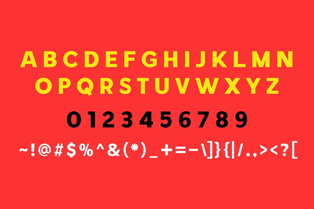
A jersey number has a practical purpose. Fans, referees, commentators, and photographers need to identify players quickly. Because of this, readability should always come before decoration.
Numbers may be seen from the opposite side of a stadium, on a television broadcast, or in a fast-moving photograph. If the shapes are too thin, complicated, or similar to one another, they can become difficult to recognize. For example, the numbers 1 and 7 should look clearly different. The same applies to 3 and 8 or 5 and 6.
Keep the Shapes Clear
Good jersey number fonts usually have strong silhouettes. Thicker strokes can improve visibility, while enough negative space helps each number remain recognizable.
Designers should also avoid excessive decorative details inside the numbers. Small cuts, outlines, or textures may look impressive at full size on a computer screen but disappear when viewed from farther away. A simple structure often creates a stronger result.
Lettering Adds Personality to Football Jersey Design
Player names are another opportunity to express the visual style of a team. Lettering can feel futuristic, classic, industrial, sporty, or even retro depending on the typeface. These small choices can influence how the entire jersey is perceived.
A modern sans serif can create a clean professional appearance. A condensed display font may feel faster and more energetic. A custom angular typeface can make the design feel more aggressive.
The best lettering does not compete with the rest of the jersey. Instead, it supports the existing visual direction.
Avoid Overly Decorative Fonts
Display fonts can be tempting because they look distinctive. However, football jerseys are not the best place for complex scripts or highly ornamental letterforms. Names need to remain readable, especially when they contain many characters.
A decorative font might work well in a promotional poster but fail when printed in a narrow space across the shoulders. Always consider the final application before choosing the font.
Numbers and Names Should Work as a Pair
A common design mistake is choosing one style for numbers and another unrelated style for player names. Even when both fonts look good separately, the combination can feel inconsistent. The lettering and numbers do not necessarily need to use exactly the same font, but they should share similar visual characteristics.
Look at features such as:
- stroke thickness
- width and proportions
- corner shapes
- overall weight
- spacing
For example, a bold condensed number style often works well with condensed uppercase lettering. Keeping these characteristics consistent creates a more unified football jersey design.
Consider the Viewing Distance
Jersey typography is rarely viewed only at close range. This is why designers need to test their designs at multiple sizes. Zoom out from the artwork and see whether the number is still recognizable. Reduce the design to a small thumbnail. Check whether the player name still has enough spacing between characters.
If the typography becomes unclear when reduced, it may also struggle in real-world situations. Testing at different scales can reveal problems early in the design process.
Think About Contrast
Color contrast is just as important as typeface choice. A good font can still become unreadable if the lettering color blends into the jersey background.
Light letters usually work better on darker jerseys, while dark typography is easier to read on lighter uniforms. When the jersey includes patterns or gradients, designers may also use an outline around the numbers. However, outlines should support readability rather than become another decorative element. Too many layers, shadows, or borders can make simple letterforms feel unnecessarily heavy.
Custom Typography Can Make a Jersey More Memorable
Professional clubs often use custom or modified typefaces for their jerseys. This helps create stronger visual recognition and gives the kit its own character.
Designers working on smaller clubs, school teams, or sports merchandise can use the same principle without creating an entirely new font. Small modifications can make a big difference.
For example, you might change a few corners, introduce consistent diagonal cuts, or modify the shape of selected numbers. The important thing is to keep these adjustments consistent across the complete set.
Test Typography Before Finalizing the Jersey
Never judge a football jersey font from a single word or number. Test several player names, including short and long ones. Try every number from 0 to 9 and check how double-digit combinations behave. Pay particular attention to combinations such as 11, 17, 33, and 88.
Some fonts may look balanced with individual numbers but feel awkward when two digits appear side by side. This testing process helps you identify spacing and proportion problems before production.
Final Thoughts
Numbers and lettering are essential elements of good football jersey design. They help identify players, improve readability, and reinforce the personality of a team. The most effective typography combines visual character with practical function.
Choose fonts with clear shapes, keep numbers and names stylistically connected, and test everything from multiple viewing distances. Avoid unnecessary decoration if it makes the design harder to understand.
When typography is treated as part of the overall identity rather than an afterthought, a football jersey can feel more professional, distinctive, and memorable.
