Ligature design in branding can make a logo or visual identity feel refined, distinctive, and more memorable. By connecting or combining letterforms, ligatures introduce subtle details that can give typography a custom-made appearance. However, when they are overused or applied without purpose, they can also reduce readability and make a brand look unnecessarily complicated.
For designers and brand owners, the real question is not whether ligatures look beautiful. It is whether they support the identity, message, and function of the brand.
Used carefully, ligatures can become a small but powerful part of a visual system. Used poorly, they can turn into decoration that distracts from the message.
What Makes Ligature Design Work in Branding?
A ligature combines two or more characters into a single typographic form. Some ligatures are functional, while others are stylistic and created to give a typeface more personality.
If you want to understand the concept from the beginning, read What Is a Ligature in Typography? to explore how ligatures work, why they exist, and how they have evolved in modern type design.
In branding, ligatures are often used in logos, wordmarks, packaging, editorial graphics, and campaign headlines. Their biggest advantage is their ability to make familiar letter combinations feel more unique. A standard wordmark may look clean and professional. Add a carefully designed ligature, and the same wordmark can suddenly feel more crafted and recognizable. Still, the visual effect only works when the ligature fits naturally within the typography.
When Ligatures Add Elegance to a Brand
Ligatures can be highly effective when a brand needs a sense of sophistication, craftsmanship, or exclusivity. Luxury brands, fashion labels, beauty products, boutique studios, and premium packaging often benefit from small typographic details. A ligature can make a serif wordmark feel more editorial or give a modern display font a more customized character.
Ligatures Can Make a Wordmark Feel Custom
One reason ligatures work well in branding is that they make typography feel less generic. Many brands start with commercially available typefaces. While those fonts may already look strong, adding a carefully selected ligature can help create a more distinctive identity without designing an entirely new typeface.
For example, connecting letters such as “st,” “tt,” “fi,” or “th” can create a recognizable feature within a logo. This kind of detail can help the brand feel intentional rather than template-based.
They Can Reinforce Brand Personality
Ligatures are not only decorative. They can also support a brand’s personality. A flowing ligature may feel elegant and romantic. A sharp geometric connection can feel modern and experimental. A subtle serif ligature may communicate heritage or craftsmanship. The most effective ligatures match the tone that the rest of the identity already communicates.
When Ligature Design Becomes a Visual Distraction
The biggest risk of ligature design in branding is sacrificing clarity for style. A ligature may look interesting in isolation but become difficult to recognize when used in a logo, social media profile, product label, or small digital format. If viewers need extra time to understand the word, the design may be working against the brand.
Readability Should Still Come First
Brand typography often needs to work across many sizes and environments. A ligature that looks elegant on a large poster may become confusing on a mobile screen. Thin connections can disappear, decorative strokes can merge, and unusual letterforms can make words harder to read.
For this reason, designers should test ligatures at multiple sizes before using them as a core brand element. The goal is to create distinction without making the audience decode the typography.
Avoid Using Too Many Ligatures
Another common mistake is treating every available ligature as an opportunity. Many fonts include several discretionary ligatures, especially display fonts designed for editorial or branding use. However, using too many at once can make a layout feel overly styled.
Instead, choose one or two distinctive letter combinations and let them become part of the visual identity. A restrained approach often feels more premium because the detail appears intentional.
If you are currently exploring typefaces with expressive letter connections, take a look at 20 Beautiful Ligature Fonts Designers Love in 2026 for inspiration and font options that can work across branding, editorial, packaging, and creative projects.
How to Choose the Right Ligature Font for Branding
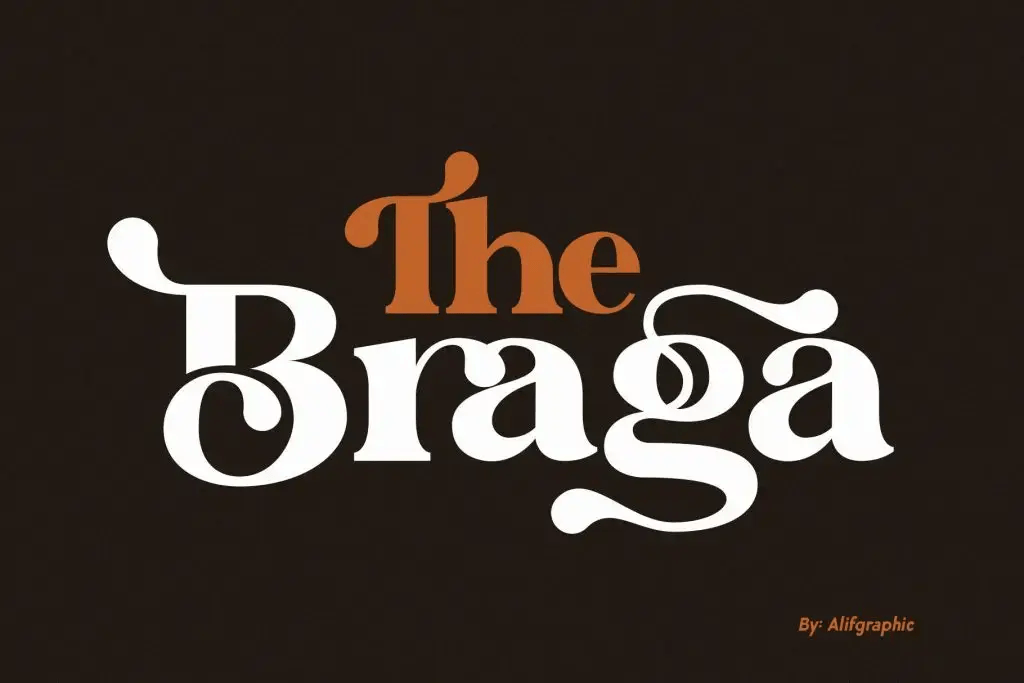
Not every ligature font is suitable for every brand. Before choosing one, start with the project’s personality. Ask whether the brand needs to feel sophisticated, playful, bold, artistic, minimalist, or traditional. Then look for a typeface whose overall structure supports that personality. Do not choose a font only because it contains attractive ligatures.
Evaluate the Whole Typeface
A strong ligature should feel like a natural extension of the font. Check the proportions, spacing, stroke contrast, and rhythm of the complete typeface. The standard characters are still more important than the decorative features. You should also test headlines, logos, short phrases, and real brand names before making a final decision. If the font only looks impressive in a specimen image but struggles with actual content, it may not be the right choice.
Use Ligatures as a Supporting Detail
The strongest brand identities rarely depend on one decorative trick. Ligatures work best when they support a larger typography system that already has clear hierarchy, consistent spacing, and a recognizable visual direction.
You might use a ligature in the main wordmark while keeping supporting typography simple. This contrast allows the logo to feel distinctive without making every piece of brand communication overly decorative. The result is a more flexible system that can work across packaging, social media, websites, posters, and printed materials.
Final Thoughts
Ligature design in branding can be both elegant and effective when it serves a clear purpose. It can make a wordmark feel more custom, reinforce brand personality, and add a level of detail that helps an identity stand out.
At the same time, ligatures should never come at the expense of readability. Use them selectively, test them across different sizes, and make sure they feel consistent with the rest of the visual system.
The best ligature is not necessarily the most decorative one. It is the one that feels natural, recognizable, and perfectly connected to the brand it represents.

One Comment