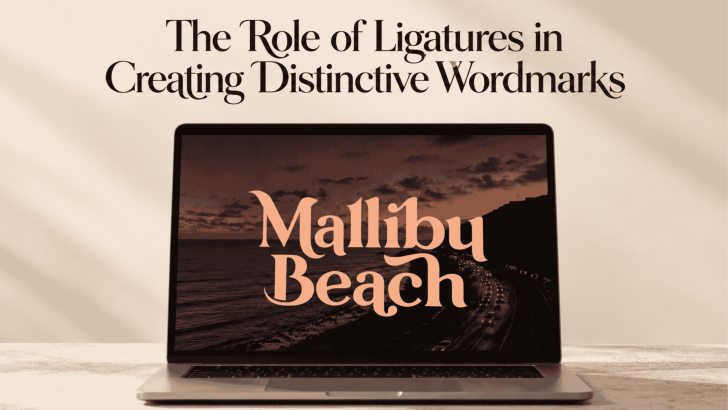
Using ligatures in wordmark design can turn an ordinary sequence of letters into something more recognizable and distinctive. By connecting or reshaping specific character pairs, designers can create visual relationships that make a brand name feel custom rather than typeset straight from a font. When handled carefully, ligatures can add personality without making the wordmark difficult to read.
This technique is especially useful for brands that rely heavily on typography as their primary identity. A small change between two letters can become a memorable visual signature. However, good ligature design is less about decoration and more about solving spacing, rhythm, and identity problems at the same time.
What Is a Ligature in Typography?
A ligature is a combined form created when two or more letters are joined into a single typographic shape. Traditional examples often include combinations such as “fi” or “fl,” where overlapping letterforms can otherwise create awkward spacing. In modern branding, designers may push the idea further by creating completely custom connections.
Ligatures can therefore serve both functional and expressive purposes. Some improve readability and spacing, while others are designed to make a logo or wordmark more distinctive. If you want to understand the basic concept first, read What Is a Ligature in Typography? for a closer look at how ligatures work.
Why Ligatures Work Well in Wordmarks?
Wordmarks depend almost entirely on letterforms, so every spacing decision becomes visible. A custom ligature can help two letters interact more naturally while introducing an element that competitors are less likely to share. This can be useful when the underlying typeface is simple or widely used.
The strongest ligatures usually feel like they belong to the word rather than being added afterward. They improve flow between characters and support the personality of the brand. When the connection looks forced, however, it can quickly become distracting.
Ligatures Help Solve Awkward Letter Pairings
Certain letter combinations naturally create uncomfortable gaps or collisions. Characters with diagonals, extended strokes, or unusual terminals may not sit comfortably beside one another. Designers can use ligatures to redesign those interactions rather than relying only on kerning.
For example, the terminal of one letter might extend into the next character, creating a smoother transition. Another approach is to simplify overlapping shapes so the pair feels more cohesive. The goal is to improve the visual rhythm of the full word rather than focusing on each letter separately.
Ligatures Can Strengthen Brand Personality
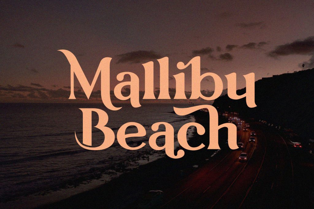
The style of a ligature can communicate just as much as the typeface itself. A smooth, flowing connection may suggest elegance or creativity, while a sharp geometric ligature can feel technical and contemporary. Designers can use these details to reinforce the broader visual direction of the brand.
That does not mean every brand needs an elaborate custom connection. The ligature should support the intended tone, not become the main attraction without reason. A restrained solution often feels more timeless than one built around a temporary visual trend.
Readability Should Come Before Uniqueness
Distinctive wordmarks still need to be understood quickly. If a ligature transforms two letters so heavily that the brand name becomes difficult to recognize, the design has lost an important part of its function. This problem becomes even more serious when the logo appears at small sizes.
Always test the wordmark without explaining what it says. If viewers consistently misread the connected letters, the ligature probably needs simplification. The most effective custom details make the name memorable while preserving its basic structure.
When Ligatures Become a Visual Distraction
Ligatures can easily become overdesigned. Connecting too many characters can make a wordmark feel like a puzzle, especially when every letter has a different treatment. Strong branding usually benefits from one clear idea rather than several competing typographic tricks.
This is why context matters. For a deeper discussion about where the line sits between elegance and unnecessary complexity, explore Ligature Design in Branding: Elegant Detail or Visual Distraction?. It can help designers evaluate whether a custom connection genuinely improves a brand identity.
Use Ligatures to Create Better Rhythm
Wordmark design is not only about individual letters. Designers also need to consider the overall rhythm created by positive and negative space. A well-designed ligature can reduce an awkward gap and make the word feel more unified.
Pay attention to the space around the connection as much as the connection itself. A ligature that looks attractive when zoomed in may create an uneven dark spot when viewed at normal size. Checking the full silhouette helps reveal these problems.
Test Ligatures at Different Sizes
A custom wordmark may appear on everything from a large storefront to a small mobile header. Thin details or tight intersections that look beautiful at large sizes can disappear or merge when reduced. Designers should therefore test ligatures across realistic applications.
Start with large and medium sizes, then reduce the mark significantly. If the connection remains understandable and visually clean, it is more likely to work as part of a flexible identity system. This testing process is especially important for digital-first brands.
Avoid Relying on Font Ligatures Alone
Many typefaces already include standard or discretionary ligatures, which can provide a useful starting point. However, using the default feature does not automatically create a distinctive wordmark. Another brand using the same font may have access to the same letter combinations.
For a stronger identity, designers can modify an existing ligature or develop a custom connection based on the specific letters in the brand name. Even a subtle adjustment can make the result feel more intentional. The key is to preserve the logic of the original typeface while adding something unique.
Think Beyond the Logo
A strong ligature can influence more than the main wordmark. Its shapes may inspire patterns, icons, monograms, or graphic details across the broader visual identity. This creates consistency without repeating the full logo everywhere.
However, the ligature should not be stretched into every possible application. Use it where it strengthens recognition and avoid turning one distinctive feature into visual clutter. Restraint usually makes a brand system feel more confident.
Final Thoughts
The role of ligatures in wordmark design goes beyond joining two letters together. A thoughtful ligature can improve spacing, create better rhythm, reinforce personality, and give a brand name a recognizable visual signature. Its value comes from balancing distinctiveness with clarity.
Designers should therefore treat ligatures as functional branding tools rather than automatic decoration. Test every connection at different sizes, evaluate readability, and consider whether it genuinely adds meaning to the identity. When the detail feels natural, even a small typographic connection can make a wordmark far more memorable.
